A logo for London
If you think about London, certain images immediately dance around in your mind.
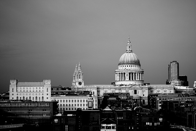
Perhaps some of its buildings: Charles Barry's Palace of Westminster, Sir Horace Jones' Tower Bridge, or Sir Christopher Wren's St Paul's Cathedral.
Or something more recent - Marks and Barfield's London Eye, Norman Foster's Gherkin, or Renzo Piano's Shard?
All individually iconic, but perhaps not representative of the entirety of London.
Often a city becomes known by its skyline, but London has no single point from which it is best viewed, so no single arrangement of its architecture has become dominant. (Though for our money, the view looking east from Waterloo Bridge is hard to beat.)
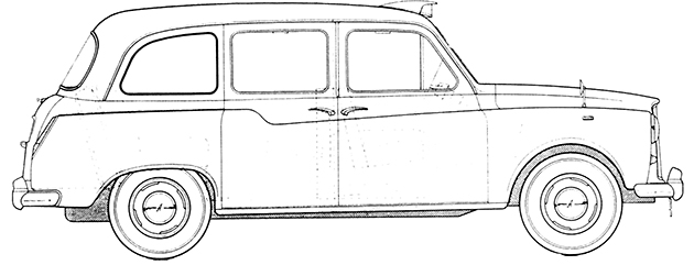
Other London icons, as evidenced by the wares sold in a thousand tatty tourist shops, include the red double decker bus (probably in the form of Douglas Scott's Routemaster), and the London black cab (most probably in its Austin FX4 incarnation).
Those are the 'things' that quickly spring to mind.
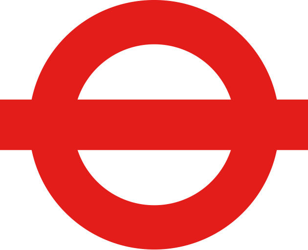
But if you're asked to think of a piece of graphic design that most represents London, then you can't help but think of the representations of London's transport systems - either the iconic Transport for London roundel (the name for the circular logo with the bar through the middle), or the ingenious Underground map (shown here in its current incarnation).
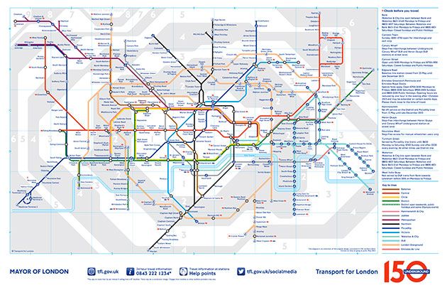
While we are familiar with the story of Harry Beck's design of the map, the story of the roundel has been a little less celebrated (though there is a good short history of its creation on the London Transport Museum site).
Fortunately, David Lawrence's new book, A Logo for London, sets the record straight, in exacting detail.
The book documents the genesis and evolution of the roundel, demonstrating that rather than being the offspring of any single creative genius, it is the child of many hugely talented designers and administrators - including Frank Pick, Harry Ford, Edward Johnston, Eric Gill, Hans Schleger, and Misha Black from Design Research Unit. It has grown and changed over the course of more than a hundred years to become the defining graphic symbol for London (despite the occasional attempt to find something else to do the job).
Lawrence describes how the roundel had two direct antecedents, in designs used by companies that later became part of the London Transport group.
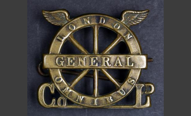
Firstly, there was the logo of the London General Omnibus Company, designed by a gentleman known as Mr Crane, featuring a spoked bus wheel with a bar through it, adorned by a pair of wings.
Secondly, there were the station signboards of the Metropolitan District Railway, blue enamelled signs with white lettering, which announced which station you were at.
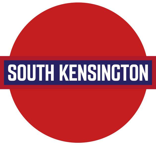
In use around 1906, these were beginning to be swamped by a proliferation of text based advertising which surrounded them at stations. Frank Pick, the real genius behind much of the London Underground's branding, suggested testing out new signs of different shapes and sizes. A year before, Joseph Carter, Company Secretary of the District line, had done exactly that sort of test, and had come up with a red disc bisected with a blue bar with white lettering. This new design, used for station signboards from 1908 onwards, looked something like this:
These two pieces of design were then brought together by calligrapher Edward Johnston, who had been commissioned by Frank Pick in 1913 to create a single typeface for the Underground (which is a whole other tale in itself). There's a lovely section in the book detailing Johnston's correspondence with Harry Carr at the Underground Group about the design of the new Underground logotype.
Johnston's new Underground roundel, then known as the bulls-eye, was used from around late 1919, and is the moment at which the roundel found the form that is still with us today. Here is a drawing from 1925 detailing its exact proportions:
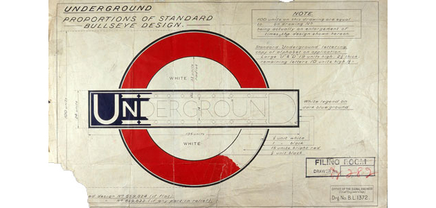
If we deconstruct the logo, we can see that although it grew out of the spoked wheel logo of London General, and the red circle of the early signboards, it artfully represents both a tunnel, and a train running through it. Or perhaps (at a stretch) a bus running across an abstracted representation of the city. Perhaps, even, the river running from west to east across the city.
It's possible it doesn't really matter at this point - its meaning after all is self-defined through use.
Lawrence goes on to show how the logo is gradually introduced across London's entire transport network, on signage, posters, leaflets, maps and uniforms.
So the old solid red circular sign at South Kensington would have changed to look something more like this:
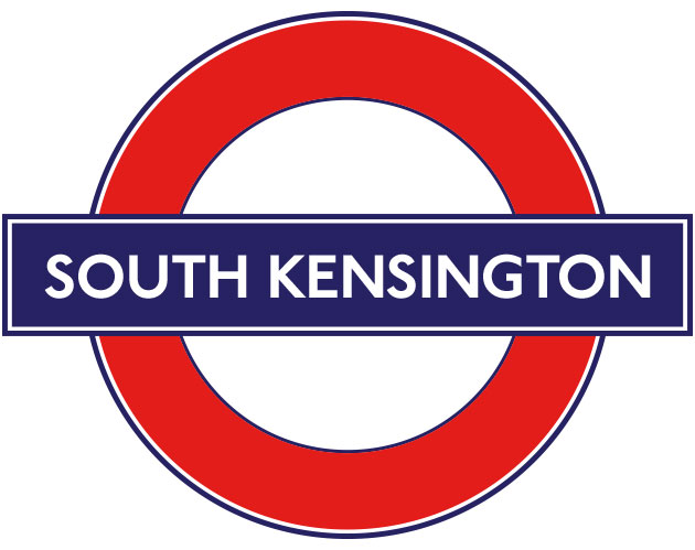
The design of the roundel stayed more or less the same through to 1935, when Hans Schleger* was commissioned by Frank Pick to put together new designs for bus stop signs. Schleger stripped back the roundel to its simplest form - a coloured circle with a coloured bar, with the type reversed out of the bar. His redesign was gradually implemented right across the network, so that by 1955 station signboards looked more like the one below, stripped of their keylines:
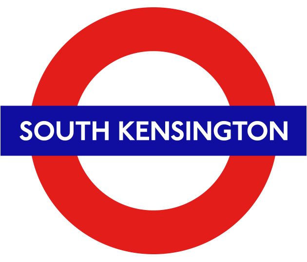
They've remained that way more or less until the present day. (Though interestingly, the latest crop of signs have reinstated a keyline, in the form of a silver grey border on some of the signboards.)
Rather brilliantly, nearly all of the Transport for London visual guidelines are available on the TfL website, so it's easy to see how the roundel is now being used across the city's vast transport system.
For example, here are all the different networks it represents:
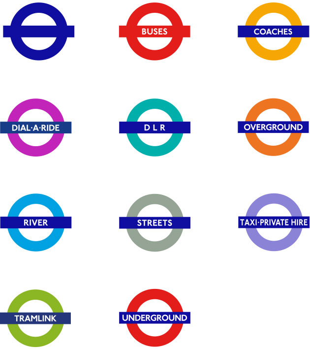
Not bad for a hundred year old logo. (Although it doesn't always work perfectly - Taxi·Private Hire roundel, we're looking at you there.)
A Logo for London, while occasionally a tad dry, is a great addition to the recent crop of books detailing the design of the capital's transport system (you should also check out Mark Ovenden's fantastic London Underground By Design
).
For more roundel goodness, take a look at the London Underground Poster and London Underground Signs groups on Flickr.
*No Wikipedia page for Hans Schleger? Astounding.