The Last Werewolf

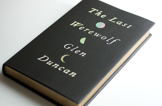
The Last Werewolf is the fantastic new novel from Glen Duncan, published by Canongate. We picked it up in Foyles the other day, having popped in there for a quick browse. We hadn't heard of the book before, but a few things made us pick it up and buy it.
First up, we've naturally got a bit of an interest in all things monstery, thanks to Hoxton Street Monster Supplies - so the title alone was enough to make us take a look.
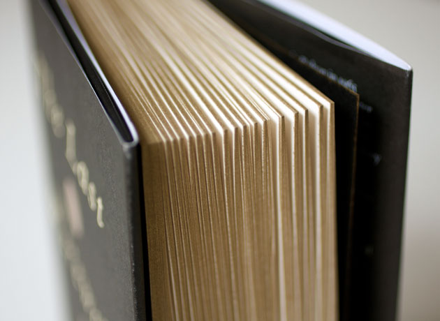
Secondly the dust jacket, designed by Peter Mendelsund (check out his Jacket Mechanical blog - lovely stuff), is foil blocked with a diffuser foil, which reflects a spectrum of light, so that grabbed the 'ooh, look, shiny!' part of our brain. Similarly, the pages of the book have a gold gilt edge - that's a sort of metallic covering on the outside edge of the pages, traditionally used to protect the pages of books from dust. That gives the book the feel of being something special - a feeling that stuck with us all the time we read the book, sitting particularly well with the subject matter too - not something you'd ever experience on a Kindle. (Nor, interestingly, would you know that these design elements existed if you just looked at the book on Amazon, given that they only ever show a front cover shot, often created from the design artwork before it's actually printed, so without any special printing processes.)

Thirdly, the back cover had a quote from Nick Cave:
'A magnificent novel, beautifully crafted and full of genuine suspense, that tears the thorax out of the horror genre to create something that stands rapturous and majestic and entirely on its own'.
All of that was enough to get us to hand over our cash and start reading. And it's a fantastic book - partly a philosophical examination of desire, existence and mortality; it's also a classic horror novel, though it plays on its genre expectations at the same time as embracing them.
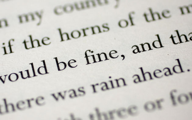
Our only quibble in fact is with the typesetting of the book. The book is set in Perpetua by Palimpsest Book Productions, but they've used a cut of the font which doesn't have ligatures:

There's not really much excuse for that kind of behaviour, and it made us groan every time we stumbled across one.
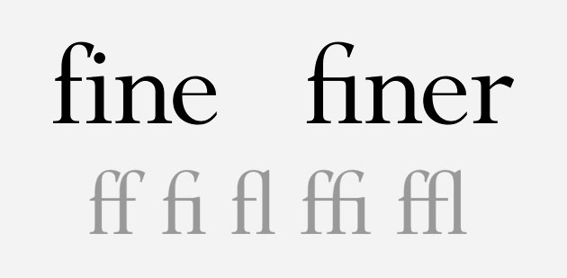
Ligatures, for those who don't know, are the combined letterforms that are used where two characters would otherwise butt up against each other uncomfortably, as with the fi in 'fine' above and below. Most commonly ligatures are created for the combinations ff, fi, fl, ffi, and ffl:

The book has its own website, which feels wildly at odds with the design of the book, which is a real shame, and a missed opportunity.
Those are minor gripes though - we loved the book, and highly recommend it.