Alan Kitching’s A–Z of Letterpress
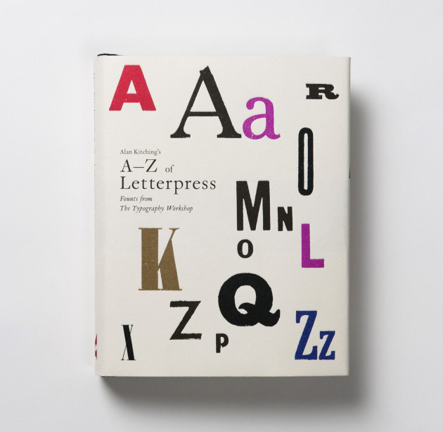
The good folks at Laurence King have just sent us this lovely new book - Alan Kitching's A-Z of Letterpress.
It showcases Alan Kitching's extensive wood-letter fount collection, which he's amassed and restored over years in his south London print workshop.
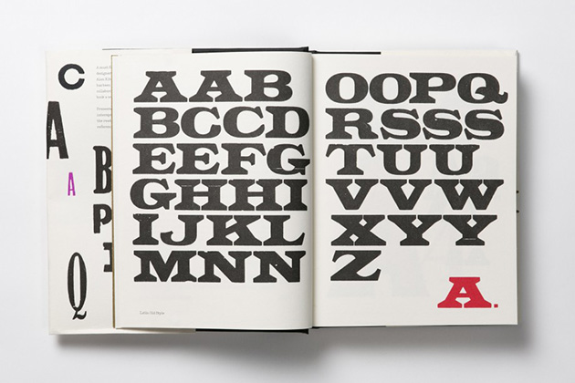
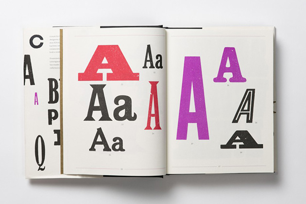
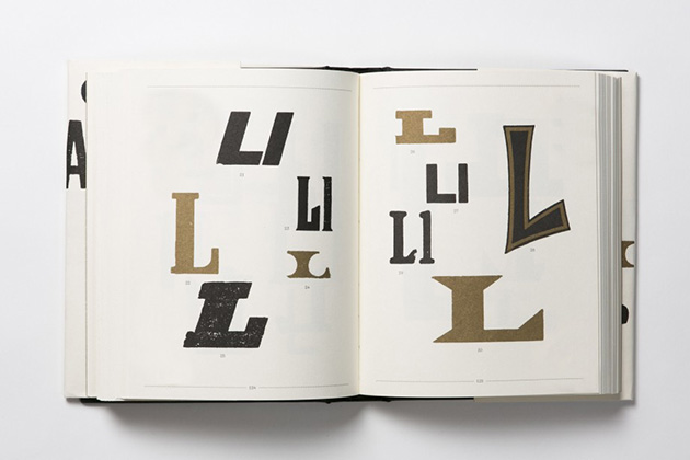
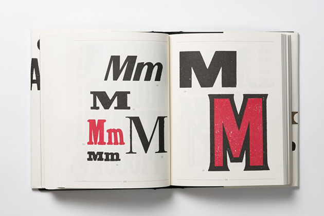
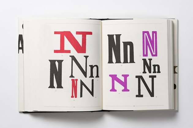
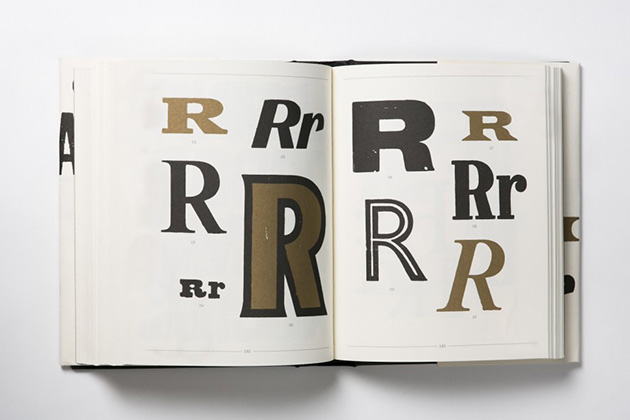
The book is divided up alphabetically, with each chapter featuring a single letter shown in up to thirty nine different founts. The chapters are divided up by spreads which each feature an additional full alphabet (so the one above, preceding the A chapter, is Latin Old Style).
This trick of separating out single founts across the whole book prompts you to examine each letterform on its own, and in contrast to the neighbouring designs of the same letter. We have a sneaking suspicion that it might also have been done to discourage people from just scanning in entire alphabets for their own use, rather than, say, going to an actual printer to have something set in actual type.
The book is beautifully printed in five spot colours, onto quite a bulky uncoated stock, giving it a lovely feel in the hand. These images make it look quite large, but actually its roughly A5 size (just a bit squatter).
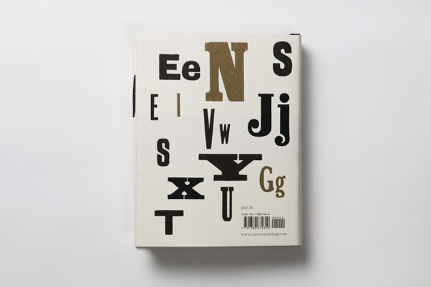
It was conceived and developed by Alan Kitching in collaboration with Angus Hyland, designed by Alexandre Coco at Laurence King, with a jacket by Pentagram.
It's quite a curio of a book. A wonderful historical record of a marvellous collection though to be certain. And the 16 Line Runic Grotesque is utterly delicious.
Excitingly, Laurence King also have a monograph of Kitching's work in the pipeline, due out next year. Huzzah!
