Fedrigoni 365
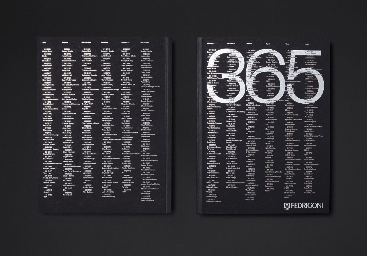
Back in the middle of summer, the good folks at paper company Fedrigoni got in touch to ask if I’d like to contribute to their 2018 calendar, Fedrigoni 365.
They were asking 365 designers to each design a single page, featuring a single date from the year: “Your design can be influenced by anything to do with the given number, date or time of year, but please keep in mind that we want this to be a book of numbers, or graphics influenced by numbers. So your allocated number should be a core element of your design. The calendar will be printed in silver PMS 877U throughout to a Sirio Black paper, so please have this in mind when creating your design.”
Jessica from Fedrigoni dropped a copy of the finished book round to me recently, and it’s really quite gorgeous. The combination of black covers, paper and fore-edge give it the feeling of a solid block. The silver ink pings out against the black paper, and given that there are so many entries, it provides a stunning demonstration of the versatility of a single ink on a single stock.
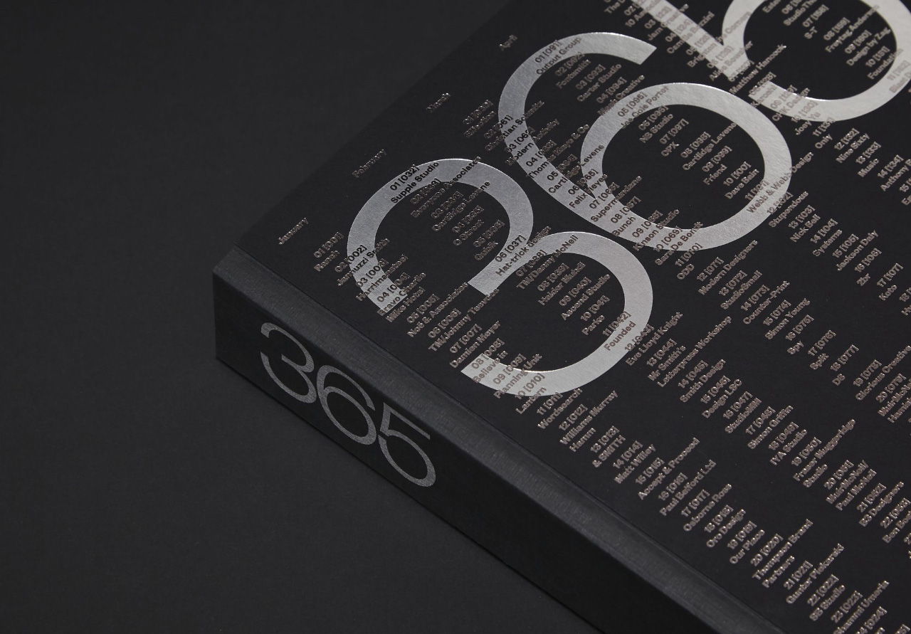
The covers feature the full roll call of contributors. Herding together 365 of the great and the good from the UK graphic design world must have been a huge logistical task, but it makes for a brilliant snapshot of the industry. Contributors include graphic designers, illustrators and type designers, from large studios to individual practitioners.
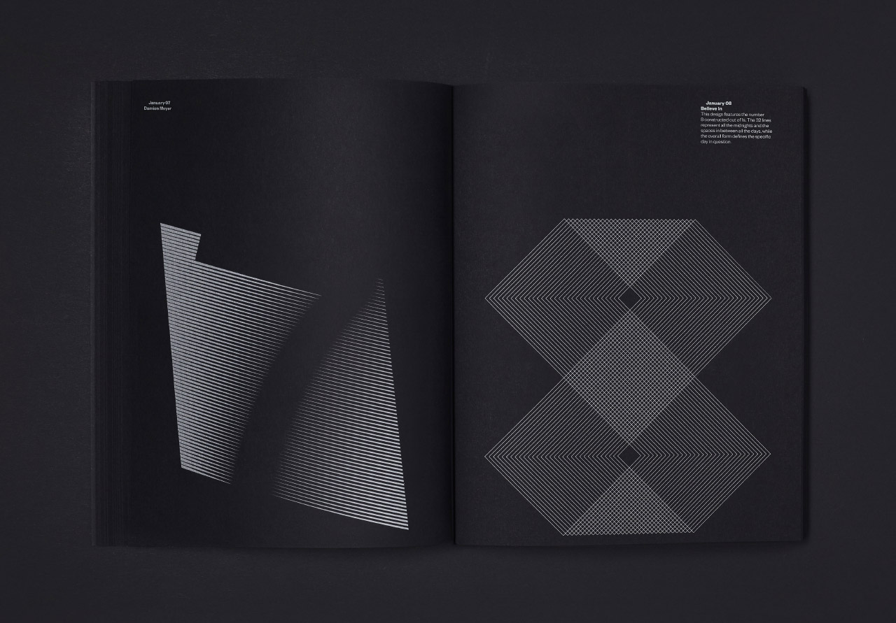
It’s fascinating to see the visual themes that crop up repeatedly amongst 365 responses to a single brief – dice, moons, lines, circles, geometric shapes, dominos and abstracted numbers are all popular (though some of that may be due to the brief stating a preference for vector-based artwork).
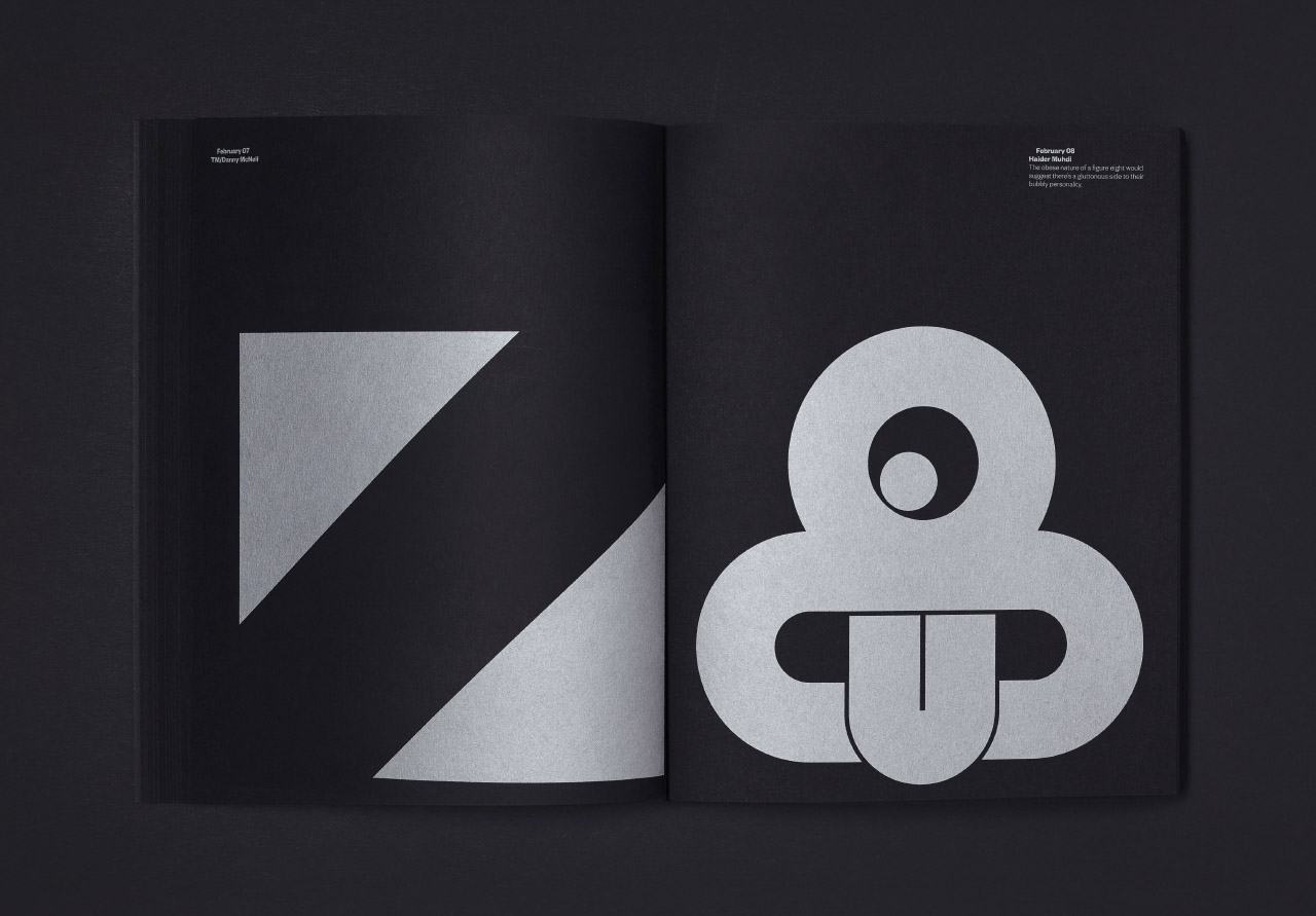
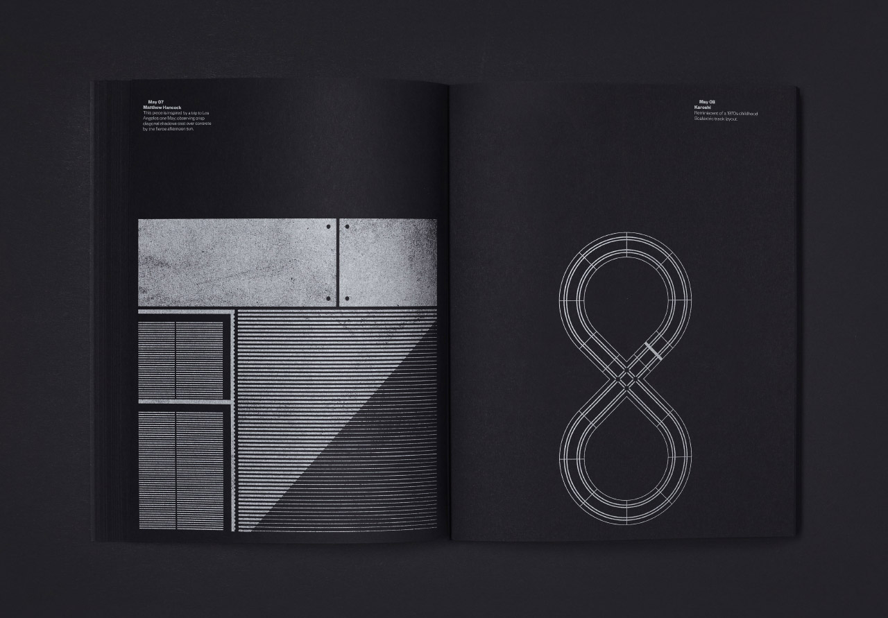
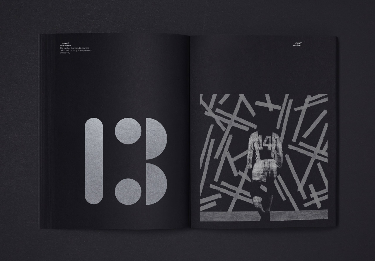
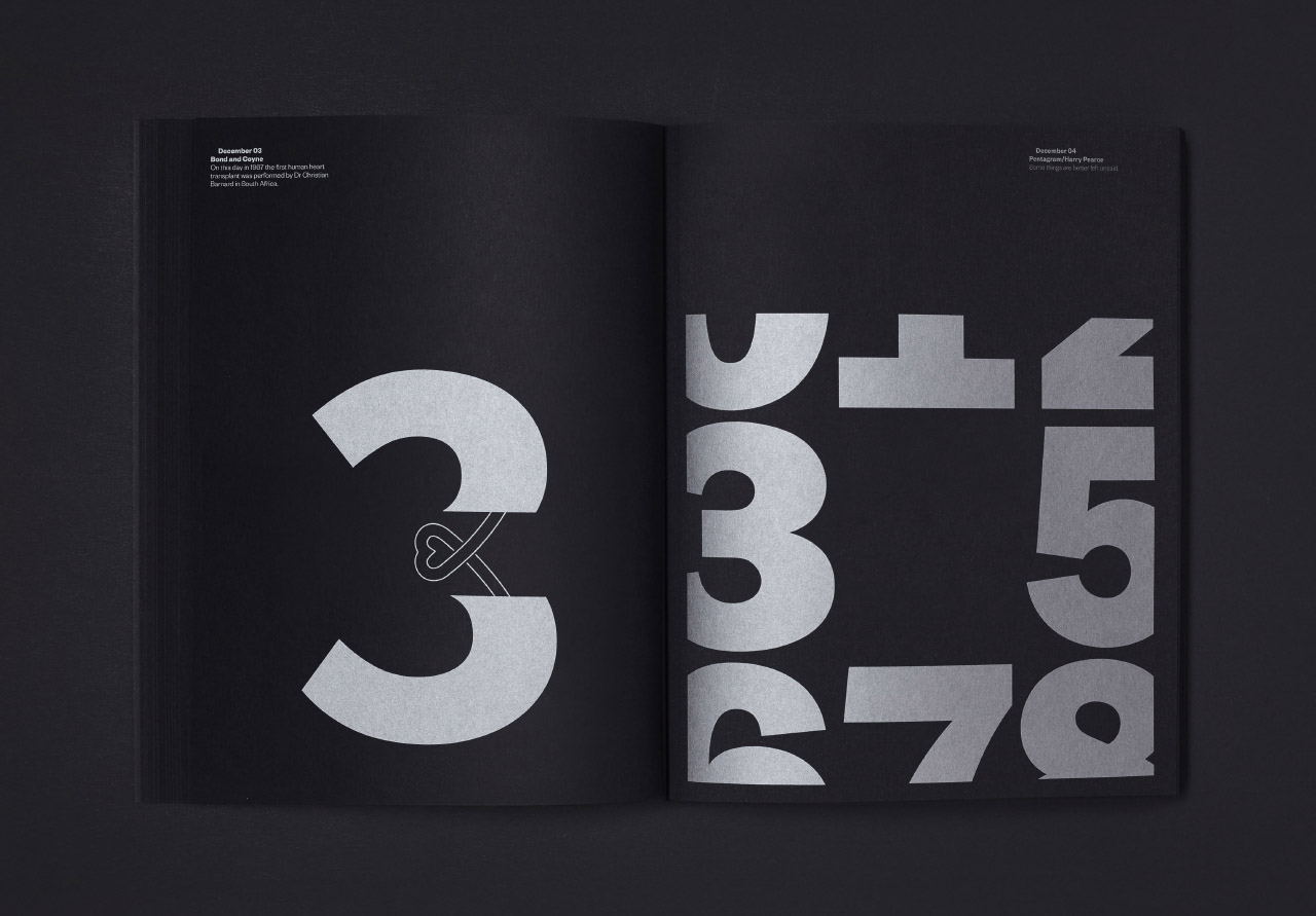
The date I was allocated was 30 June.
After playing around with some rather unsuccessful geometric abstractions, I decided to do some research into the number, 30. I found various bits of interesting information (30 is the sum of the first four squares, so it’s a square pyramidal number; if you dial it on your phone you’ll get put through to Greece…), but then hit upon a wonderful little bit of information about the way the number was used in articles by American journalists.
Here’s the piece I created in response:
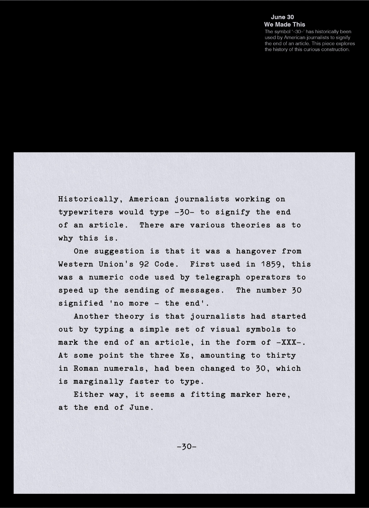
Given my piece referred to the history of journalism, I felt that a typewritten design was the only way to go, and I was careful to keep in the double spaces that were traditionally used between sentences when using a typewriter.
The calendar has been elegantly designed by TM Studio, and you can buy a copy at Counter-Print for just £15 (just in time for Christmas!), with all profits going to the Make-A-Wish charity.