LCC Stay wider of the rider
Cycling through London each day can be a mixed blessing.
Some mornings, with a light wind at your back, and the sun glinting off the buildings and the river, it can feel like perfect way to get around the city. Some mornings though, as yet another vehicle speeds past you with just inches to spare, you end up thinking long and hard about the wisdom of your mode of transport.
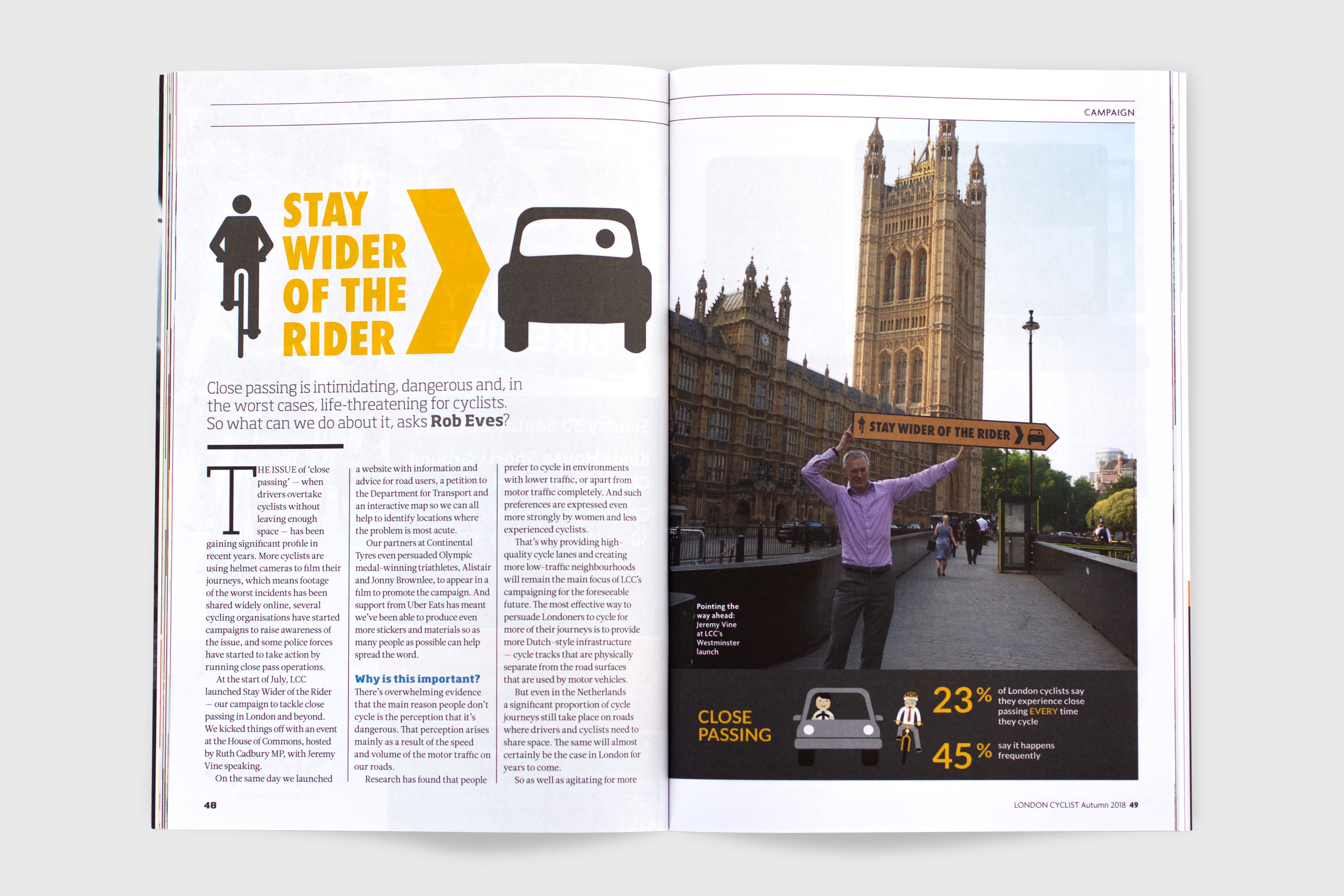
London Cycling Campaign wanted to do something about these close passes, where drivers fail to give enough room to cyclists as they drive past them. Close passing is at the very least intimidating, but can easily be dangerous, and in the worst cases, life-threatening. Following on from the success of the Heart of London campaign, they asked me to design the materials for a campaign to encourage drivers to ‘Stay wider of the rider’. (The same campaign slogan has previously been used by cycling organisations in Australia and South Africa, with great results.)
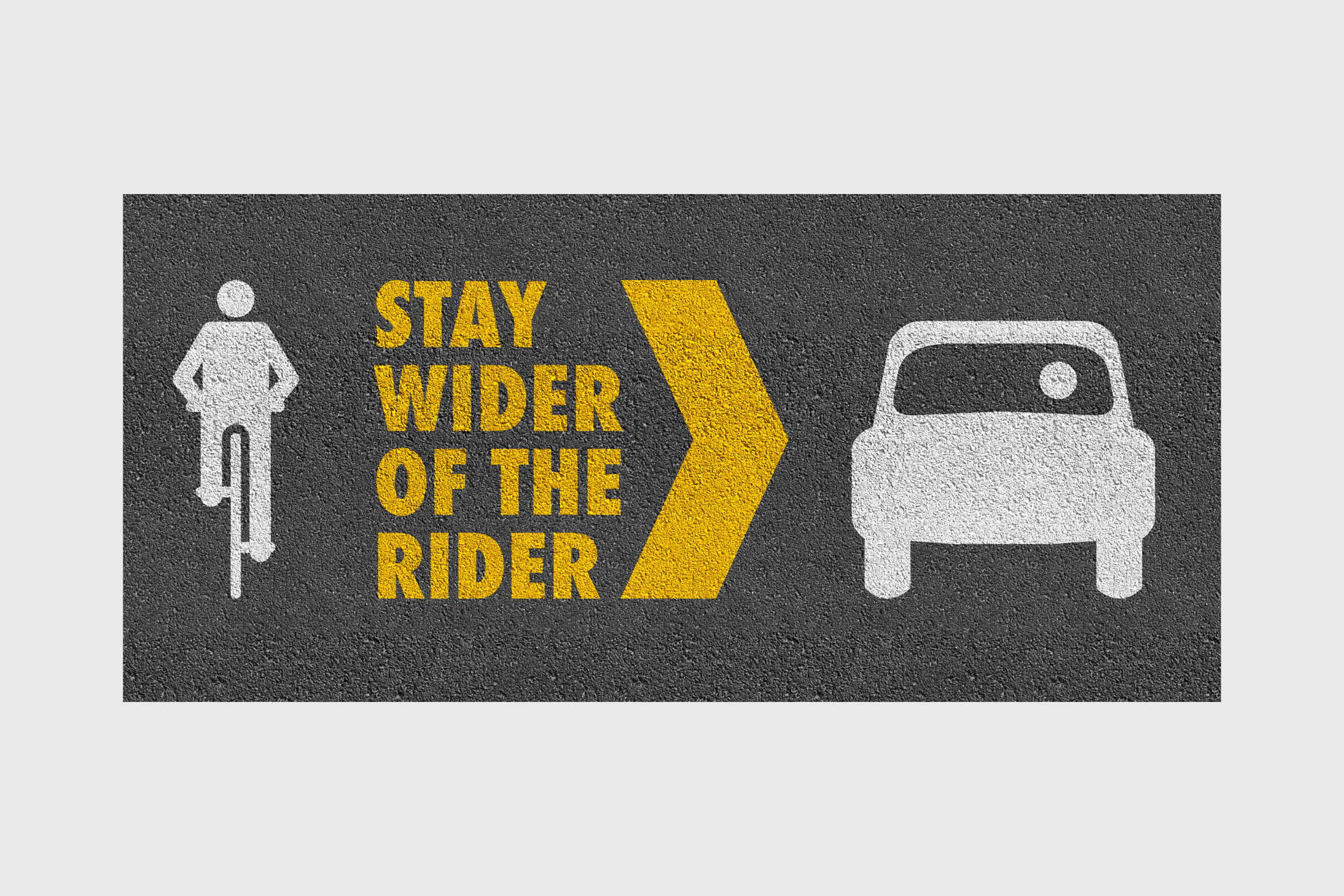
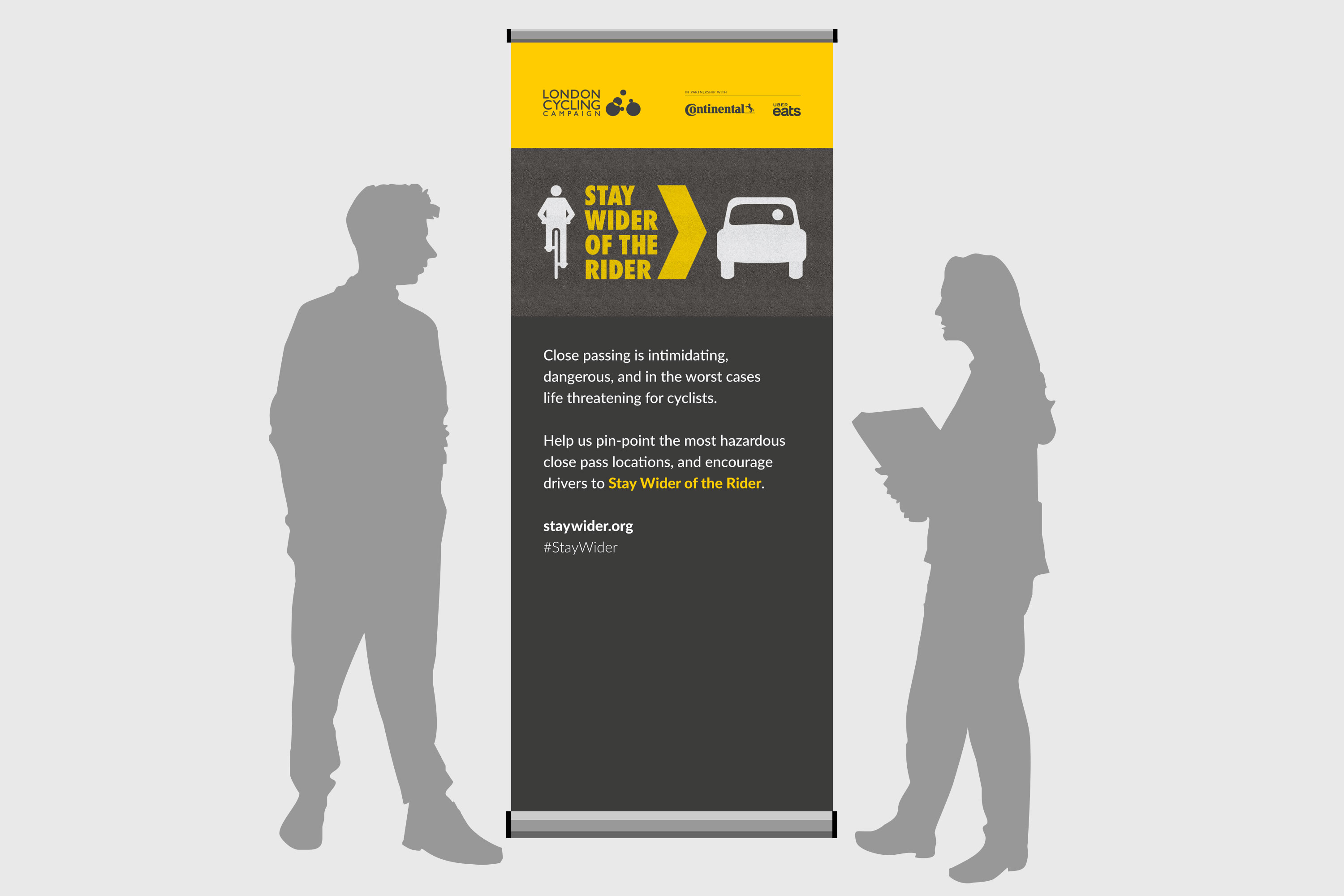
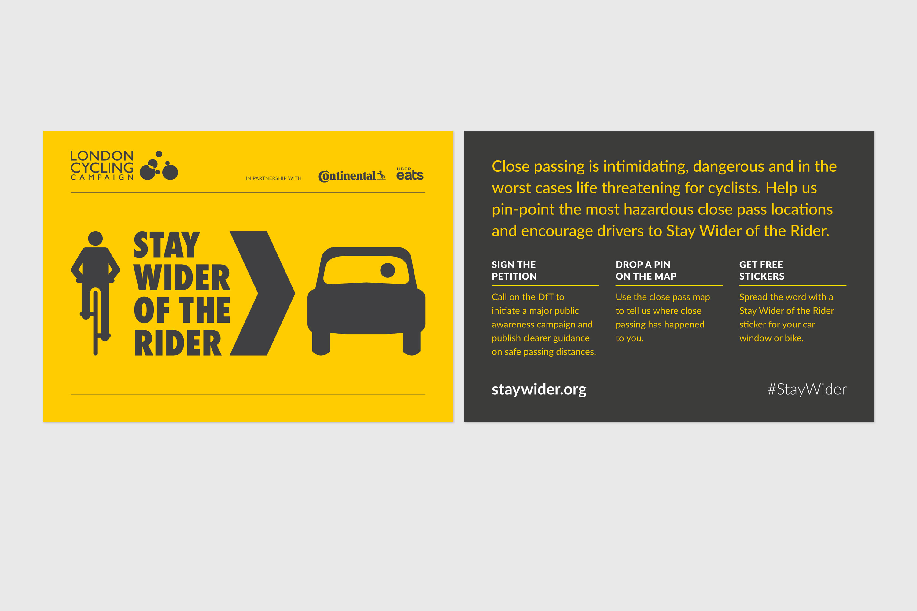
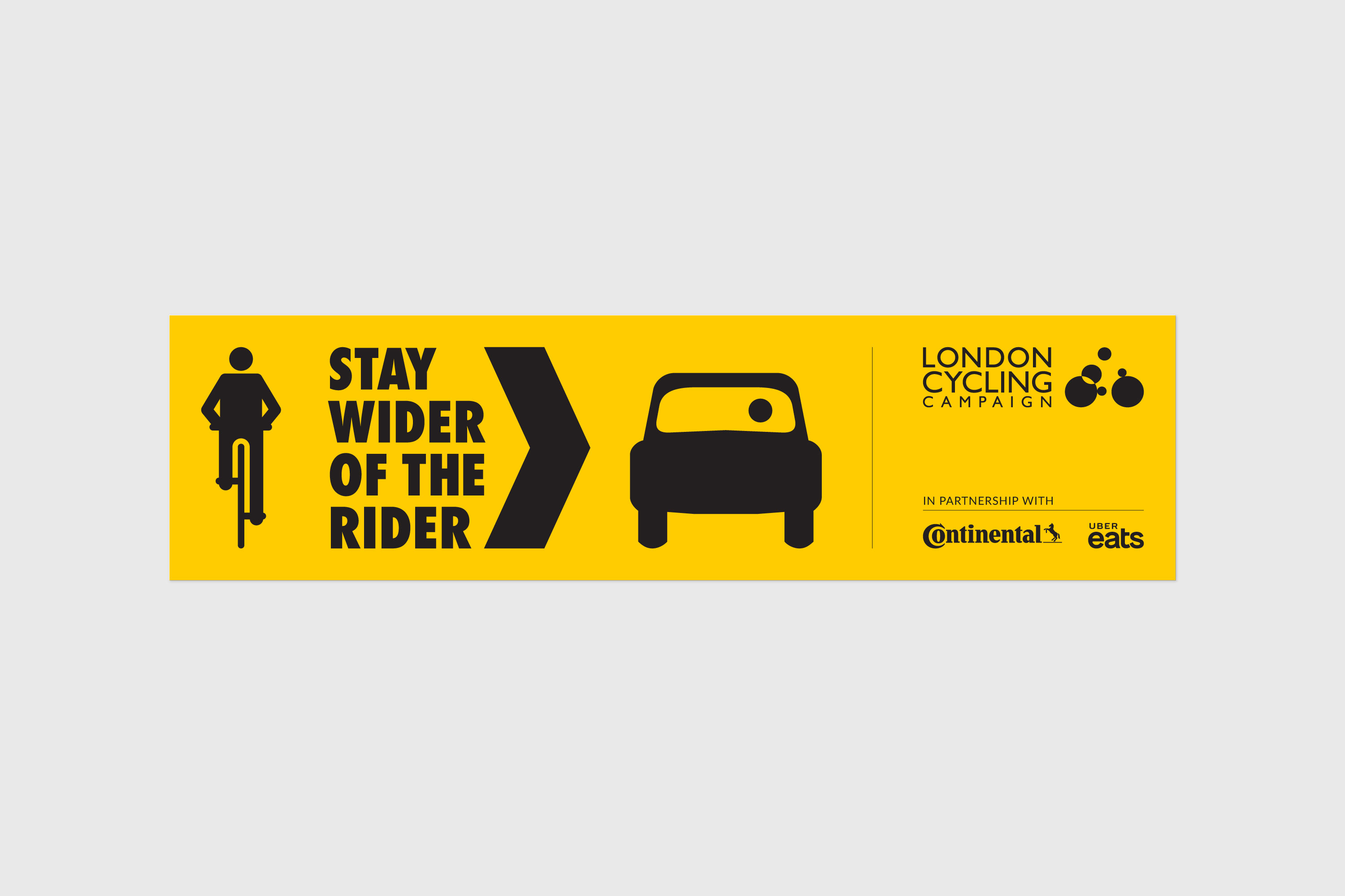
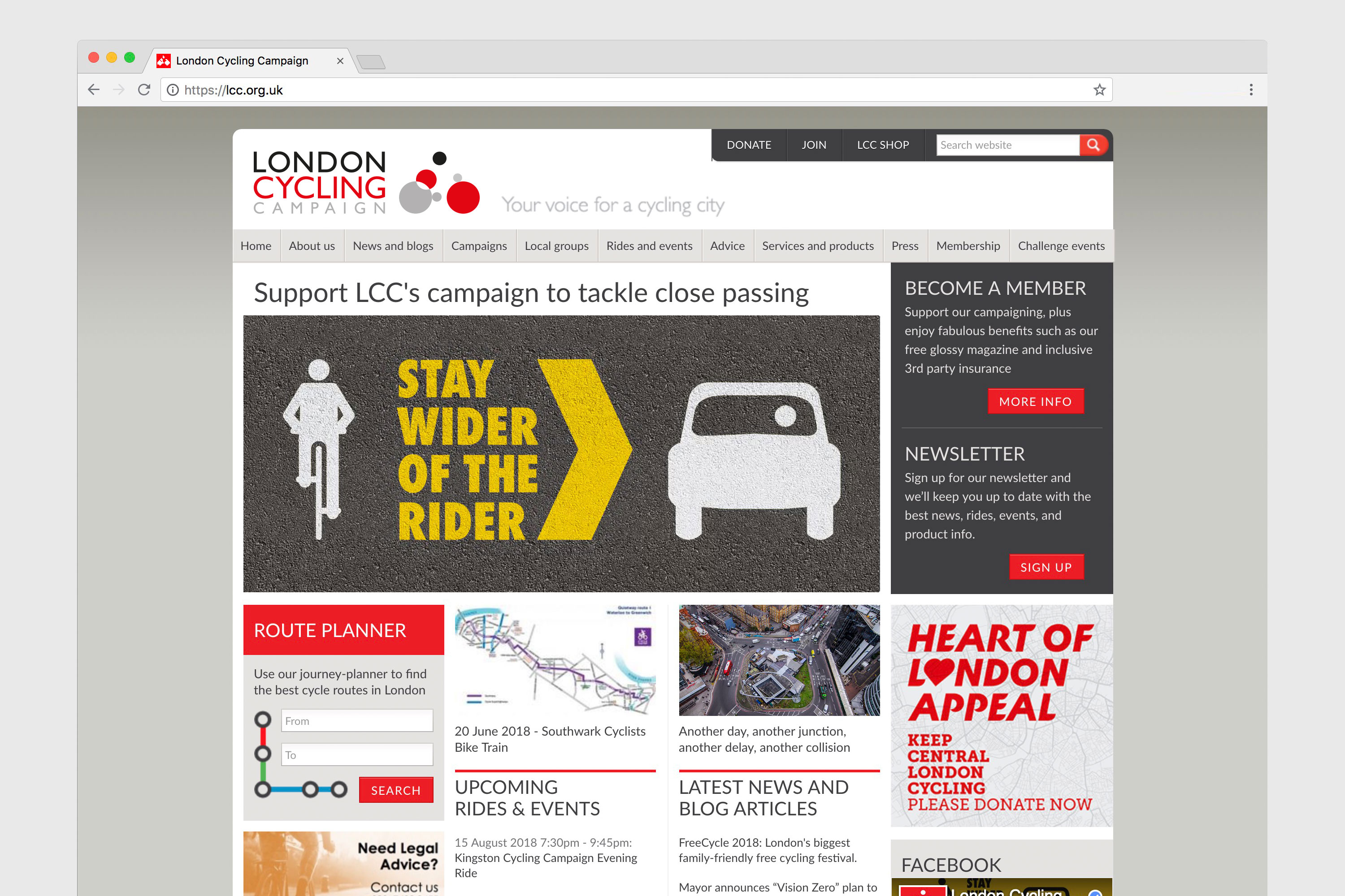
Working from the visual language of road signs, I created a simplified illustration of a cyclist and a car as seen from behind, from a driver’s viewpoint, together with the campaign message and a large chevron. Using a simplified colour palette of grey and yellow, as well as a tarmac texture, I created a whole suite of campaign materials.
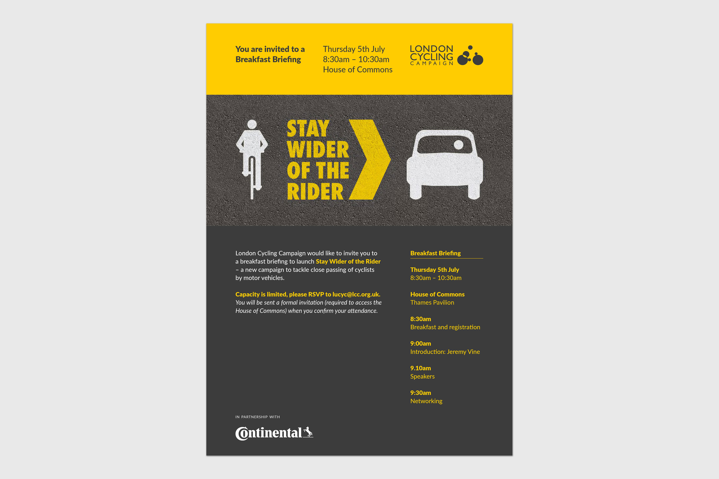
The launch event was held at the House of Commons, for which I designed this invitation:
