15 years of blogging
Well now, it seems that today is the fifteenth birthday of the We Made This blog! A small celebration seems appropriate, right? And, if you’ll excuse the nostalgia, perhaps a little rummage around in the past…
The first We Made This blog post was on Monday 6 March 2006 – it didn’t get carried over to this site during the last redesign, but you can still see it in the archives of the old wemadethis.typepad.com site. Since then, I’ve written over 600 posts on all manner of design related stuff. Heck, the blog even got featured in The Guardian’s Guide at some point.
In some ways the blog has become my online design memory – or at least part of it, along with Flickr, Instagram and so forth. I’ve been looking back through old blog posts today, and it was a real pleasure to trundle through pieces about design exhibitions, films, books, typography and loads more. And it was interesting to see how many people were commenting on posts back in the day. Naturally, most of that conversation has migrated to Twitter over the years – but I’d like to say a big thank you to everyone who has commented in whatever form, at whatever time. I also just had a browse through the blog links on the old Typepad site actually, and it’s great to see so many of those still going too. A huge hello to AceJet170, I Love Typography, Kottke, Noisy Decent Graphics, and Swiss Miss.
So, I thought that as a way of celebrating, I might remind you of some of what I’ve written, by way of fifteen of the most popular posts from the blog (based on a thoroughly un-thorough browse through the site’s analytics).
Up first, a post from 2011 about Cattle Brands, on the back of which I still get occasional emails from folks in the US looking to know more about specific brands.
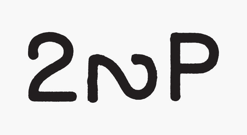
Then jumping forwards to 2015, Albertus and The Prisoner, about the use of an amended version of Berthold Wolpe’s Albertus in the wonderful TV show The Prisoner. An adapted version of the post can also be seen over on Fonts In Use, with several interesting comments.
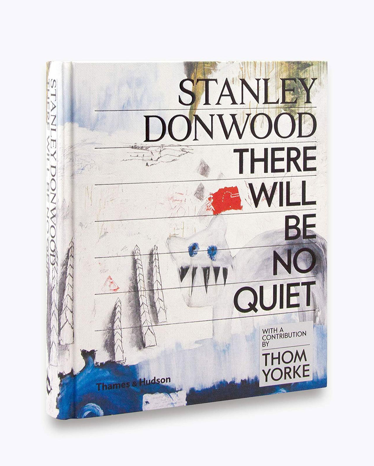
A couple of relatively recent posts have been proving particularly popular. Firstly, a review of Stanley Donwood’s brilliant book, There Will Be No Quiet.
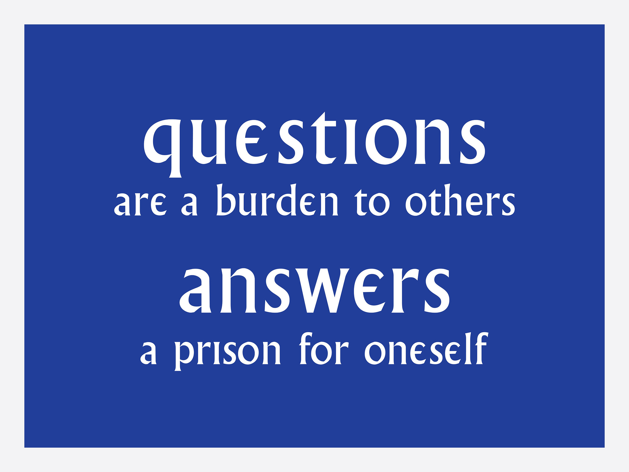
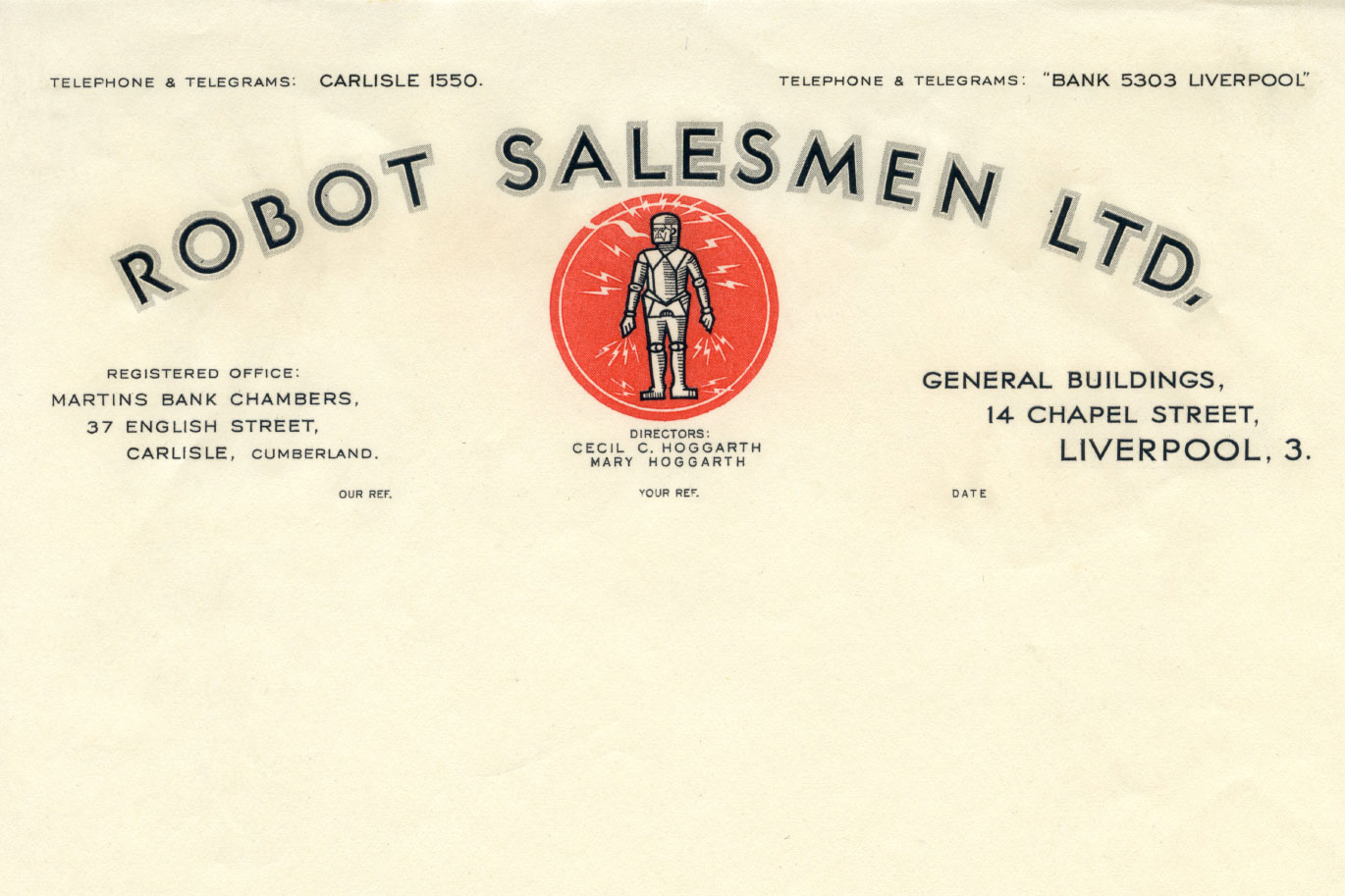
And secondly, a piece about the curious history behind a piece of headed paper from Robot Salesmen Ltd.
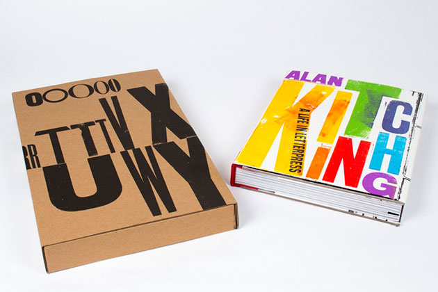
In 2016 I reviewed a wonderful book about Alan Kitching’s beautiful work, Alan Kitching: A life in letterpress.
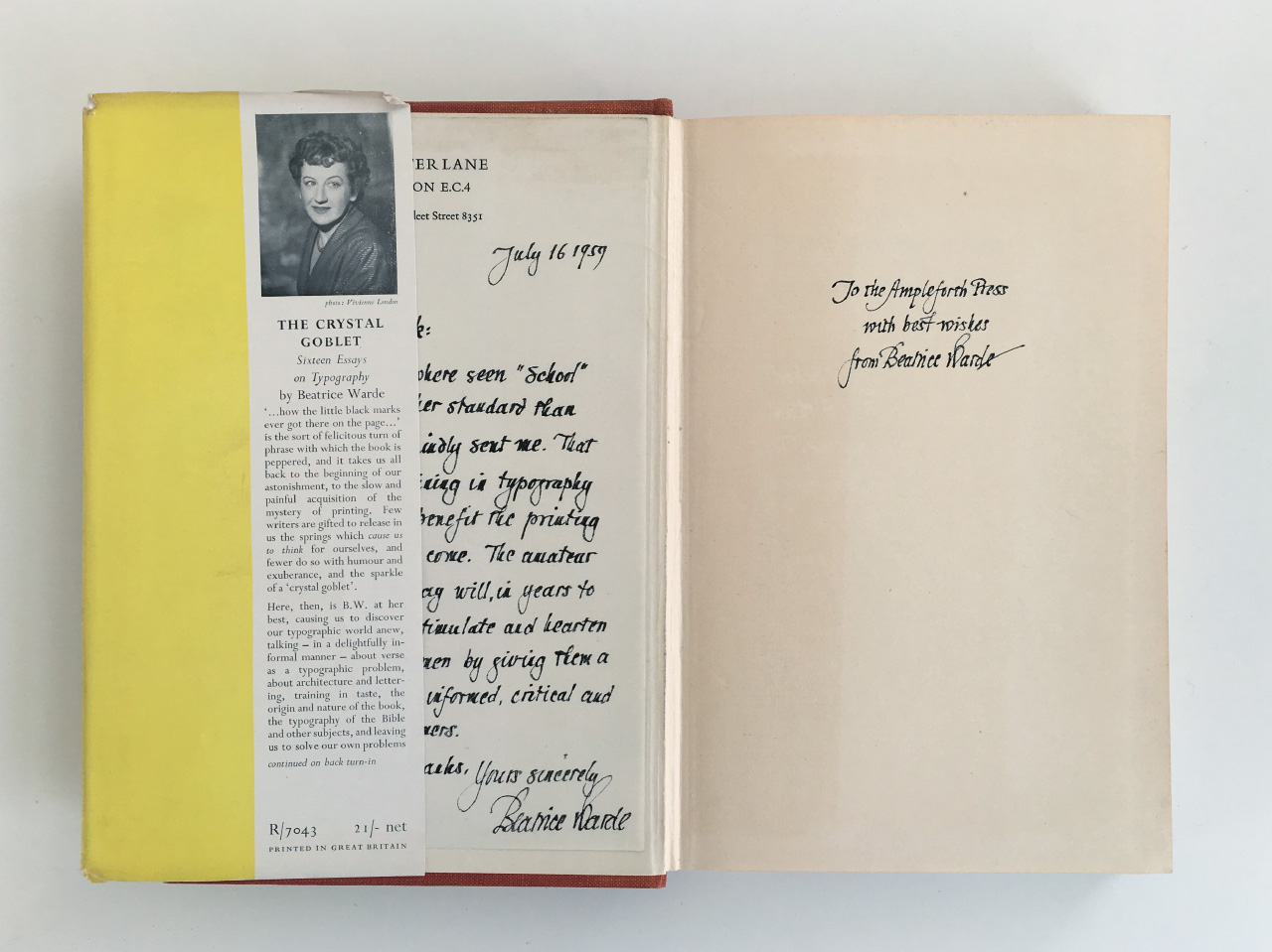
The following year I wrote about another, rather older, design classic – Beatrice Warde’s The Crystal Goblet.
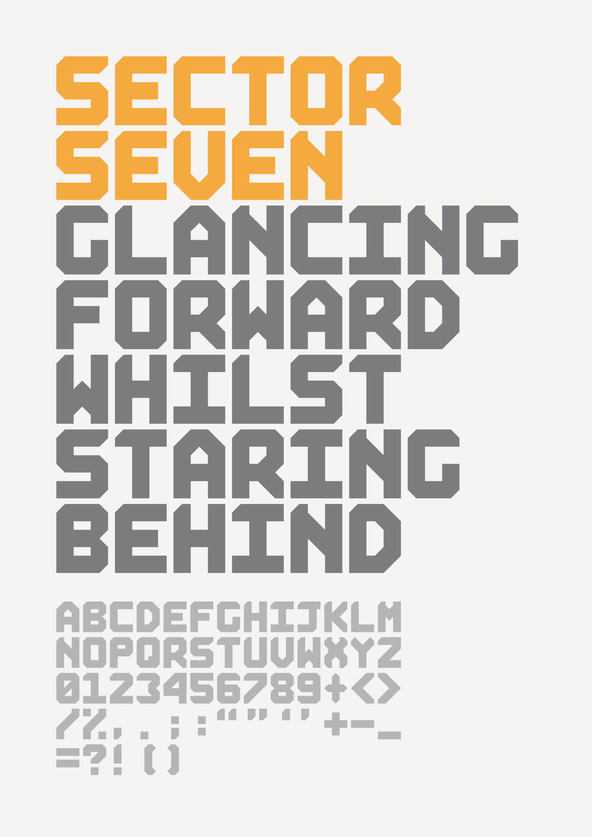
While a lot of the blog’s posts are about other people’s work, I occasionally sneak in some of my own work – as with this post about a print and monospaced typeface I created for Max Fraser’s Joy of Living fundraiser.
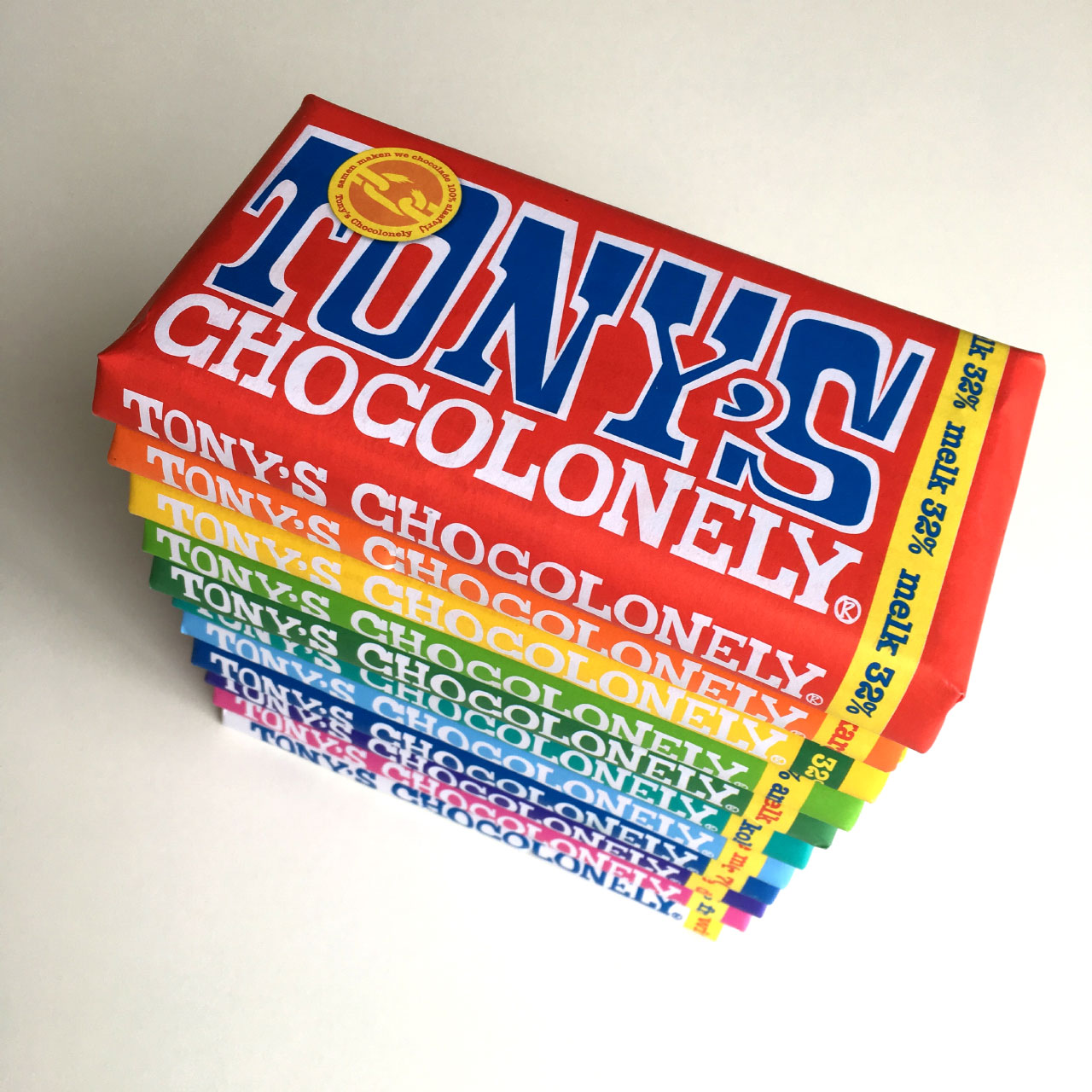
In March 2018 I wrote about the wonderful Tony’s Chocolonely, and a visit from their art director Klink, which itself was inspired by a blog post from four and a half years earlier. It’s great to see that Chocolonely is now stocked throughout the UK. If you don’t know about them, go have a read.
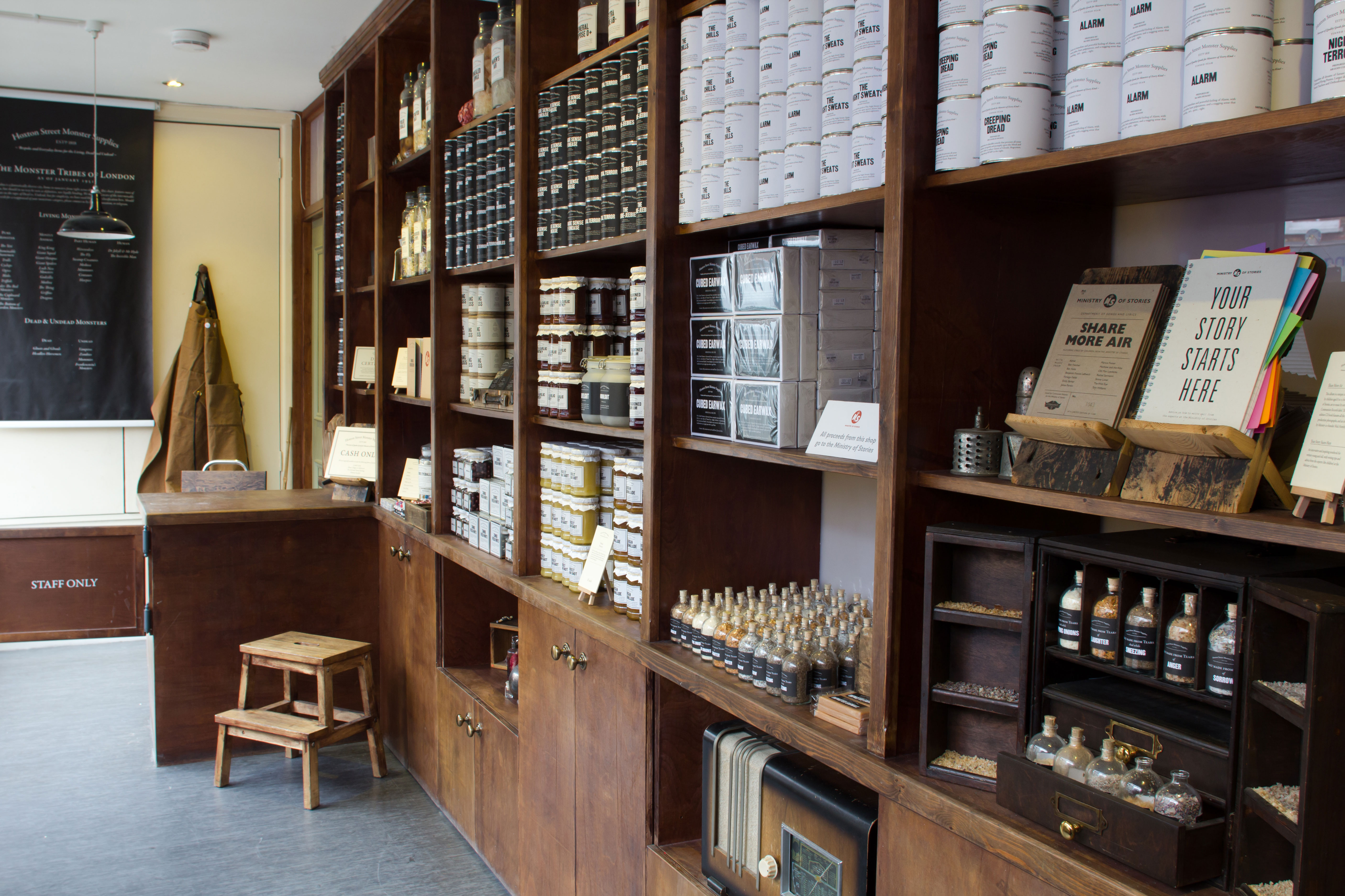
Another instance where a blog post led to something unexpected, was a piece from 2008 about Dave Eggers’ TED talk about the 826 National writing centres. I wrote that if anyone in London was interested in doing something similar, they should get in touch. On the back of that I ended up meeting with Lucy Macnab, Ben Payne and Nick Hornby, and we set to work creating the Ministry of Stories and Hoxton Street Monster Supplies. Over ten years later, they’re both still going strong, with the shop even having been voted as the No.1 Kids’ Shop in London by Time Out magazine. This post, written in 2010, just after we opened the centre and the shop, recounts the whole story.
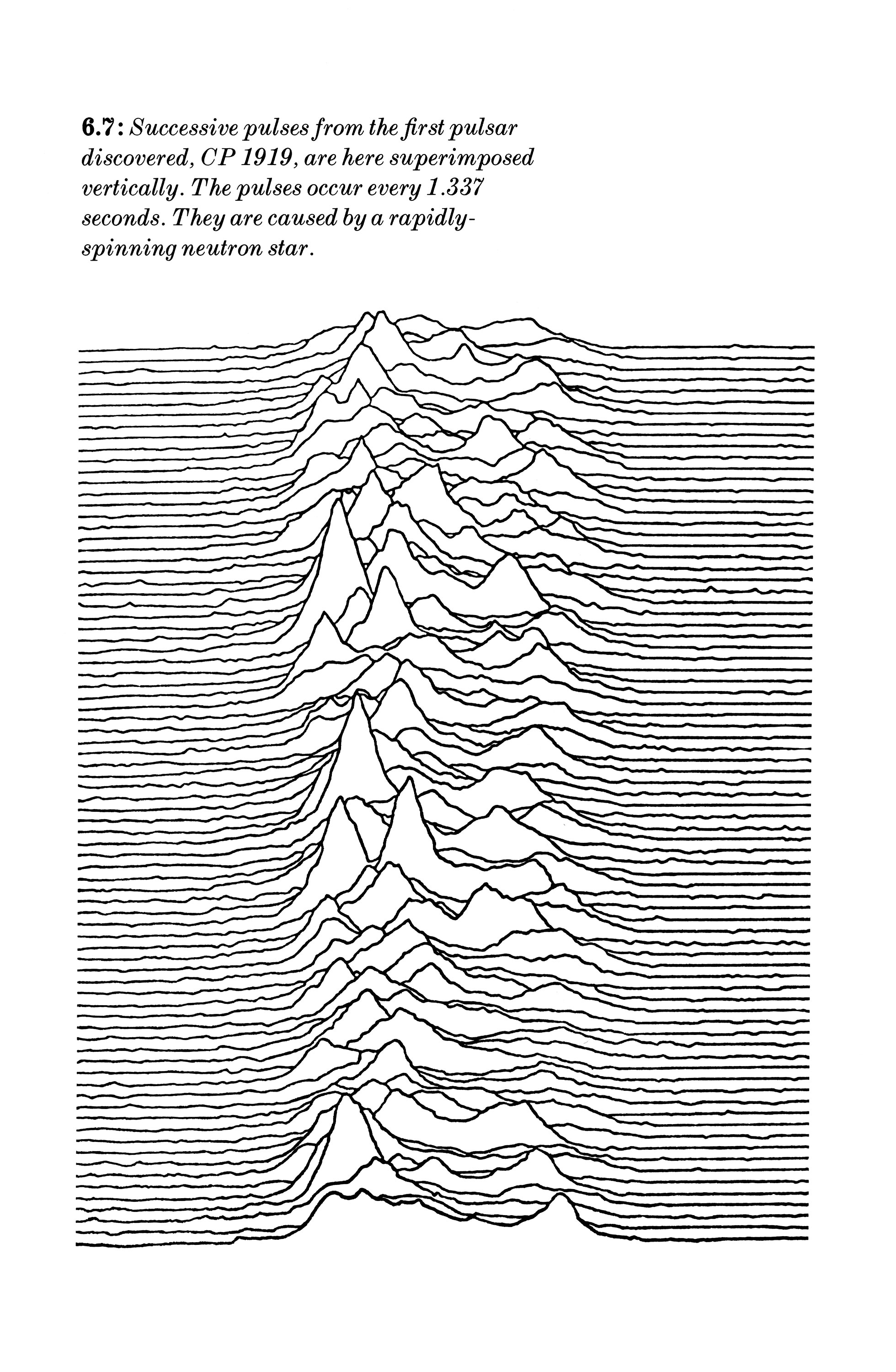
In 2015 I was lucky enough to be the Honorary Designer for the Wynkyn de Worde Society, and got the chance to create a whole heap of lovely printed keepsakes for the various talks that took place over the year. I wrote this post about creating a keepsake for Daniel Mason’s talk about working on facsimile versions of Joy Division’s packaging. As a birthday present to you all, here’s a big version of the CP 1919 pulses diagram that was used on the cover of Unknown Pleasures.
I have from time to time been lucky enough to have guest contributors on the blog, and several of the pieces by those folks have been really popular. Amongst those are three by some very good friends of mine, Clare Skeats, David Pearson and Paul Finn – the latter two of whom I’ve shared a studio with for the last 12 years. Clare wrote about the importance of a Foundation course, Dave wrote about his incredible matchbox label collection, and Paul wrote about George Perec.
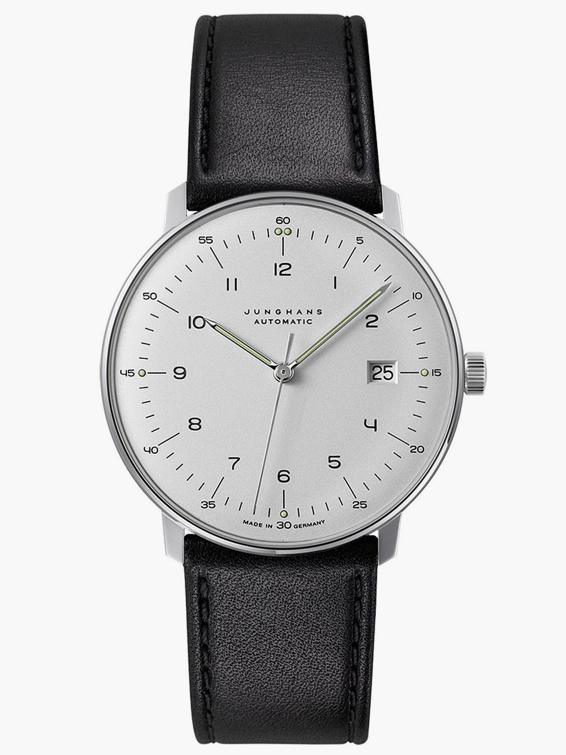
Since this post is marking the passage of time, this post, from 2015, which examines the sorts of watches graphic designers tend to wear, seems, well… timely. (I wonder what the results would be if we did a survey now? I’m guessing the Apple Watch is adorning way more wrists now.)
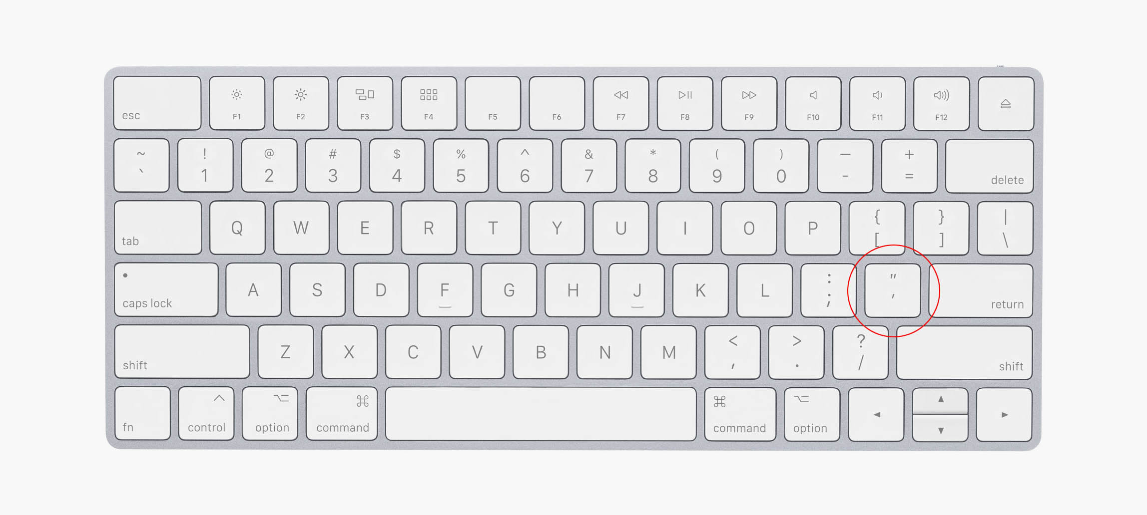
And finally, one of my favourite posts, examining the horror of Dumb quotes.
Well, thank you all for reading this far – both today, and for however long you’ve been reading the blog.
It’s been a fun fifteen years… cheers!