British Graphic Design
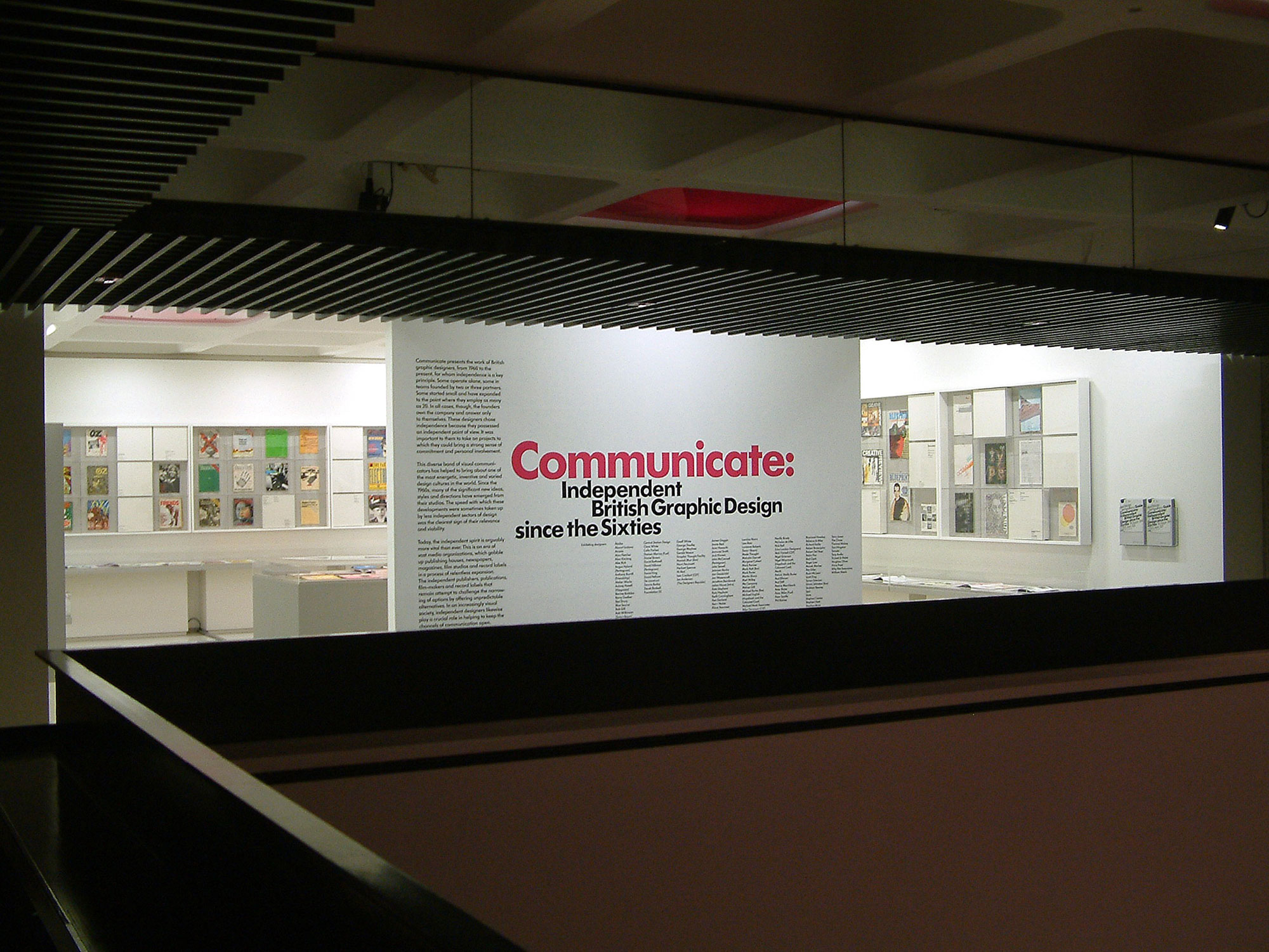
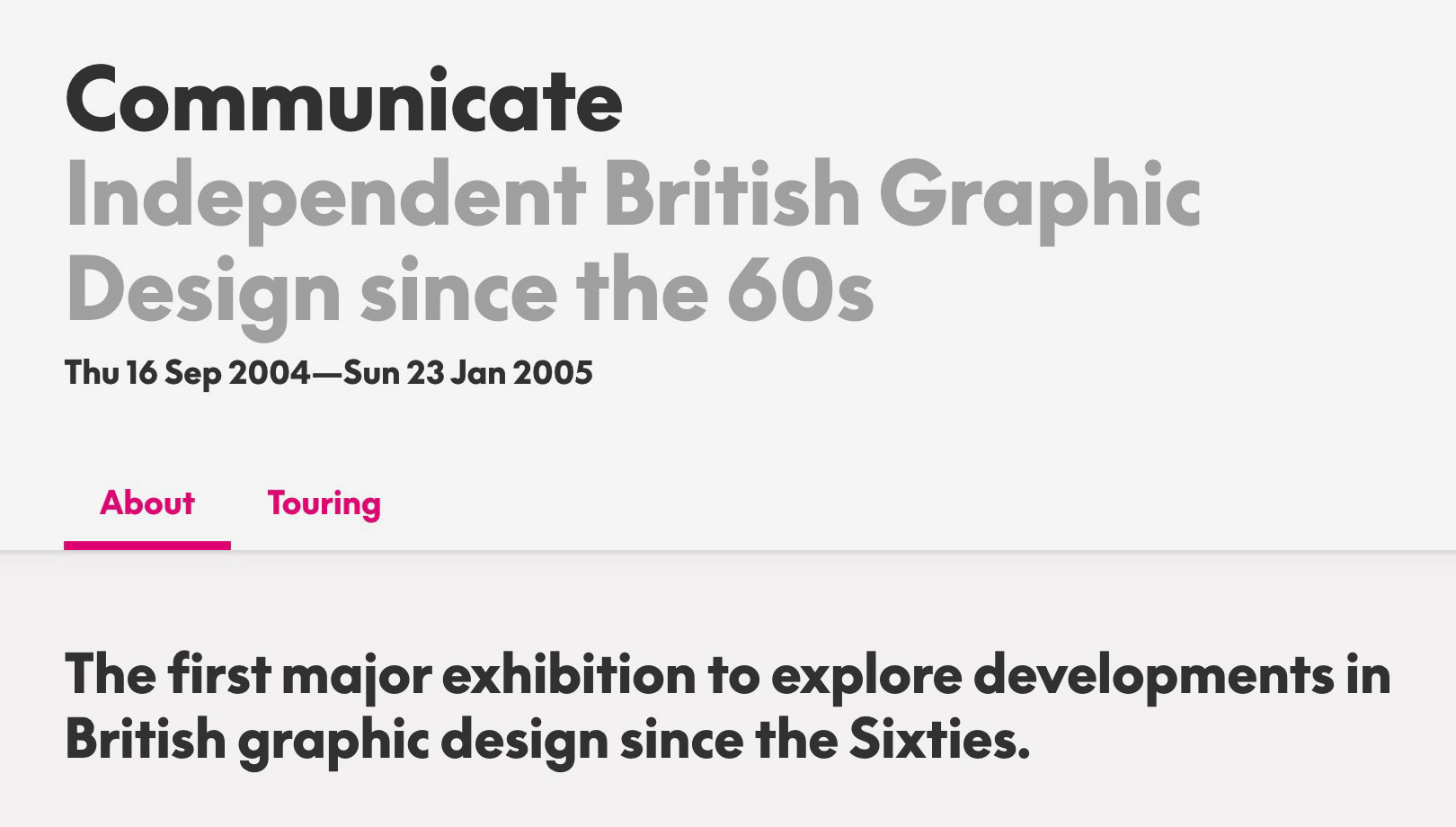
Twenty years ago today, Communicate opened at the Barbican – an exhibition of the best of independent British graphic design from the 1960s through to 2004.
Apart from that though, large overviews of British graphic design have been pretty much non-existent.
The nearest we got was British Design from 1948: Innovation in the Modern Age at the V&A in 2012, which covered British design more generally, including products, furniture, architecture, fashion, as well as graphics. I reviewed the show here.
You can pick up both exhibition catalogues for just a few pounds over on AbeBooks – quite a bargain!

So I was thinking – a show focused on Britain’s graphic design history is long overdue. And then I got to thinking – well, if we are going to have a exhibition of British graphic design, what would be in it?
As a starter, I’ve pulled together a few bits and bobs here, and listed them chronologically, with links to places you can learn more about them.
I’ve mainly focused on the sort of work that the general public might be aware of, things that are part of our shared cultural heritage. I’ve picked out a few things partly because they’ve survived a really long time in their original form (with minor tweaks here and there) – which would seem to suggest a really successful piece of design.
Of course, a lot of this is pulled from the existing canon of graphic design. The earlier stuff is in some ways easier to select, as it’s already been sifted, sorted and collected. (Though of course that means we might be missing out on some glorious but hitherto uncelebrated work.) More recent work is trickier to filter – we need the benefit of hindsight to understand which work really matters. But then maybe that’s just the natural evolution of any cultural history – some things gradually get dropped by the wayside, and other things are picked up, and examined afresh, over and over. Goodbye old canon, hello new.
It’s also a selection heavily weighted towards print and branding, which is of course just a narrow slice of graphic design. I haven’t wandered into motion graphics, web / interactive design, game design and so on.
This post is intended as a stimulus. Something to get you thinking about what you would include. And hopefully to create a bit of impetus for a comprehensive British Graphic Design exhibition – perhaps at the V&A, or the Barbican? (It might be that something like this is already in the works – which would be brilliant!)
I’ll link to this post this across my various social media platforms (go find We Made This on Instagram, Threads & LinkedIn) – so there’ll be plenty of places for people to feedback.
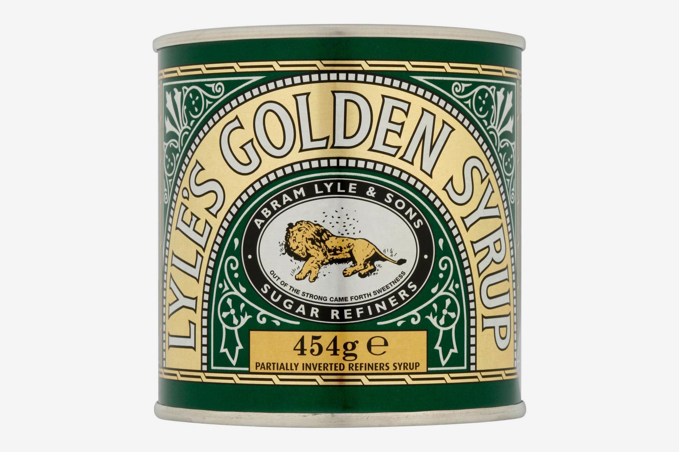
Lyle’s Golden Syrup tin has looked more or less the same since around 1888. Earlier this year there was quite the hoo-ha in the design press when they introduced some updated packaging options.
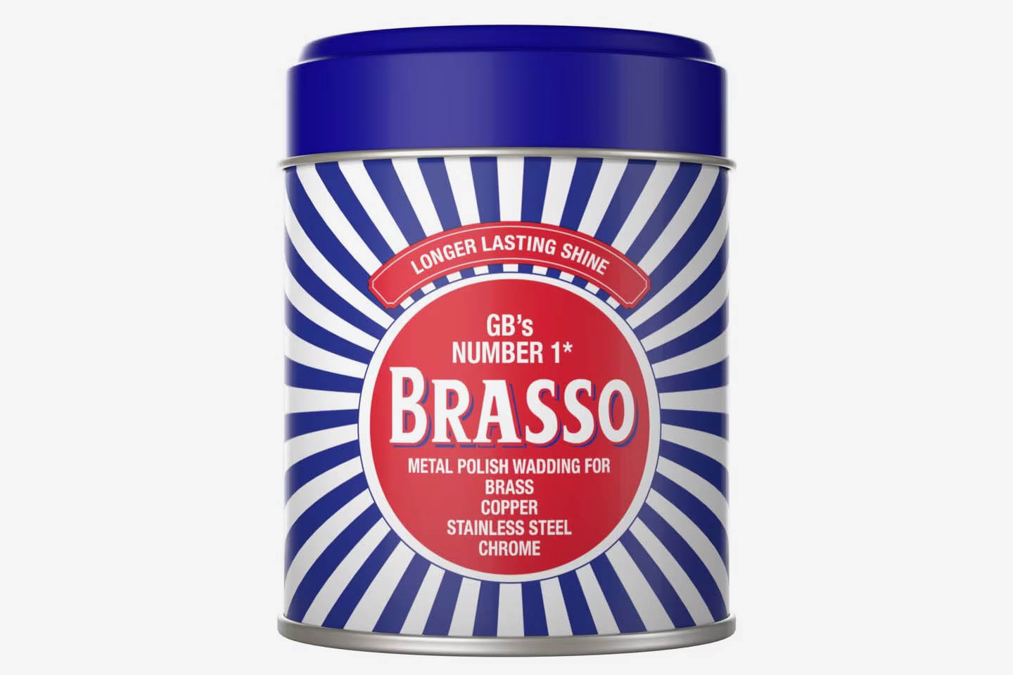
From just a few years later, Brasso metal polish also has a design that has lasted for over a century – a red roundel set against a sunburst of blue and white lines.
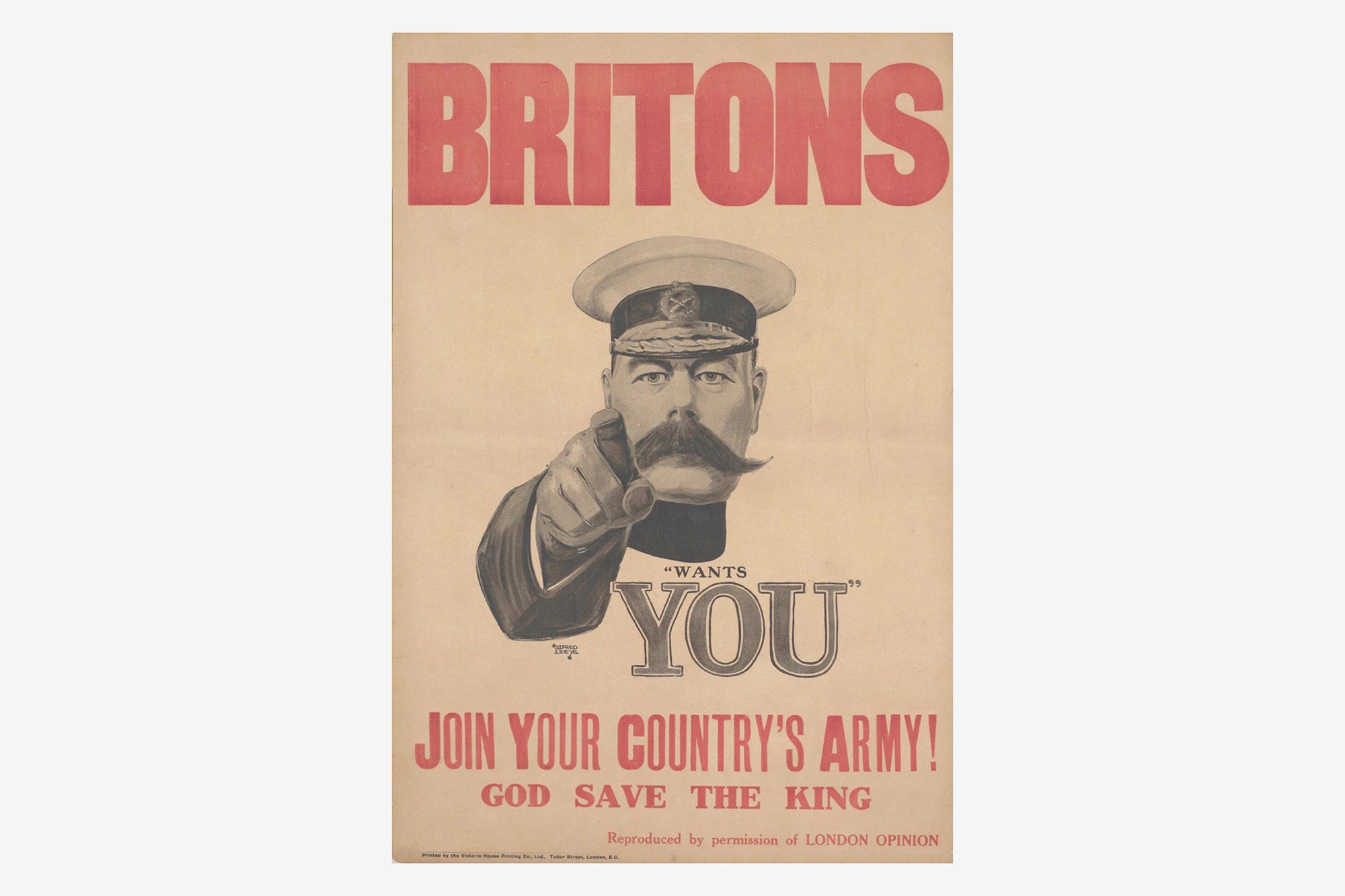
Alfred Leete’s 1914 poster Britons – Lord Kitchener wants You started out as a cover for London Opinion magazine (with the text ‘Your Country Needs You’).

![]()
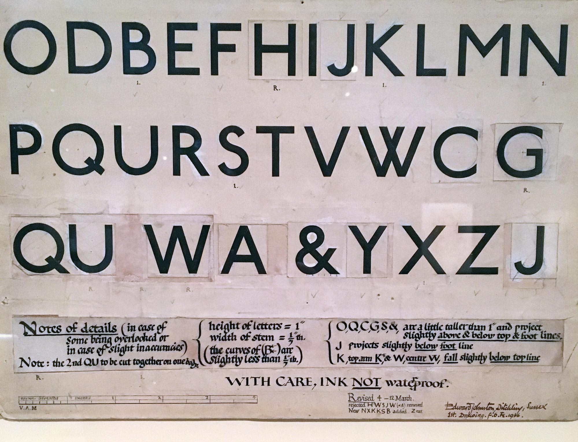
From around 1917, Edward Johnston’s stunning lettering and bar and circle symbol for London Underground, commissioned by Frank Pick. The symbol is now used in various formats across London’s transport system, run by Transport for London, with the lettering updated to work across print, signage, and on-screens, in the form of Johnston 100.
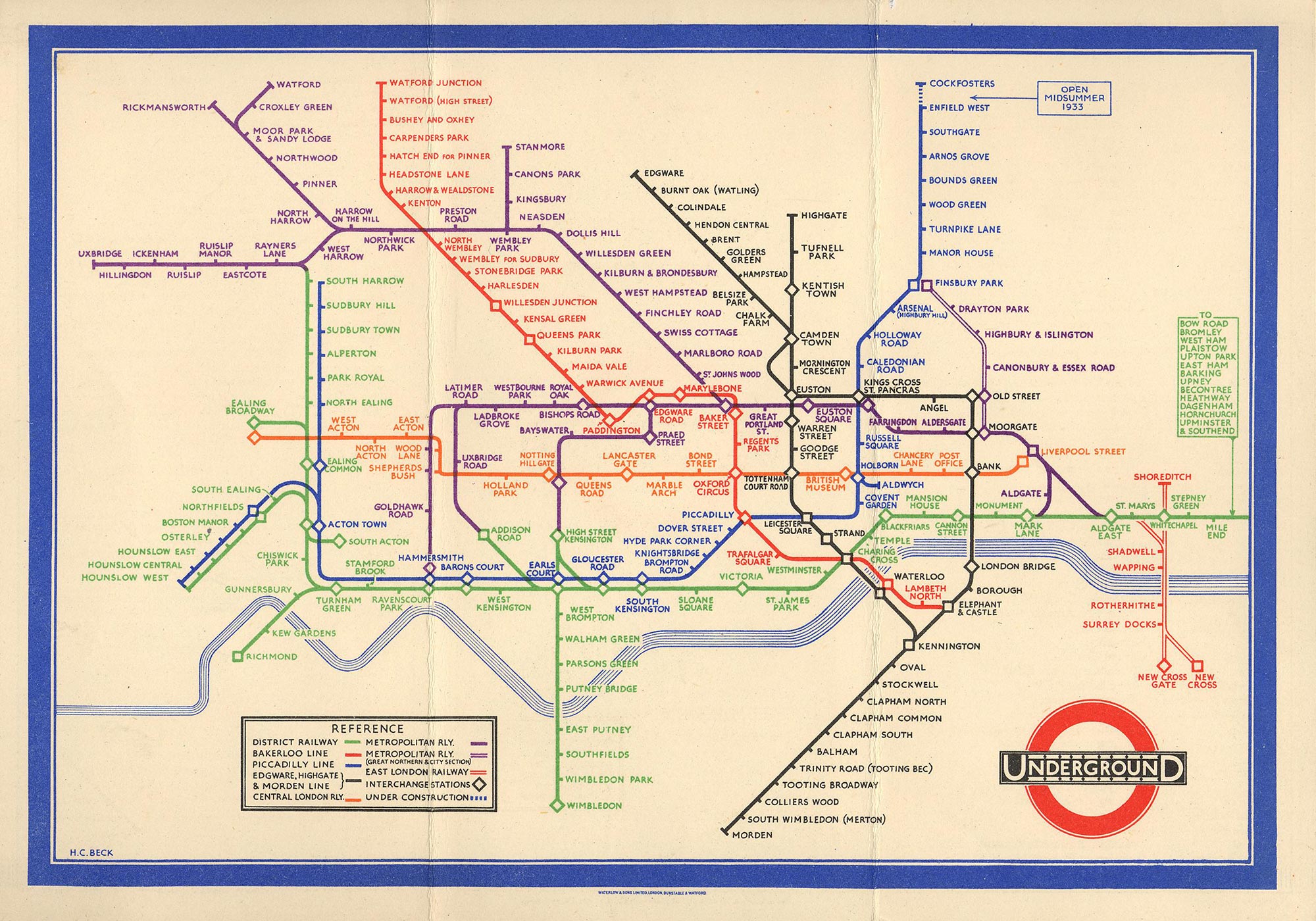
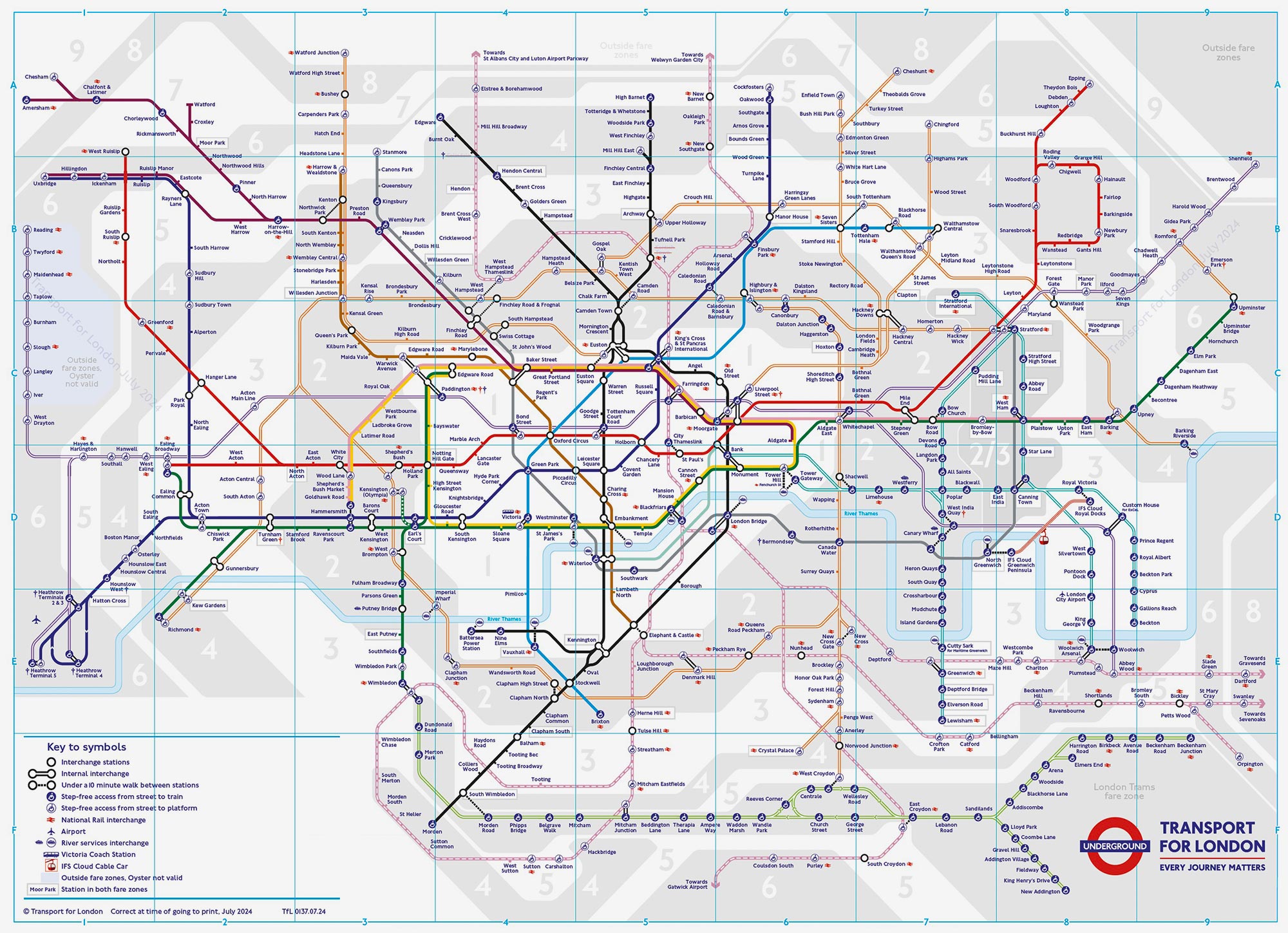
Draughtsman Harry Beck produced his iconic diagrammatic map of the London Underground system in 1933. The map is still in use today, though it’s a lot more cluttered thanks to a lot more tube lines, additional information and fare zones.
![]()
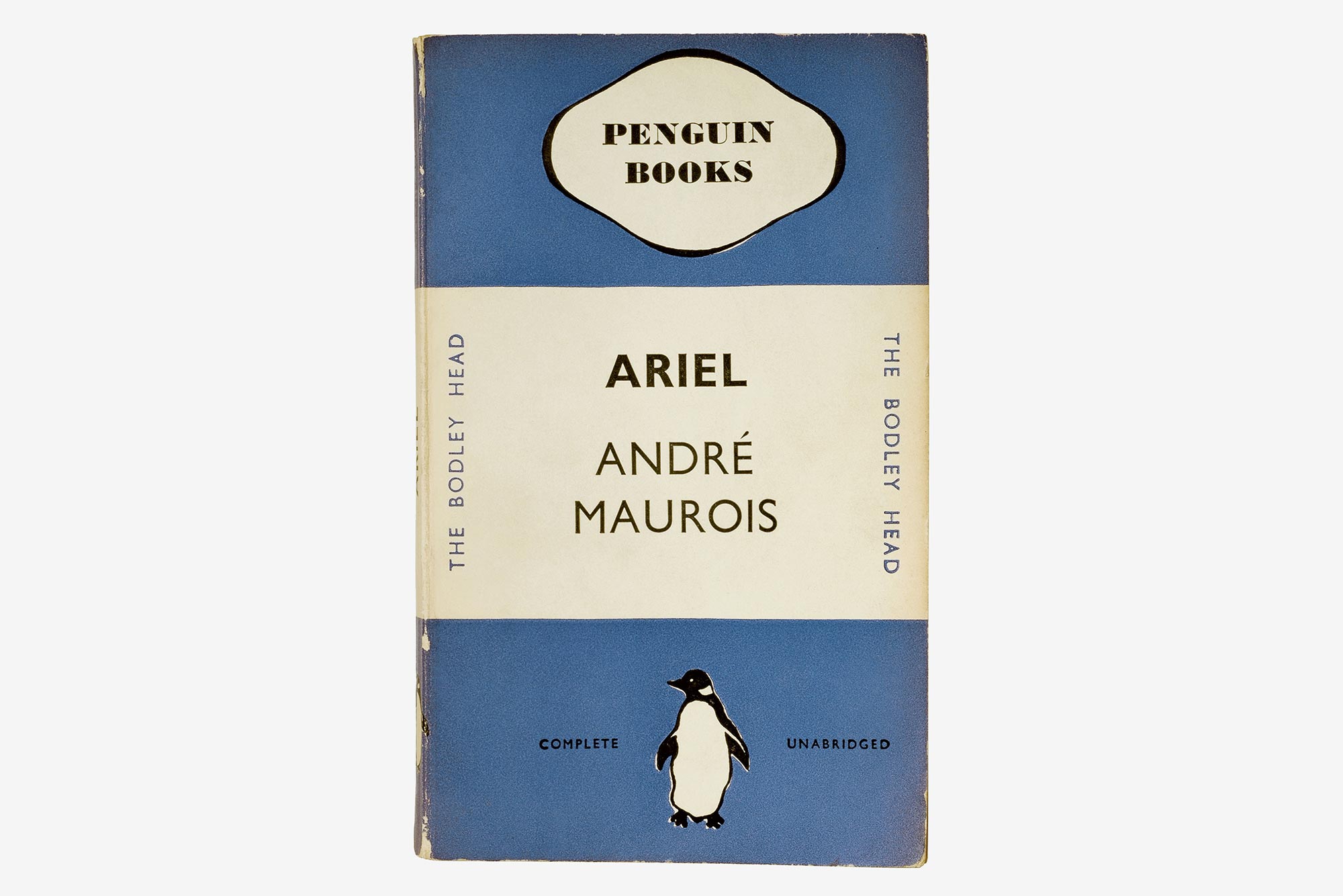
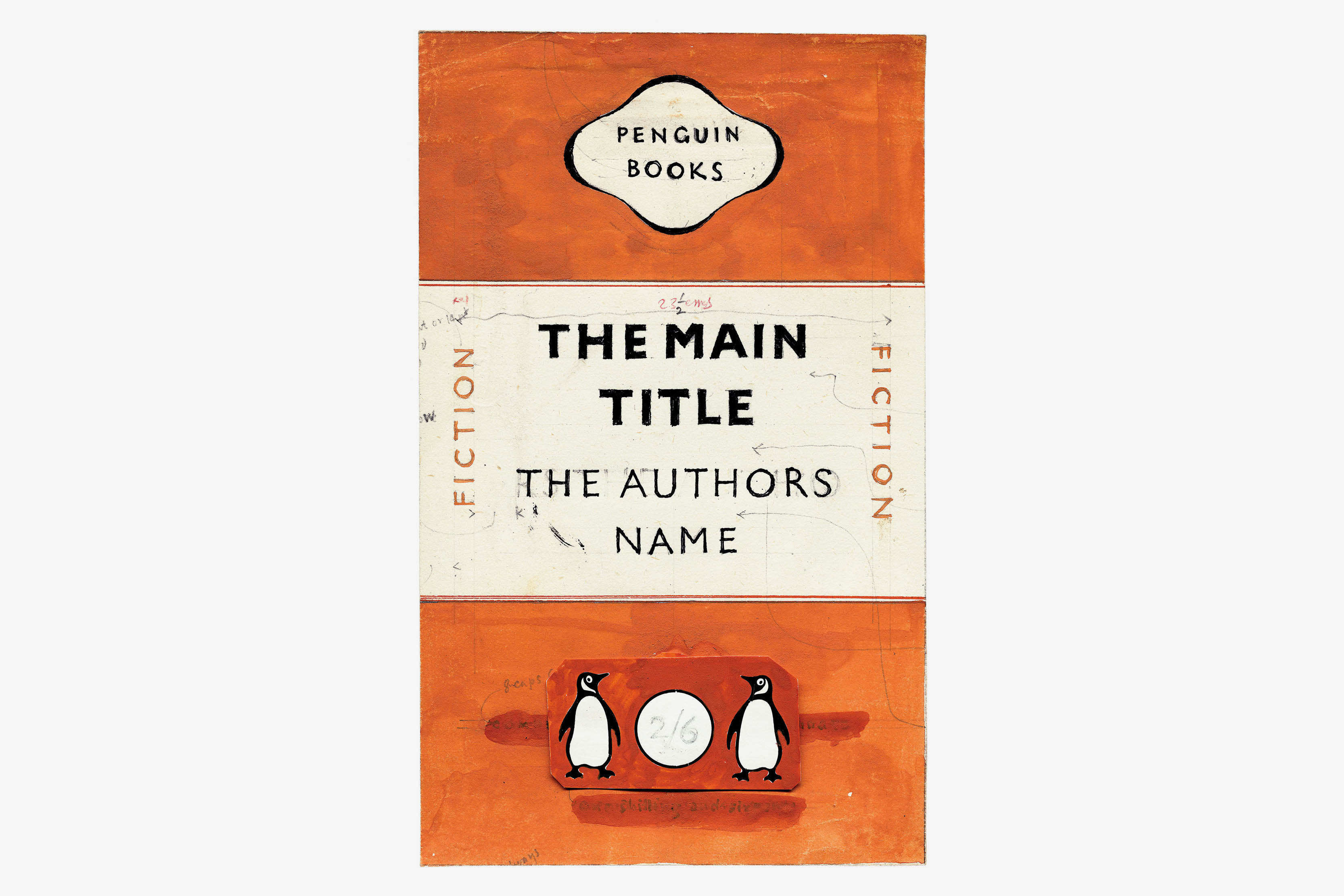
From 1935, Edward Young’s Penguin Books cover design and logo, seen here on the cover for Ariel, one of the first ten titles from the Penguin imprint. The cover design and logo were revised in 1948 by Jan Tschichold, and the Penguin logo is still in use today.
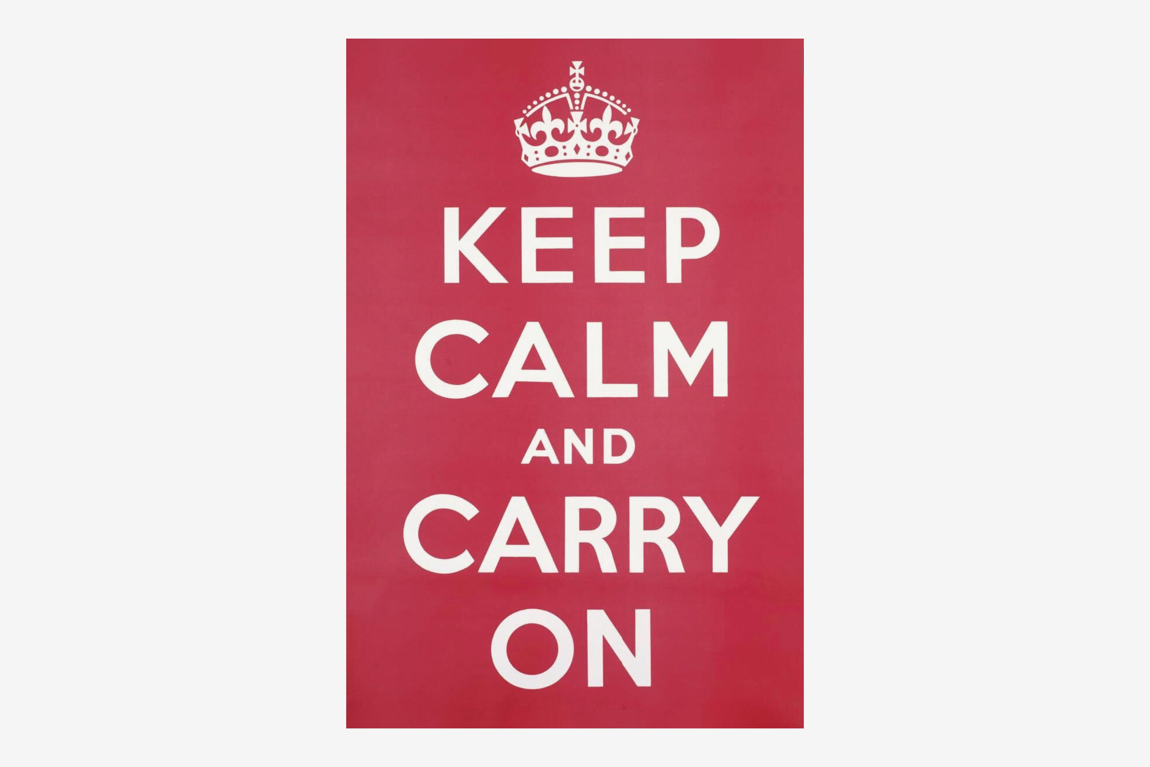
Keep Calm and Carry on, a poster from 1939 that only really became famous when rediscovered in a bookshop in Alnwick in 2000. Reproductions were printed, and the design gradually became ubiquitous – loved and loathed in equal measure.
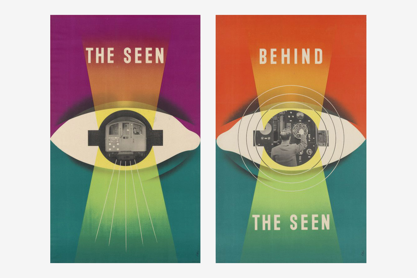
James Fitton’s pair of 1948 posters for the London Underground, The Seen and Behind the Seen.
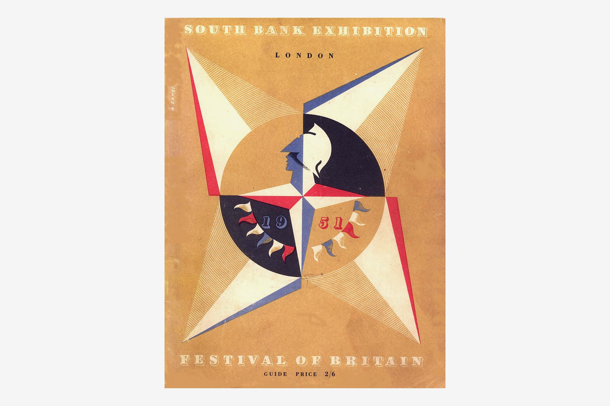
The 1951 Festival of Britain identity designed by Abram Games.
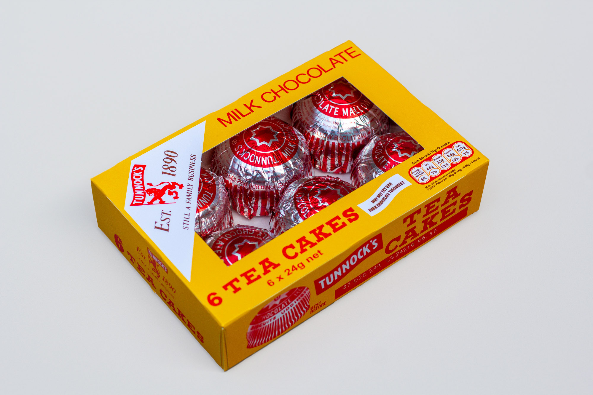
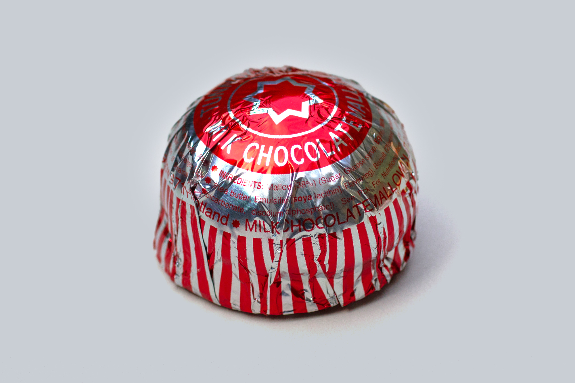
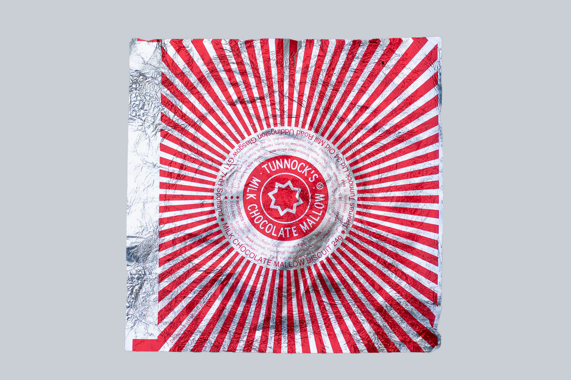
From 1956, the Tunnock’s Tea Cake, with its iconic foil wrapper.
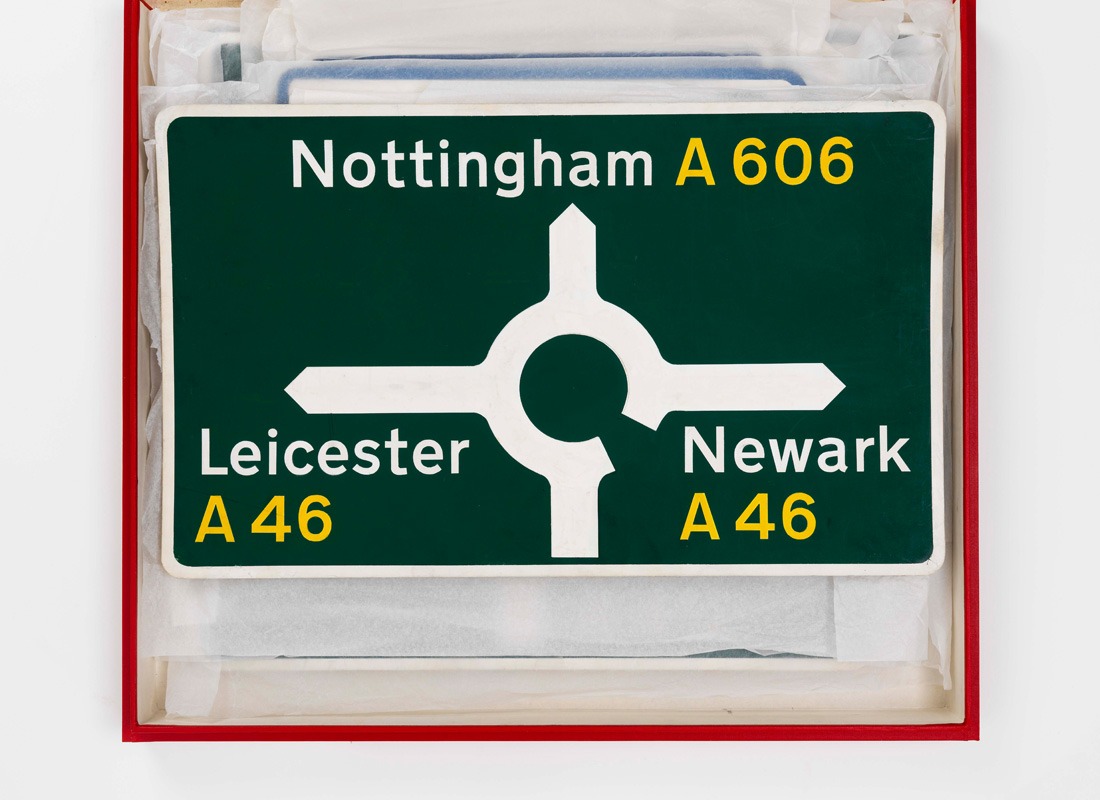
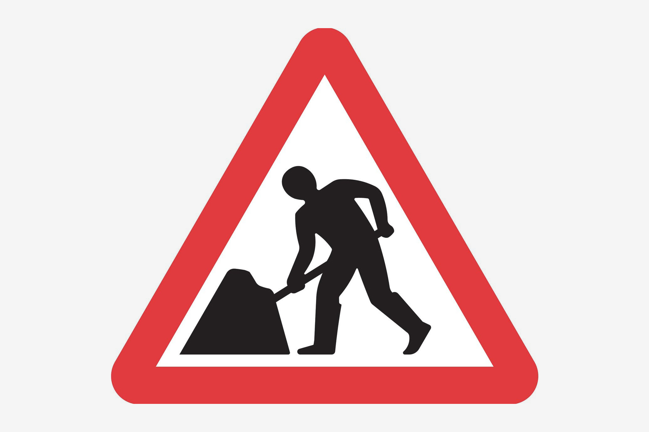
British motorway and road signage system designed by Jock Kinneir and Margaret Calvert, between 1957 and 1967.
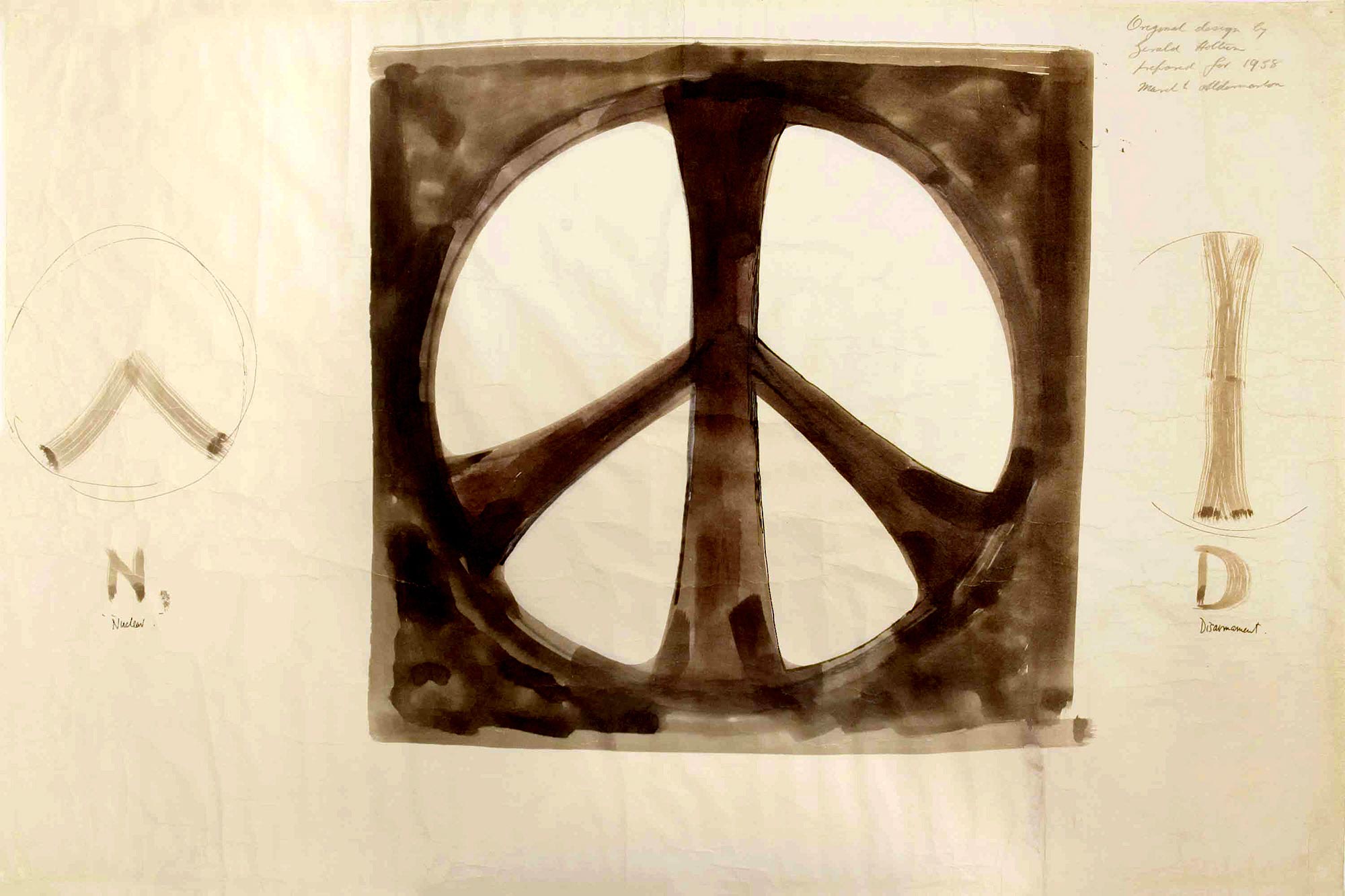
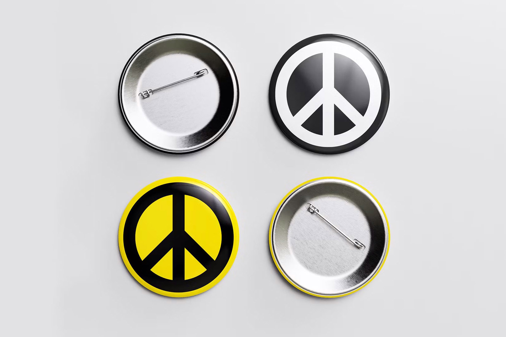
From 1958, Gerald Holtom’s identity for CND, the Campaign for Nuclear Disarmament, ‘representative of an individual in despair, with hands palm outstretched outwards and downwards’, as well as the semaphore positions for the letters N and D; recently updated by Paul Tunnicliffe.
![]()
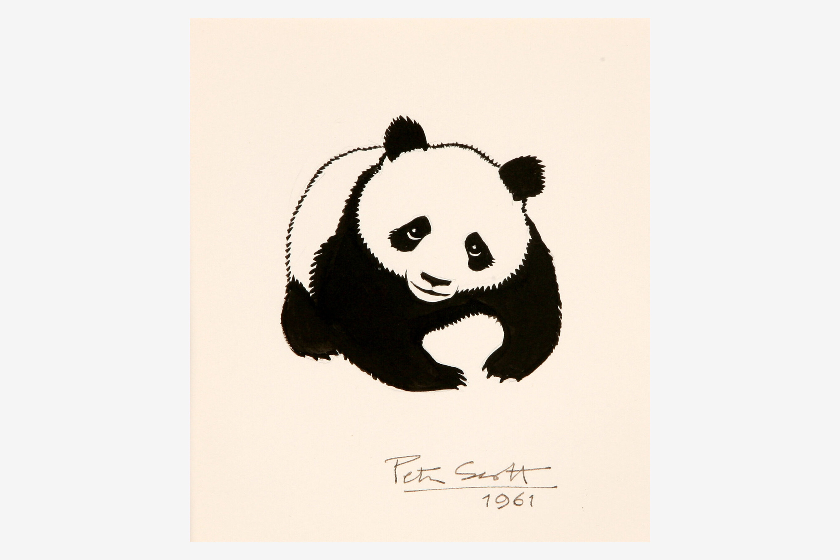
Sir Peter Scott’s 1961 original sketch for the identity for the World Wildlife Fund, and its current form (now the World Wide Fund for Nature).
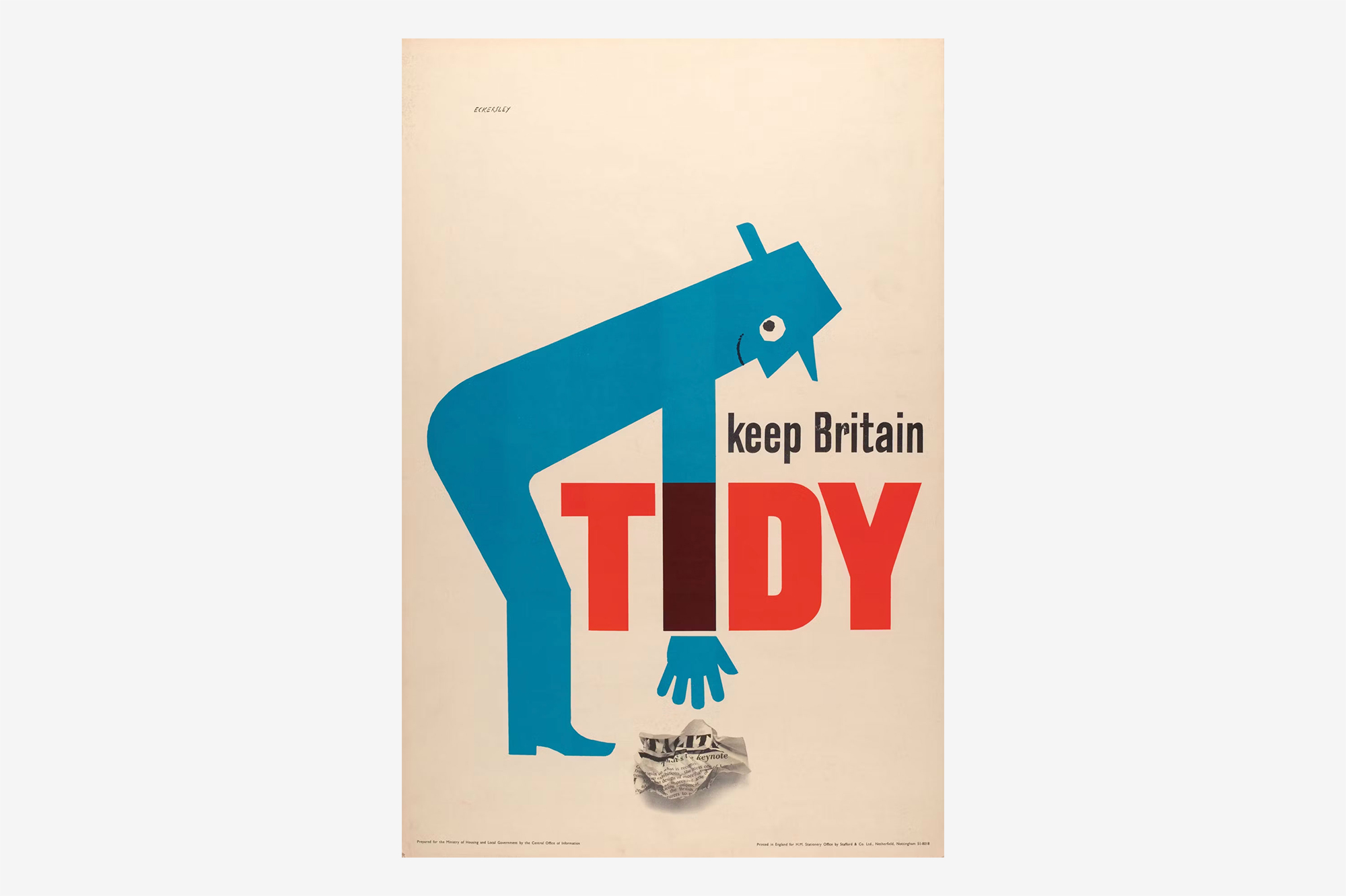
Tom Eckersley’s 1963 Keep Britain Tidy poster.
![]()
The 1964 Glasgow Airport identity by Margaret Calvert and Jock Kinneir.
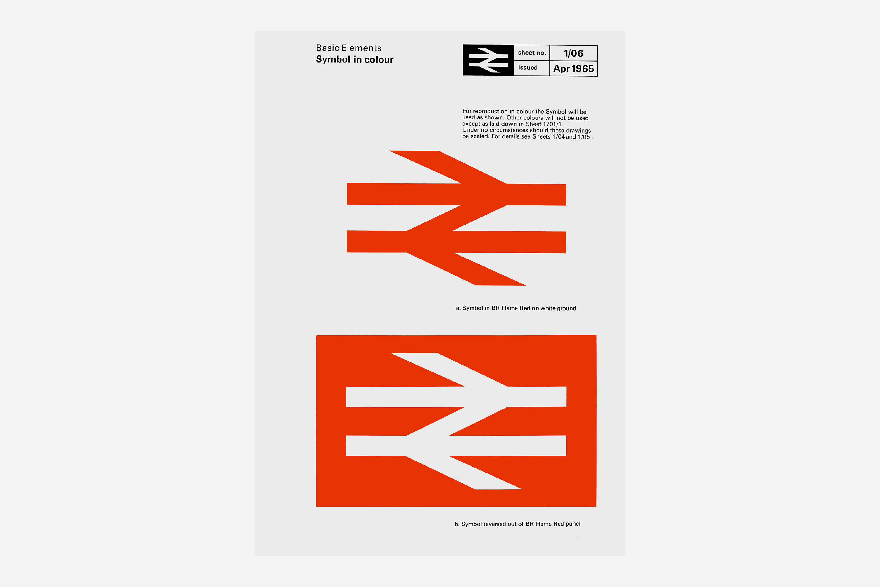
The British Rail symbol designed by Gerald Barney at Design Research Unit, in 1964…
![]()
and the Rail Alphabet, designed by Kinneir and Calvert in the same year.
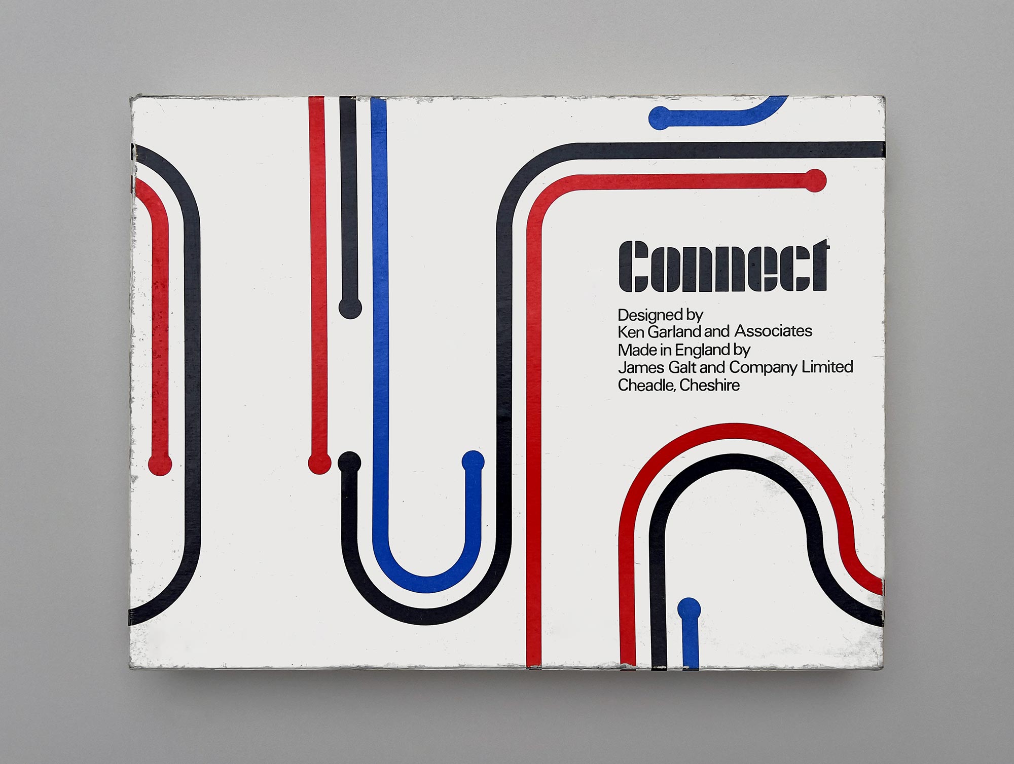
Connect, the children’s game designed by Ken Garland for James Galt and Company in 1969.
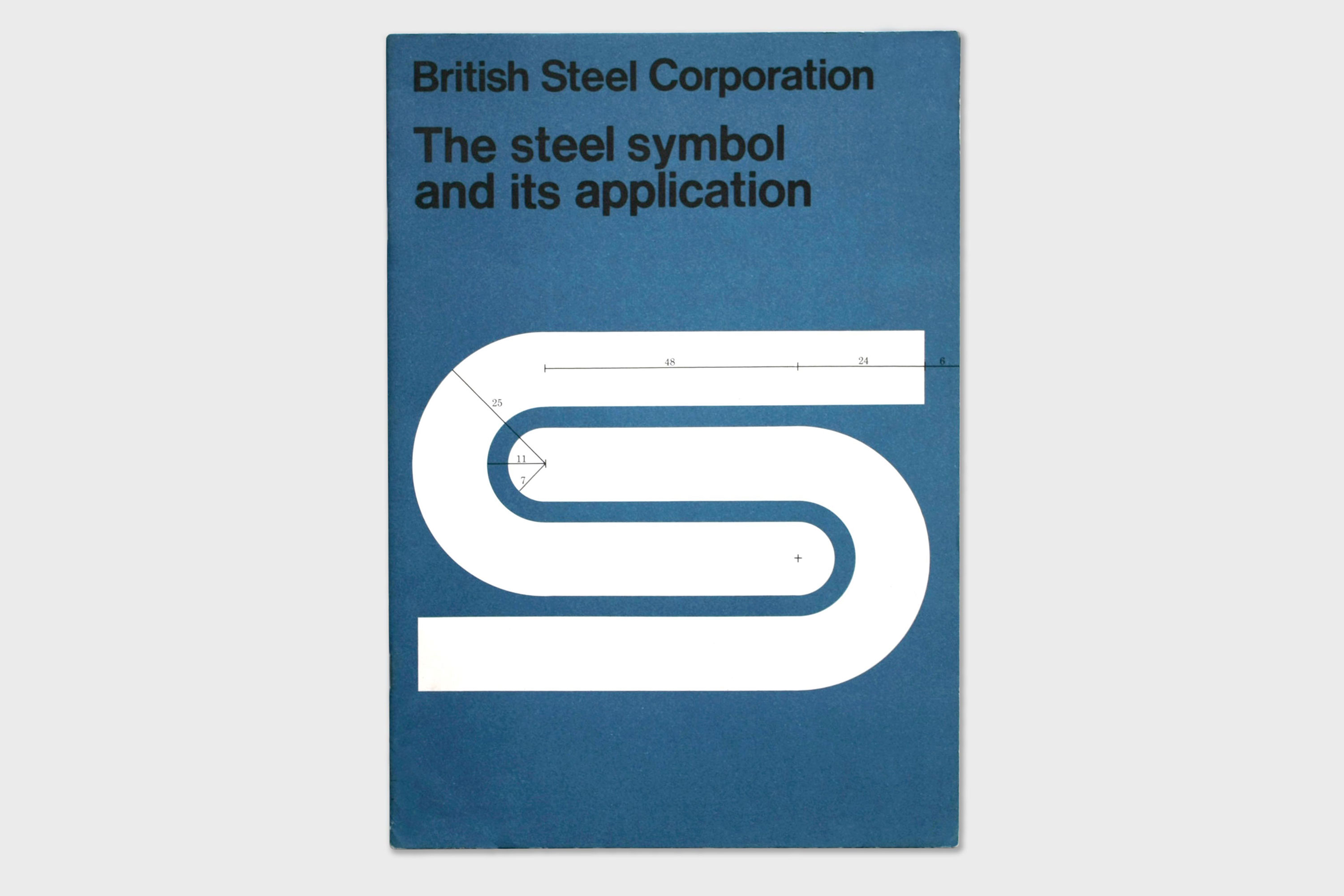
The British Steel Corporation logo, designed in 1969 by David Gentleman.
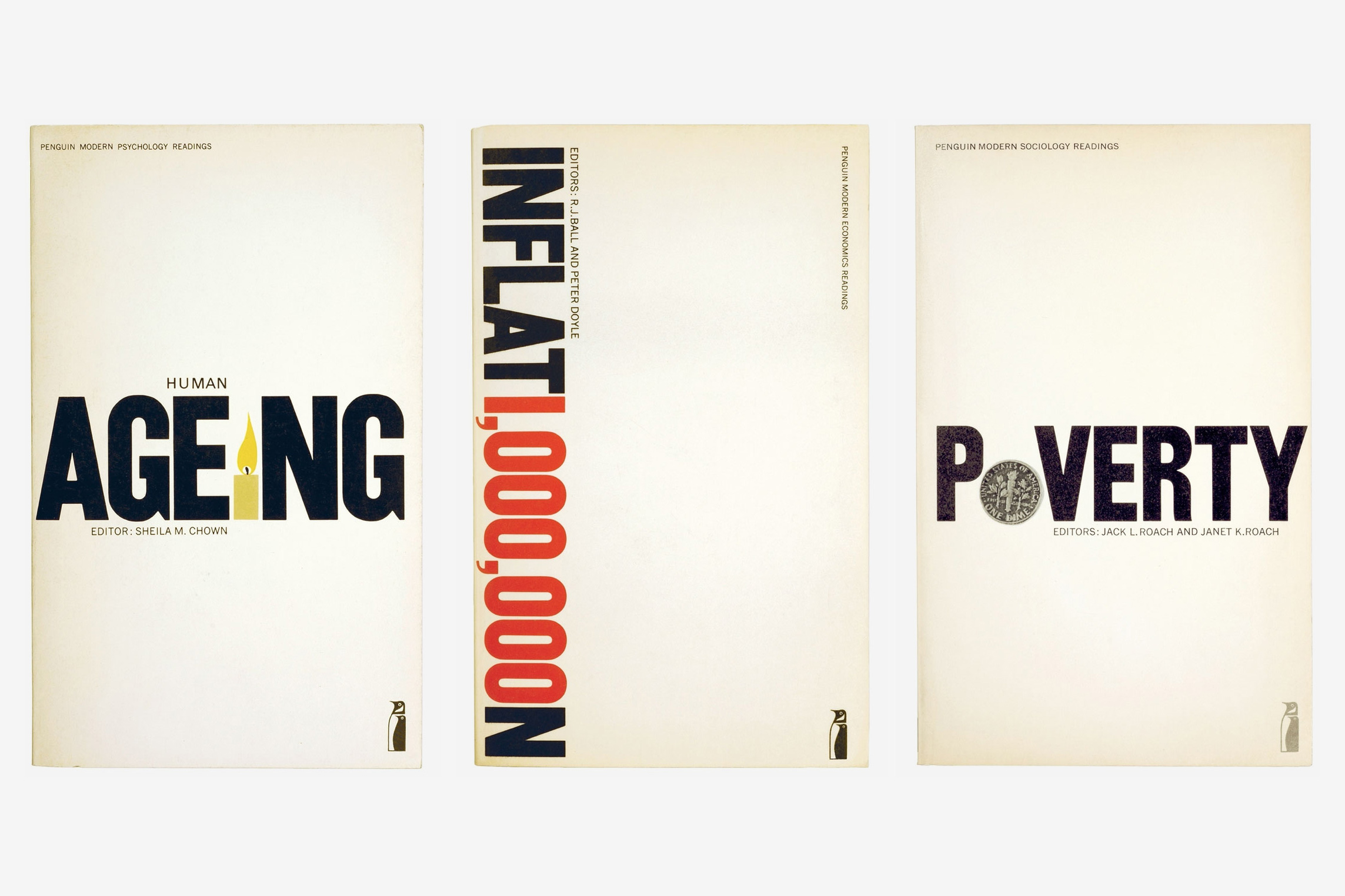
From 1971, book covers for the Penguin Education series, designed by Derek Birdsall at Omnific.

Sticking with Penguin, David Pelham’s iconic cover for A Clockwork Orange from 1972 (check out Jonathan Barnbrook’s recent cover too).
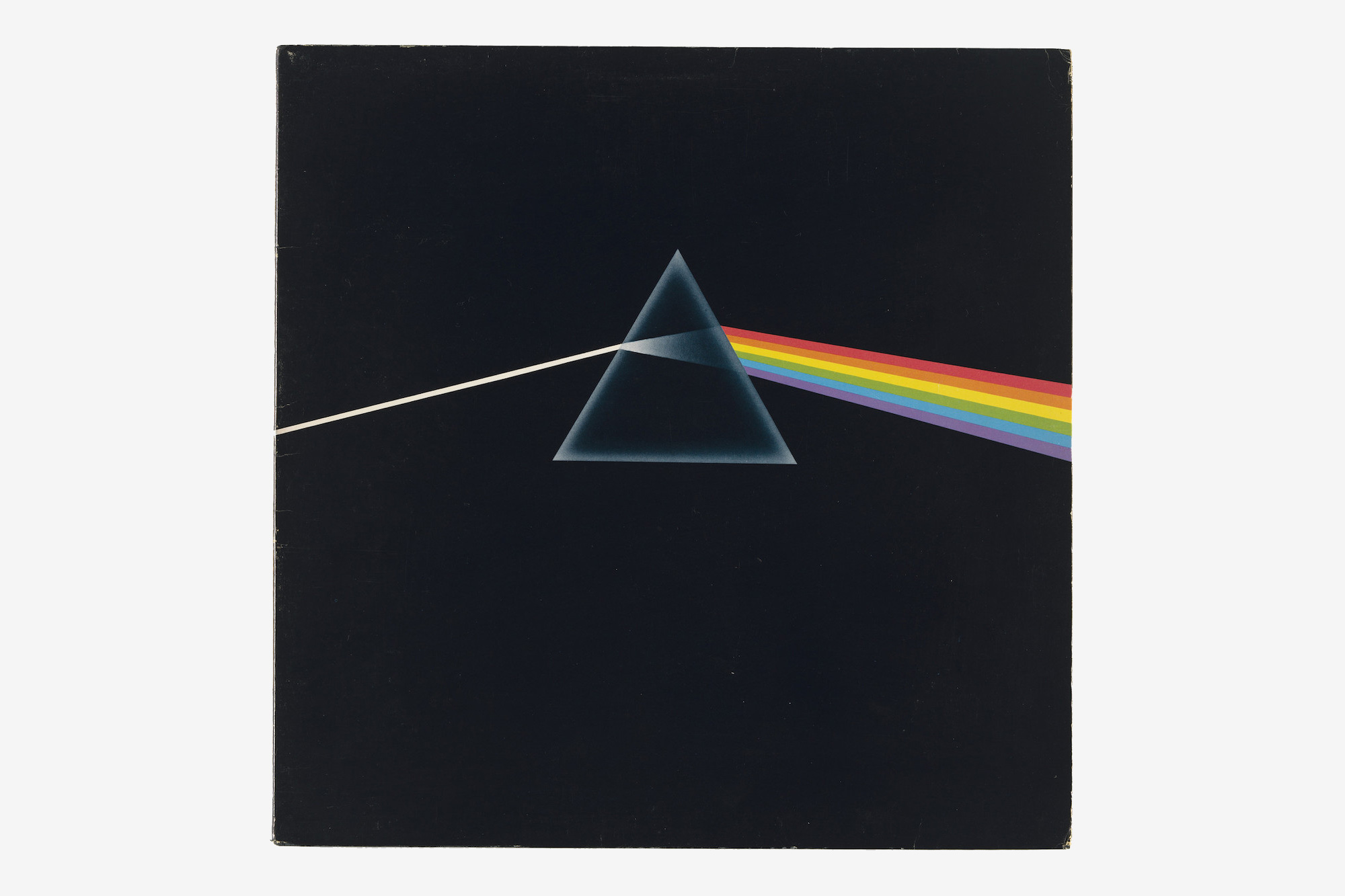
The album cover for The Dark Side of the Moon, designed in 1973 by Hipgnosis, with an illustration by George Hardie.
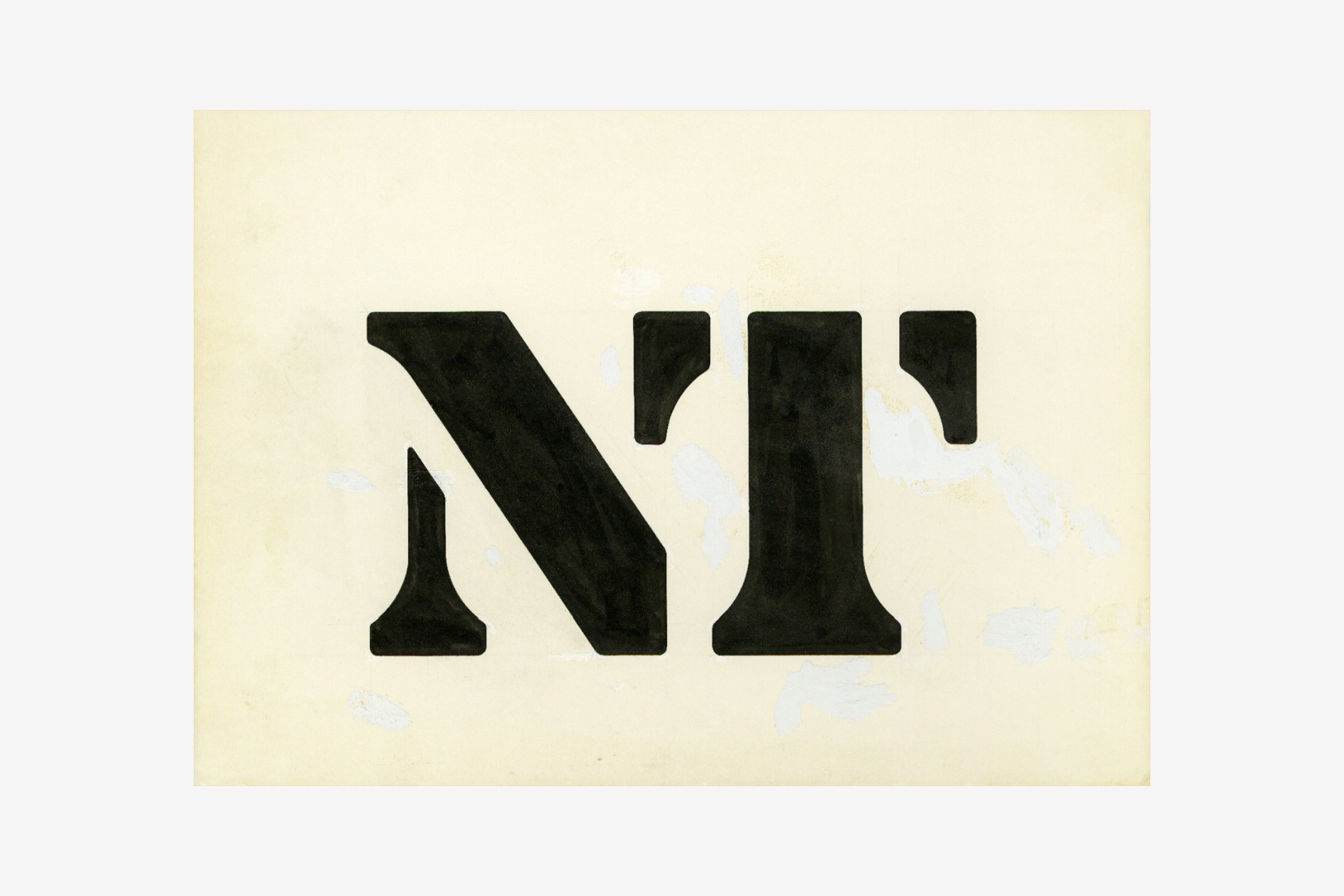
From 1974, the logo for the National Theatre, designed by Ian Dennis at FHK Henrion’s studio, Henrion Design Associates International.
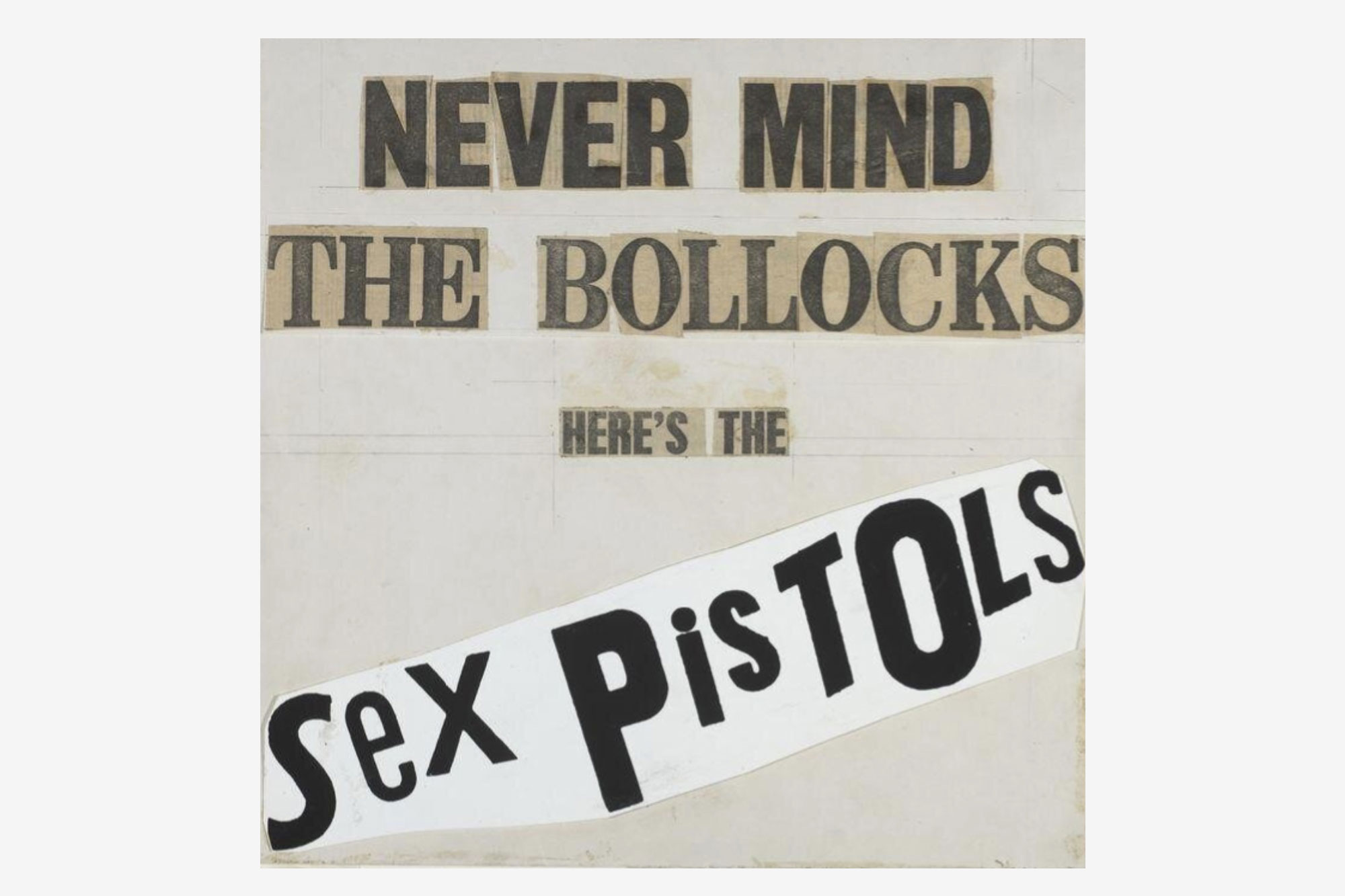
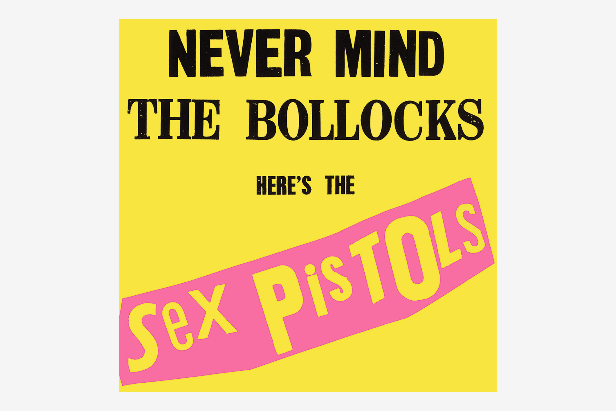
Artwork for the Never Mind the Bollocks, Here’s the Sex Pistols, album cover by Jamie Reid, 1977.
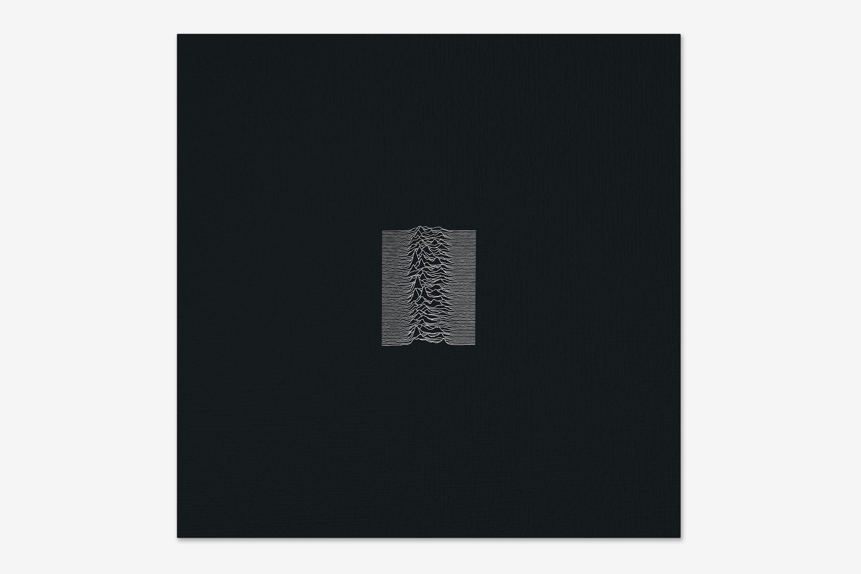
From 1979, the cover for Joy Division’s Unknown Pleasures album, by Peter Saville, with an illustration found in The Cambridge Encyclopaedia of Astronomy.

A David King poster from 1982.
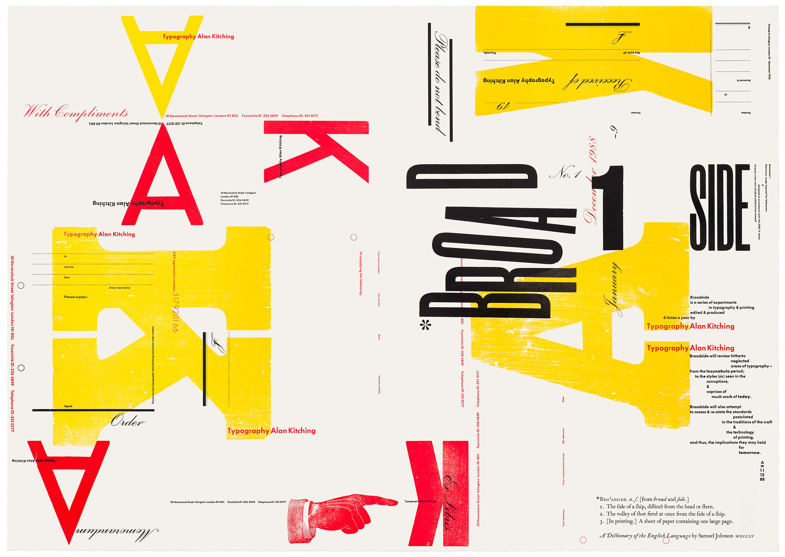
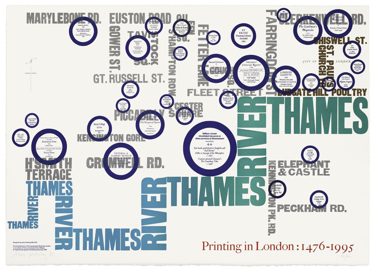
A couple of Alan Kitching’s beautiful letterpress printed Broadsides from 1988 and 1995.
![]()
The Victoria and Albert Museum logo designed by Alan Fletcher in 1989, while at Pentagram.
![]()
The Formula One logo designed in 1994 by the Carter Wong studio.
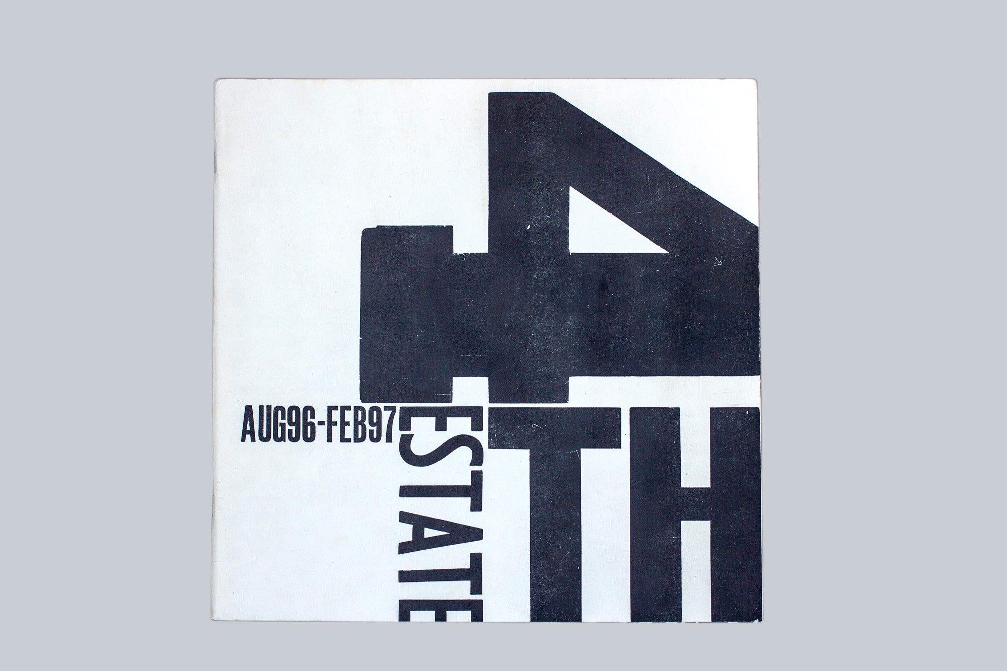
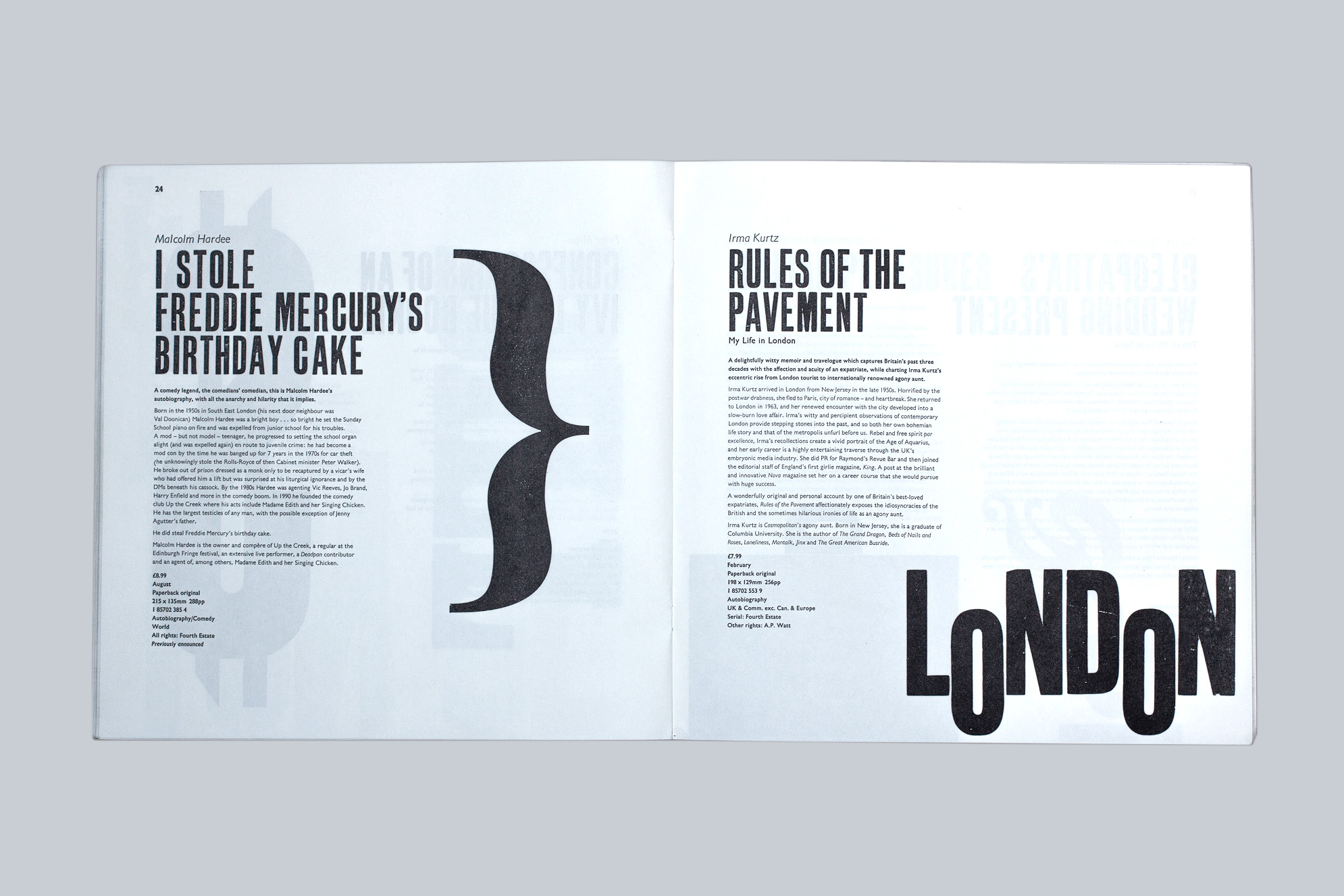
From 1996, a letterpress printed catalogue designed by Vince Frost for 4th Estate, set and printed by House of Naylor.
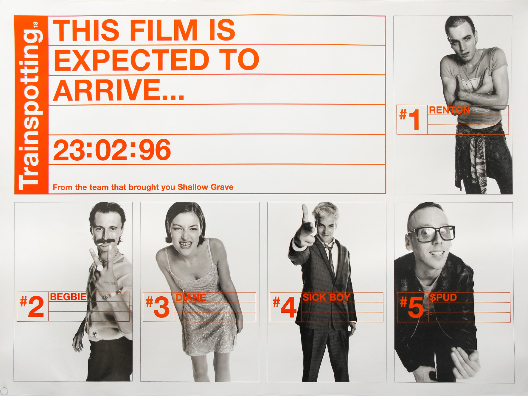
From the same year, the Trainspotting poster campaign from Stylorouge (image from Filmonpaper.com).
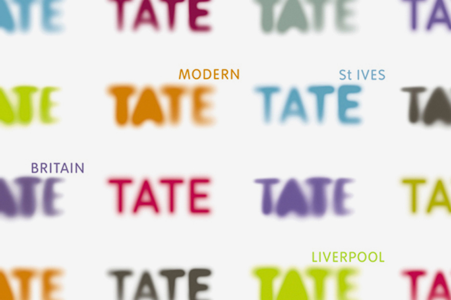
The Tate galleries identity from 1999 by Marina Willer at Wolff Olins.
![]()
From 2002, the Habitat logo and identity by Graphic Thought Facility.
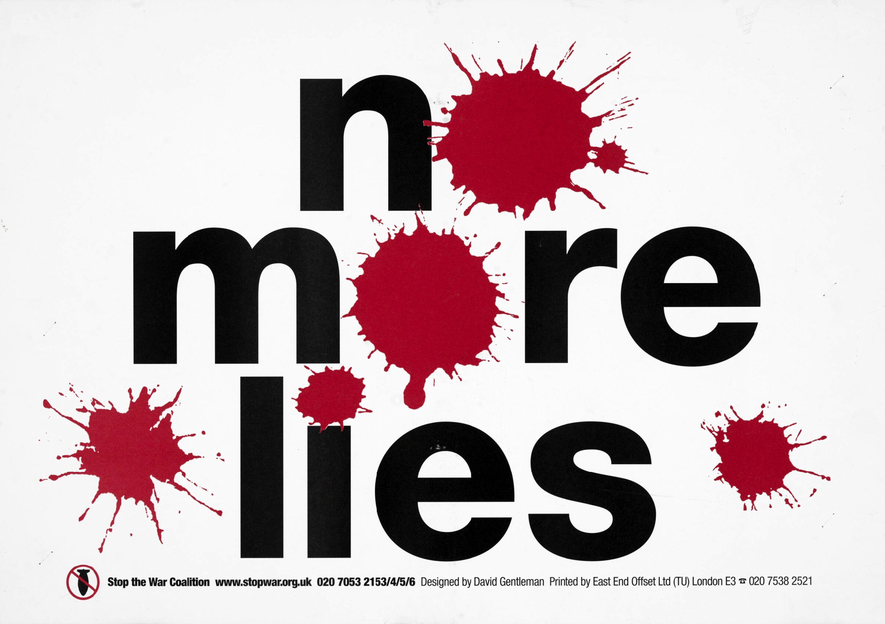
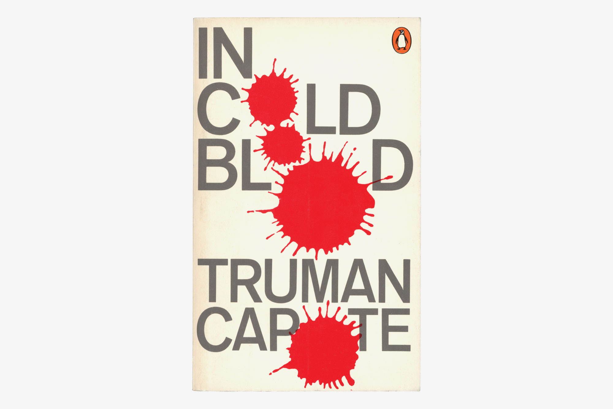
A Stop the War Coalition poster from 2006 by David Gentleman, presumably inspired by David Pelham’s 1970 cover for In Cold Blood by Truman Capote?
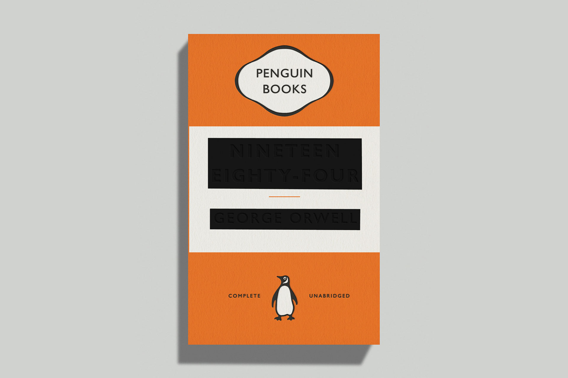
David Pearson’s 2013 cover for George Orwell’s Nineteen Eighty Four, with a redacted title and author name.
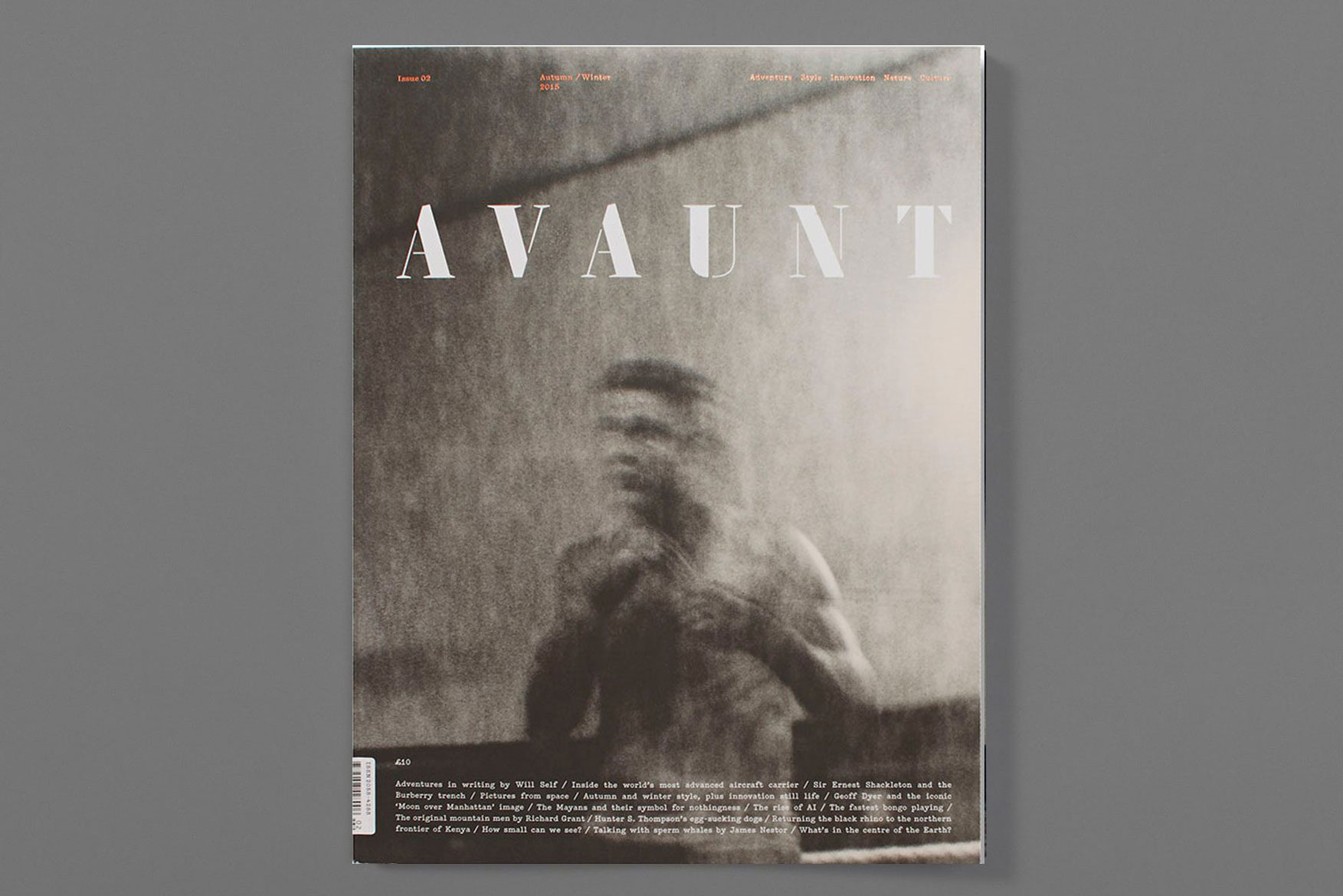
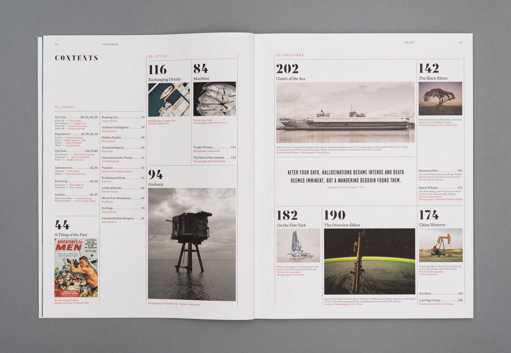
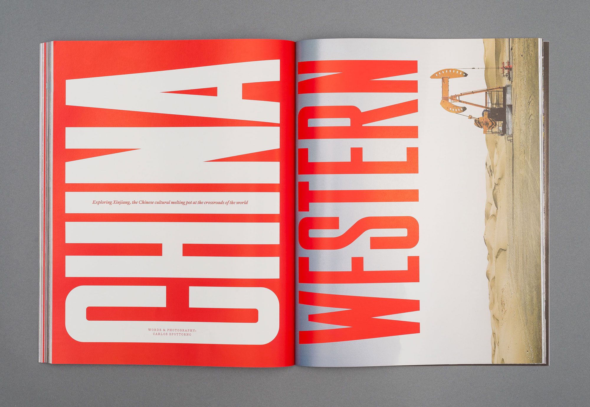
Avaunt magazine, designed by Matt Willey – this issue is from 2015 (to be honest, I’d happily put any of Matt’s work into an exhibition).
Anyway, that’s hopefully an inspiring selection of designs from across the years.
So, over to you. Which pieces of British graphic design would you include?