Fedrigoni 365 – 2025

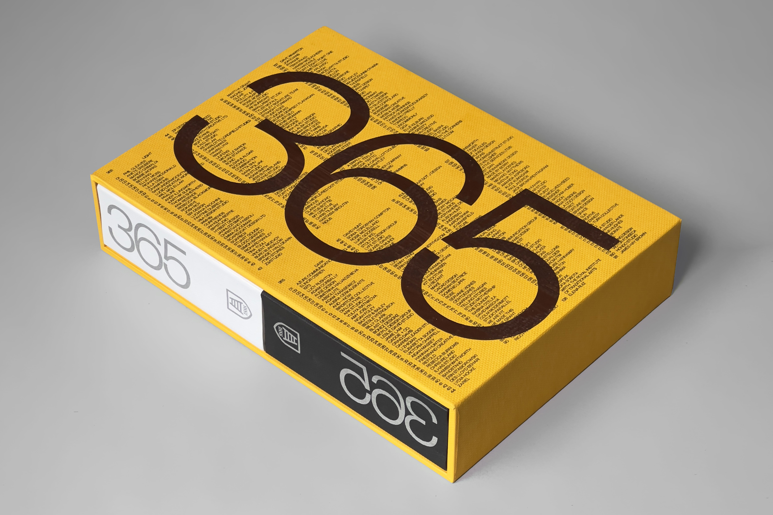
Each year since 2018, paper company Fedrigoni has created a calendar, Fedrigoni 365, featuring the work of designers and illustrators, initially from the UK, but now from all around the world. The calendar is useful in four main ways: as a visual calendar, as a promotional piece for Fedrigoni, as a promotional piece for each contributor (in blog and social media posts just like this one), and also as a snapshot of creativity each year. Or as the official blurb has it: “The Fedrigoni 365 project is designed to foster creativity, spark conversations, and highlight the versatility of Fedrigoni’s speciality papers.”
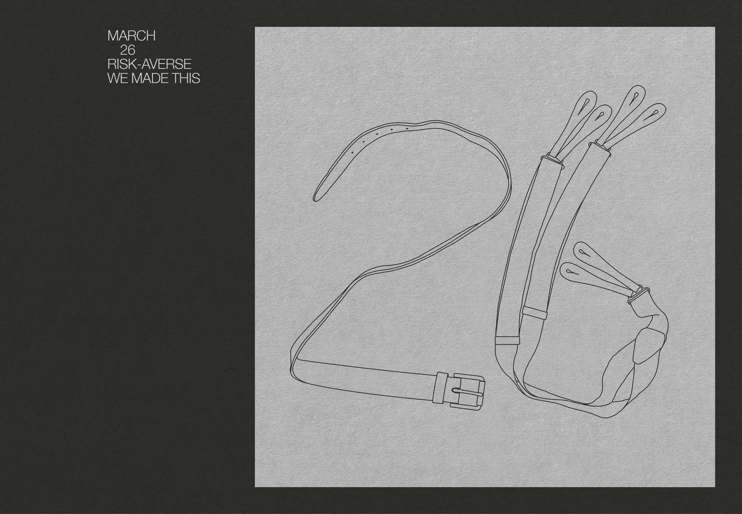
Each creative is given a number (a specific date from the year) to illustrate. I created a typographic illustration for the 2018 calendar, and created another for the 2025 calendar, which was recently launched at an event at the Crafts Council gallery.
The theme for this year’s edition was ‘opposites’. The publication is split into two books, one ‘Light, one ‘Dark’, held together in a slipcase. The Light book is printed in silver onto white paper stocks, the Dark book silver onto black stocks.

Each contributor was told whether their piece would be for the Light or the Dark book, and then given a word or phrase, and a date, to combine into an illustration. The opposing word or phrase was given to another creative, to appear on the same date in the opposing book .
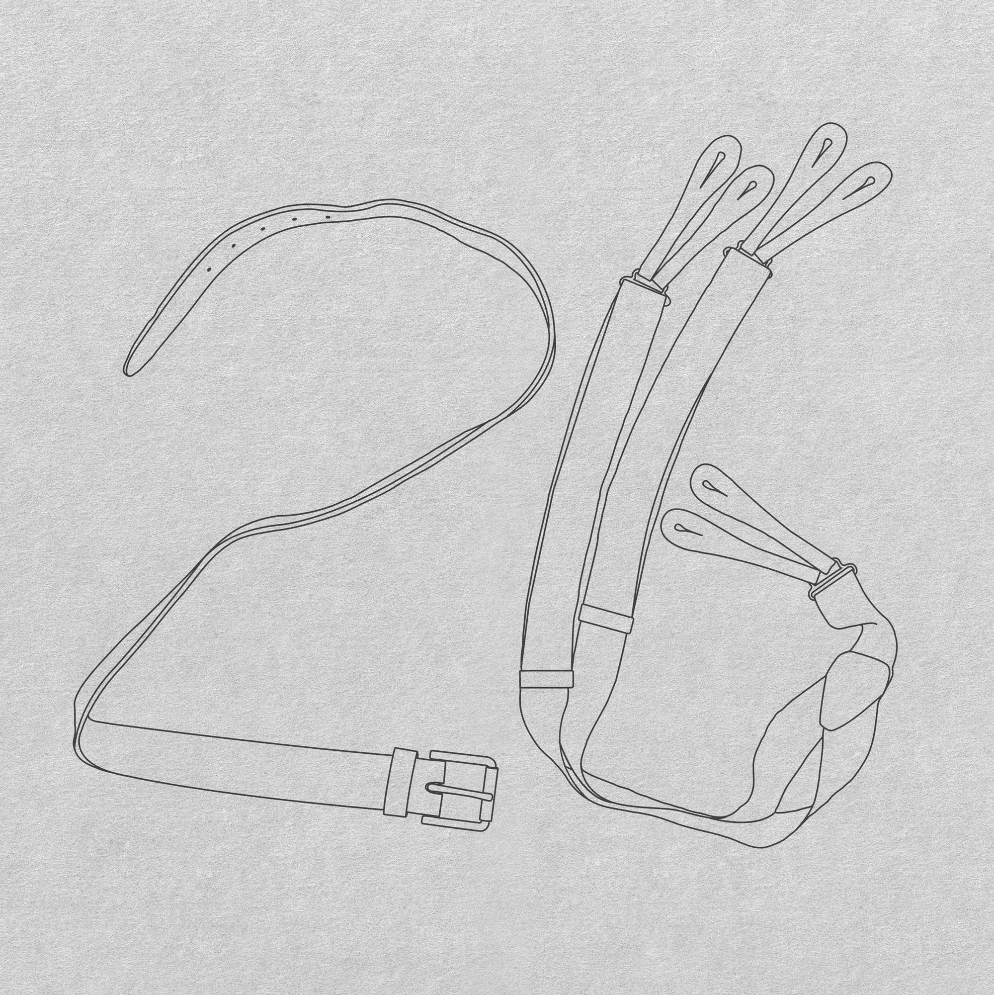
I was given the date of 26 March, and the phrase ‘Risk-Averse’, to go into the Dark book (with someone else designing a ‘Risk-Taking’ number 26 for the Light book).

A small problem with the project is that you don’t know what stock your piece will be printed onto, so you can’t be sure of the level of contrast that there’ll be between your illustration and the paper. For instance, the silver ink stands out gloriously in the section printed onto Ispira Nero Mistero, a rich black matt stock, but far less well against the lighter grey of Freelife Merida Graphite (both those are FSC Mix stocks) . Bolder, thicker artwork is certainly a safer bet when faced with this uncertainty.
Perhaps 730 illustrated numbers are also just too many to browse through comfortably? Sometimes (frequently to be honest), less is more.
A larger consideration though is the sustainability of a publication like this. Do the ends justify the means? The calendar is without doubt a beautiful thing, but being fixed to a particular year, it feels to me that it, very literally, has a short shelf life. It would be fantastic to see any future publications address this.
The books have been beautifully printed by Pressision in Leeds, bound by Diamond Print Services, with the slipcase made by Showcase Creative. You can pick up your own copy from Counter Print.