2012 Olympic mascots launched
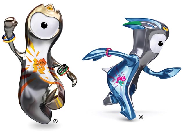
So, after the hoo-haa about the 2012 Olympic logo, here's the next big part of the Olympic branding, the mascots, Wenlock (on the left) and Mandeville. They've been designed by the folks at Iris, and given a back-story courtesy of children's author Michael Morpurgo.
Our first response on seeing them was "One-eyed aliens? Phew! Not a cuddly lion."
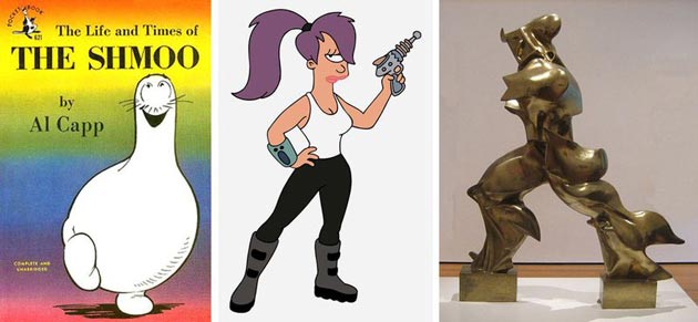
They're far closer to fully realised characters than we were expecting, and slightly bonkers, which is great. There's a touch of Al Capp's The Shmoo in there, a fair bit of Futurama's Leela, and also a bit of Umberto Boccioni's magnificent Unique Forms of Continuity in Space.
They're obviously styled to be emblematic of loads of different stuff - Wenlock's head represents the three podium positions, as well as a taxi light, and the Olympic stadium roof; while Mandeville's head has three prongs representing the Paralympic emblem. Both of them have eyes that apparently double as cameras, and they are built for online customisation, so that people can create their own versions (here's hoping for physical versions of that customisation, a bit like Kid Robot's Munnys). We'd like to see an unembellished version, a bit cleaner, simpler.
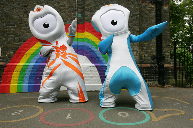
And of course, they come in life-size versions too - which we reckon might scare the hell out of younger kids...
Overall though, we reckon these two are (relatively) cool - perhaps not up there with Jamie Hewlett's Monkey animations appropriated by the BBC for its coverage of the Beijing Olympics, but not a million miles away. What d'you think?


