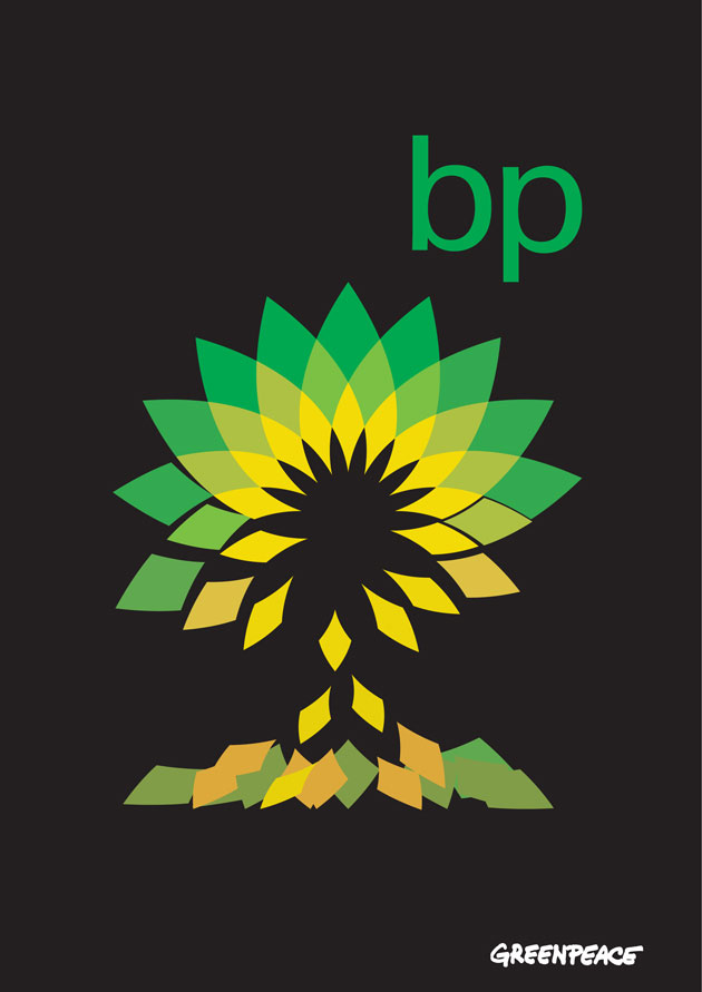
Redesign BP’s logo
Loving this - Greenpeace UK have set up a campaign to redesign the BP logo, to more accurately reflect its current tarnished status, as well as to raise awareness about the company's plans for extracting oil from tar sands.
These are our attempts at it, and Greenpeace have already posted almost three hundred entries to their Flickr set (they haven't provided links to show who's created each design, which seems a shame, but is perhaps wise), and that's just in the first week of the competition. You can download .eps, .tif and .pdf files of the logo, and there's a template as well, so that they can use the designs across lots of platforms. The competition is divided into three categories: design professionals & students; the general public; and Under 18s; and it runs until 28 June.

