Google: more is less
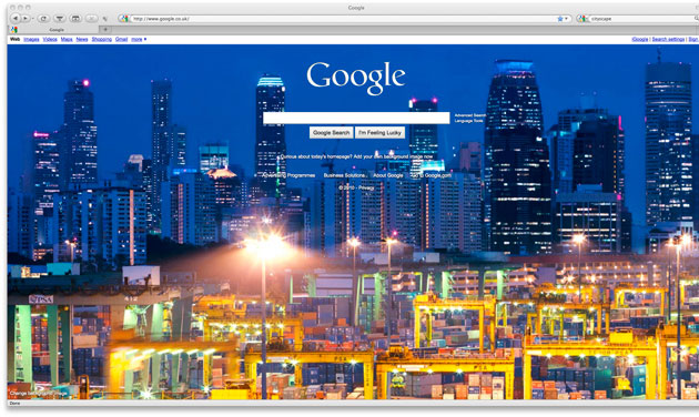
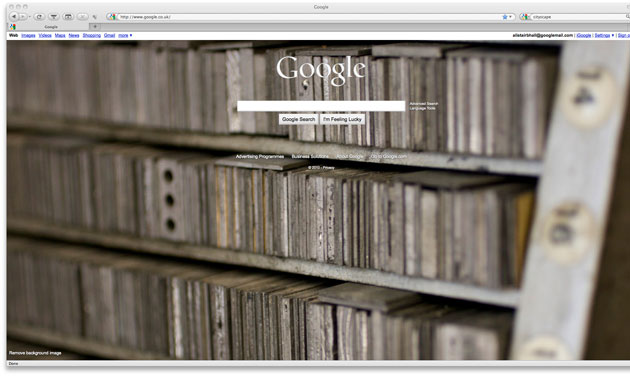
Google's homepage has gone all pictorial this morning, with a full-bleed image cluttering up their normally pristine page. You can change the picture, choosing from a range of pre-selected shots (including shots of work by Dale Chihuly, Jeff Koons, Tom Otterness, Polly Apfelbaum, Kengo Kuma (隈研吾), Kwon, Ki-soo (권기수) and Tord Boontje, as well as shots from Yann Arthus-Bertrand and National Geographic.
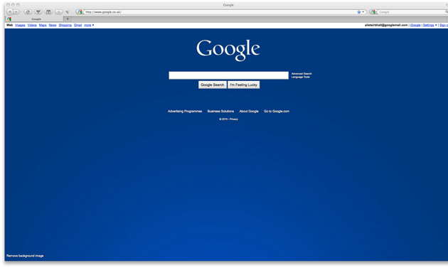
You can stick in your own images too (that's one of ours above), choose one from a public gallery, or set it to a single colour (as below), or even back to white (which is actually quite elegant, leaving a shadowed logo, rather than the usual mulitcoloured one).
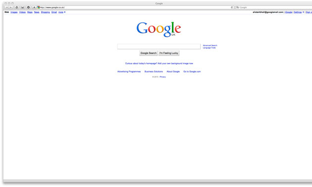
Except if you're using Safari, which isn't playing along at all, just showing the classic Google homepage. Wonder if that's a tech issue or just a low-level skirmish in the browser wars...
And frankly, as Safari users, we're happy with the standard page: we don't want our search window to be anything other than a search window. Less, as ever, is more.


