Nick Hornby on cover design
~ While Alistair is away cycling the length of Great Britain, we've invited twenty disgustingly talented people to each write a post for our blog. To kick things off, today's post is from the brilliant Nick Hornby, the award-winning author of Fever Pitch, High Fidelity
and About a Boy
; Nick is also one of the founders of the Ministry of Stories. ~

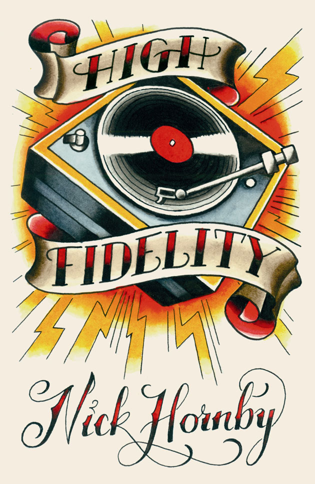
A book doesn't have a cover, not any more. It has, over the course of its life in print, lots of covers. High Fidelity, my first novel, has recently been rejacketed for the sixth or seventh time: a tattooist called Russ Abbott has produced this rather lovely image for a special edition (part of the Penguin Ink series).
Backlists are re-launched every few years, in an attempt to push books off the dreaded A-Z shelves, where they don't sell, and back on to the tables at the front of the shops. Paperback covers are frequently different from hardbacks; increasingly the big retailers, Amazon and the supermarkets, have a say in how a book looks before publication, if the book in question has serious commercial prospects. I don't really know what to say about that, apart from observing that the people who sell books in supermarkets have different tastes from my own. I am at liberty to object to the covers on my novels, if I really hate them, but my publishers would then, I think, be entitled to ask me to take a lower advance, if I care about aesthetics so much. The days of the iconic jacket illustration, the image that forever becomes associated with a much-loved novel, are nearly gone. The stakes are too high now.
My first book, Fever Pitch, was different. It had the same cover for nearly ten years, from its publication in 1992 until I switched publishers at the beginning of the new century. Nobody expected the book to sell in enormous numbers - it was about football (and the conventional wisdom at the time was that football fans didn't buy books), and it was a memoir, by someone nobody had ever heard of. The great advantage of my obscurity, and the low commercial expectations for the book, was that we, the publishers and I, could choose whatever cover we wanted. We were beholden to no-one, not even anyone at Tesco.

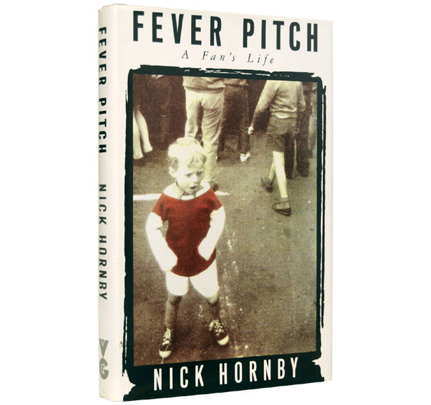
And here’s the thing about that cover for Fever Pitch: it existed, more or less in its finished form, before I’d written the book. I sold Fever Pitch on the basis of an idea and a few pages, and in the end two publishers were interested in it: Gollancz, who ended up with it, and Penguin, my publishers now. One of the reasons that I chose Gollancz is that they had already found this image. They used it for the cover of the offer they made to me, in which they outlined their plans for the book were I to go with them. I loved it; more importantly, I wanted the book I had not yet written to feel like that. Is the boy yelling or crying? Is he lost? Why is he looking in a different direction to everyone else? These questions, it seemed to me, had real metaphorical value. In other words, the jacket photo helped me to shape and focus the content of the book, in an extremely helpful way. It wasn’t as though I would have taken an entirely different direction had I not seen the picture. But that boy helped me to find my own voice, encouraged the book to become its better self.
We never managed to find the photographer, and I still don’t know who the boy is; at a reading in Dublin a few years back, someone told me that it was his cousin, at the open-top bus parade to celebrate Arsenal’s 1971 Double triumph. I do know that I owe him a drink.
~ Alistair is raising money for Cancer Research UK during his ride - please wander over to his Just Giving page and donate a little cash. ~