Clare Skeats on Foundation
~ While Alistair is away cycling the length of Great Britain, we've invited twenty disgustingly talented people to each write a post for our blog. Today's post is from the marvellous Clare Skeats - an incredible book designer, and brilliant design teacher. ~
Since 2009, I’ve been lucky enough to work as an Associate Lecturer on the Central Saint Martins Foundation Course in Art & Design. This involves leaving my stress-inducing desk for a day each week and immersing myself in the creative educations of 30 or so young people. For those of you who don’t know, Foundation is the year of study (usually undertaken around age 19) in which students experience learning in every art and design discipline, before deciding what to specialise in for a BA. Its main objective is as much to de-programme school conditioning, as it is to inform, provoke, equip and inspire.
I often find myself having to explain to people who have not come through an art or design education, what, exactly, the point of Foundation is. A frequently occurring question is ‘why do they need to do that?’. Fair point. Why should it take a year longer to graduate in jewellery design than say, marine biology? Doubts aside, almost everyone I speak to who has done this year of study (myself included), cite it as one of the most vital, pivotal and enjoyable years of their education. But it’s a year that is quickly overlooked – it’s the support act for the more talked-about BA. It’s also no secret that some Foundation courses are facing closure due to funding. So I wanted to use my 15 minutes in the We Made This spotlight to celebrate this stage in an artist’s or designer’s development and explain why I think it’s so special.
One of the first things we have to do on the course is to get students over their fears – fears of a new place (often a new country), new people, a new way of working – and one excellent (if unlikely) way of doing this is to get them to do something where we deny them an element or two of their control.
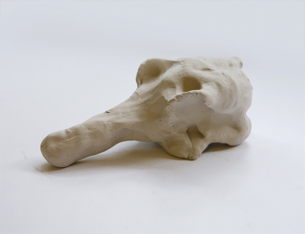
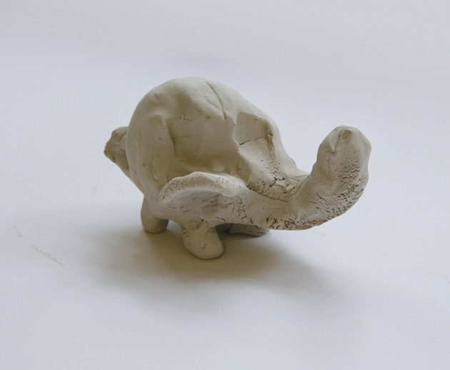
These two objects (above and top) are the results of an exercise where the students were asked to sculpt an elephant from clay, in 30 seconds with their hands behind their backs. When restrictions such as these are imposed, it’s impossible not to produce something with this much honesty and charm – it’s such a pure and uninhibited response to a creative brief. The laughter that ensues when these roughly-hewn grey lumps are offered up, represents a significant threshold of the first few days experience.

A major requirement of Foundation students is for them to keep a sketchbook. A Foundation sketchbook is instantly recognisable by its bulging form. It is the fertile receptacle of ideas, inspiration, tests, mistakes, frustrations and triumphs.
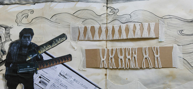
I love the sense of urgency and spontaneity that comes across in this spread by Sing Yu Chan (progressing to BA Fashion Design Technology (Menswear) at London College of Fashion); the instant visual connection he makes between the reference on the left and its hasty translation to cardboard and string weaving samples in the centre.
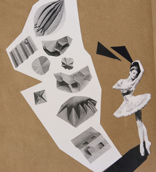
This impressive escalation of an idea (below), which grew from an exercise in folding a sheet of paper, is another example of sketchbook brilliance from Yang Yang (progressing to BA Costume Design at Wimbledon College of Art). It demonstrates so succinctly how a sketchbook can give a platform to the most ambitious (if ephemeral) creative plans.
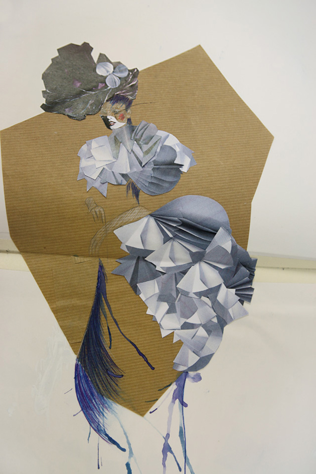
One of the things I get most excited about with teaching at this level, is the scale of ideas that can be suggested through the most humble of materials.
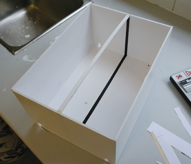
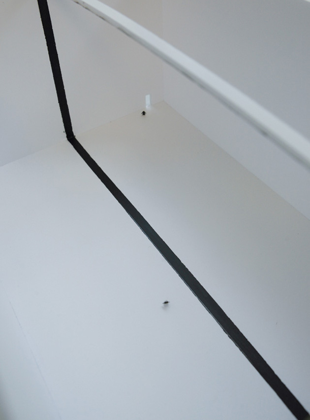
This rather unassuming-looking object by Florence Lam (progressing to BA Fine Art at Central Saint Martins) was produced in response to a visit to a recent exhibition of South African photography at the V&A. The black line (which is intended to be continuous – encircling the floor, walls and ceiling of the gallery space), is intended as a comment on Apartheid. I was surprised by my reaction to this piece when I saw it – yes it’s just some bits of foam board and black paint – but peering through the miniature doorway, it was so easy to imagine oneself in this impossibly cavernous and divided space. The scale is so perfectly judged and the whole piece is so much more than the sum of its parts – it’s an unexpectedly powerful expression of an idea from very limited means.
Another masterful deployment of basic materials can be found in these wonderful, organic, pod-like objects from Yao Wang (also progressing to BA Fine Art at Central Saint Martins). Who knew that a balloon, a bucket, Plaster of Paris and physics could produce such beautiful forms?
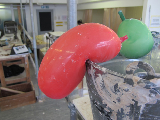
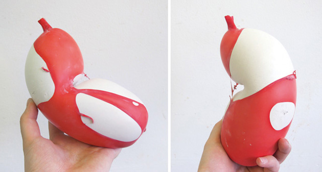
When I was speaking to Yao, shortly after her prototype stage, she had an urge to remove the shreds of balloon – an understandable drive to ‘finish’ the project as she’d first intended. But we decided that the unforeseen beauty of the red latex stretched over the smooth plaster was way too interesting and so ‘finishing’ the project in its most conventional sense became completely unimportant. Whilst we try to instil a disciplined approach with a focus on pragmatic problem solving – it is these unexpectedly brilliant outcomes and deviations that keep the students open to possibilities and reminds us as tutors not to be too rigid.
Allowing students the flexibility to bend rules is always a difficult one to judge. On the one hand, we put time and effort into writing a brief and we want the students to learn to respond to set questions with rigour and focus – but on the other, we run the risk of sucking the life out of a project if we’re too dogmatic. The following film piece by Venice Wanakornkul (progressing to BA Fine Art at Central Saint Martins), is the most perfect and playful example of why we need to allow students to bend rules. When faced with a brief to produce a piece of work in response to a culture (chosen from artefacts within the V&A), Venice opted to focus her outcome on the culture of museums. Hm…. not quite what we’d asked for – but the idea Venice had, subverted the brief in such a delightful way, we simply had to allow her to pursue it. Here is her film:
I never cease to be surprised and impressed by how sophisticated some students are in their thinking at this stage – how they utilise research and process information. The images here are from the sketchbook of Michael Ng (progressing to BA Product Design at Central Saint Martins) and they are such an impressive demonstration of lateral thinking in response to the Culture project described above.
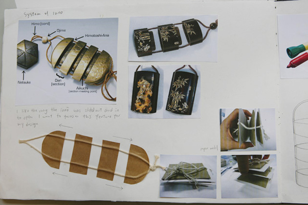
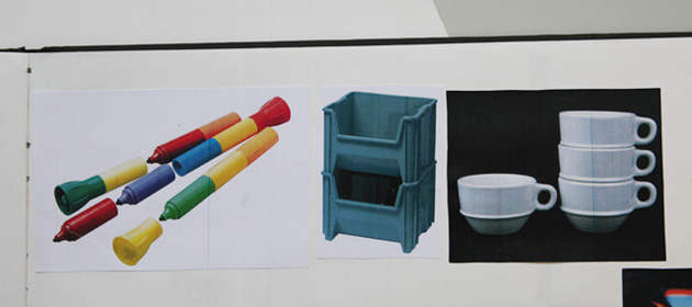
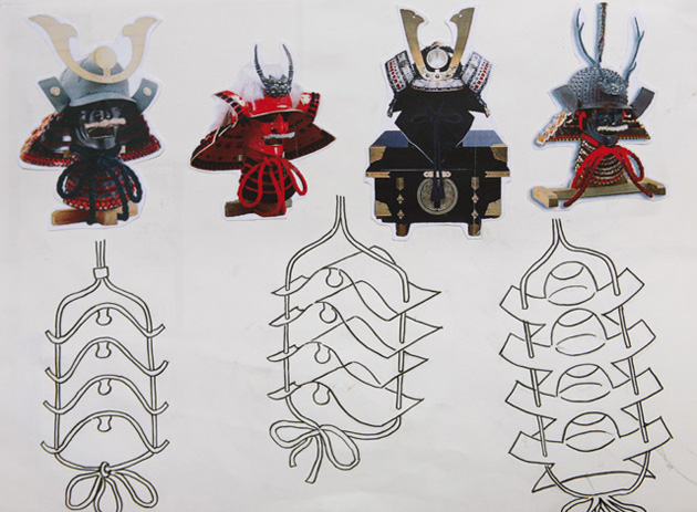
Having made some initial drawings of these Japanese artefacts in the V&A (traditional cases for holding small objects), Michael undertakes further internet research, before leaping to references of inter-locking pens, stacking crates and coffee cups, then back to Samurai warrior helmets for a further re-think on the form, before producing this prototype to a more geometric design. Michael went on to develop the design even further, incorporating lights, (yes lights!), but I think even up to this stage of his project, his sense of investigation and spirit of ‘how can I make this better?’ is so wonderfully clear to see.
The experience of teaching on Foundation has lead me to re-appraise my own working methods and to be more open to wider influences. It has made me reconnect to my own experiences on Foundation and reminds me of a time when everything seemed new and different – sometimes uncomfortably so. But most importantly, it puts me in an environment once a week, where industry cynicism makes no unwelcome intrusions and anything can be possible.
With thanks to the staff and students on the Central Saint Martins Foundation Plus course, 2011.
[The opinions expressed above are those of Clare Skeats and do not necessarily reflect those of Central Saint Martins.]
~ Alistair is raising money for Cancer Research UK during his ride - please wander over to his Just Giving page and donate a little cash. ~