Eleanor Crow on variations on a theme
~ While Alistair is away cycling the length of Great Britain, we've invited twenty disgustingly talented people to each write a post for our blog. Today's post is from the quite marvellous book designer Eleanor Crow. ~
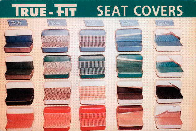
It might indicate borderline stamp collecting syndrome, but an ephemera spotter can find a good visual multiple to be irresistible. This True-Fit Seat Covers postcard (©1987 Quantity Postcards, San Francisco), sent by a friend (thanks Clare), is one such example. The variations in weave pattern and colour of the textiles are a delight.
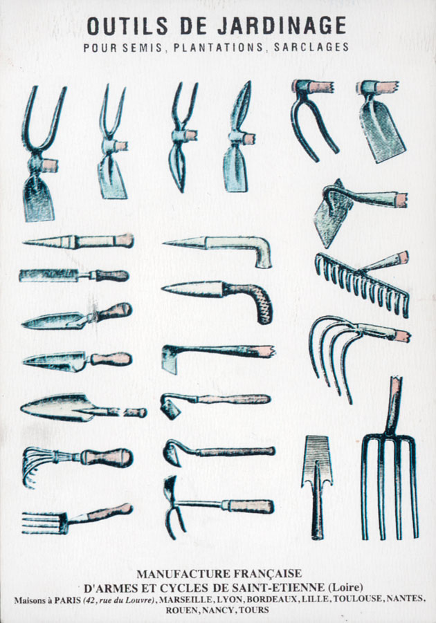
And another card Outils de Jardinage (©1995 Editions du Désastre, France) is of interest not only because I’ve recently been allotted an allotment, but for the charming comparison of prong, spike and blade on the humble garden tool.
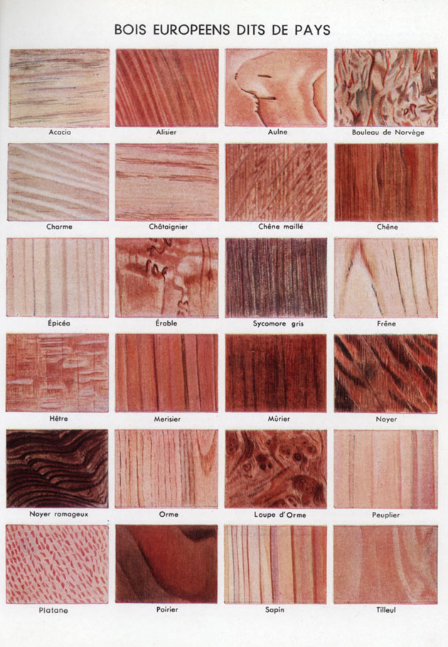
My battered copy of Dictionnaire Usuel par le texte et par l’image (Librairies Quillet-Flammarion, Paris 1956) relies heavily on visual multiples. I cannot think that I might urgently need to compare timber grains from European trees in the immediate future, but this mis-registered depiction of their subtle variations in pattern and colour is enough to merit more than a glance. The stuttering speckled lines of the Platane, or plane tree, is particularly lovely.
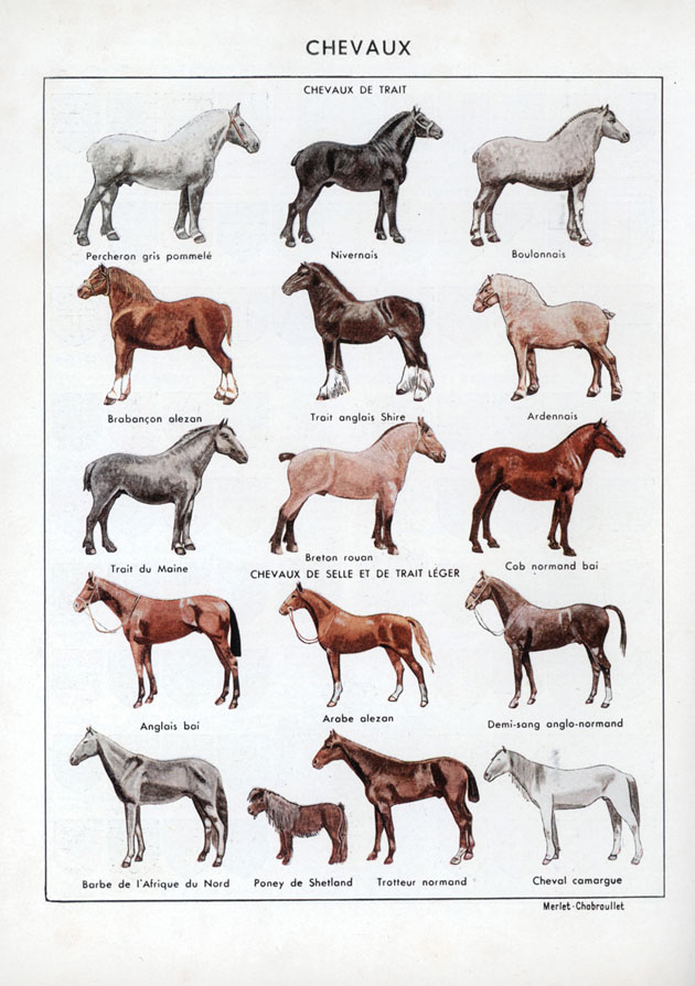
Similarly, the Dictionnaire Usuel’s colour plate of horse types is deeply appealing to even the equine ignoramus. The horses face in rows alternately to the left and the right, in uniform threes, until the last line where the tiny Shetland pony has snuck in as a rebellious fourth, and persuaded its tall friends to break with the rhythm and face to the left.
This colour plate from one of my favourite costume reference books, A Pictorial History of Costume (©1955 Zwemmer, Germany) provides a colourful display of historic oriental footwear in all its embroidered and sculpted glory – a museum display at a glance.
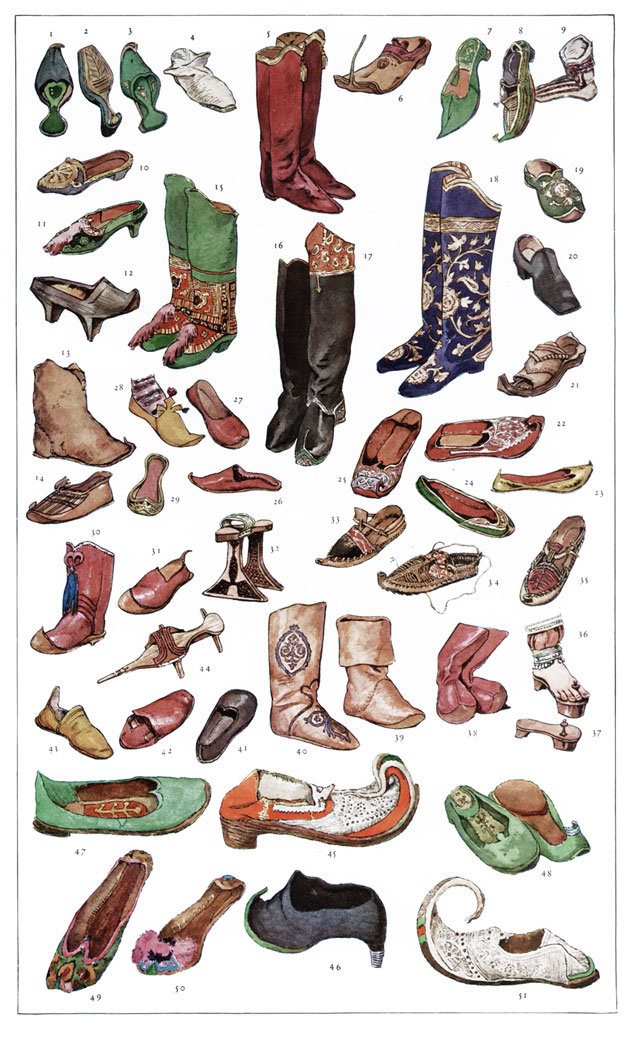
It’s precisely this idea of comparison at a glance that makes such multiples both informative and a visual delight. Information designers rely on such techniques – creating ‘small multiples’, a term popularised and described with characteristic elegance by Edward R. Tufte in Envisioning Information(©1990 Graphics Press, Connecticut). He writes of ‘small multiple designs, multivariate and data bountiful’ that enforce visual comparisons and ‘demonstrate the scope of alternatives’.
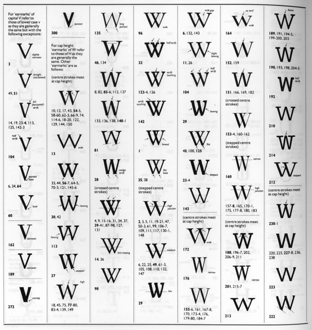
Here’s a page from the legendary Rookledge's Classic International Typefinder (©1983 PBC International, New York), demonstrating the special ‘earmarks’ or distinctive identifying features of typefaces. Technically useful, it’s also visually arresting in an abstract way with its array of Vs and Ws pinned to the page like butterfly wings.
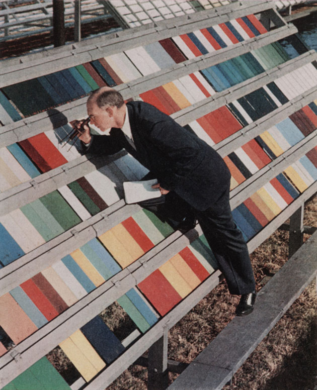
But it’s not just the small multiple that appeals when enjoying a good visual comparison – spotting a difference-spotter spotting the difference can be fun too. Here’s a 1950s Du Pont employee investigating weather wear across varying paint samples (from the March 1956 edition of Fortune magazine). It’s the contrast of his sombre figure angled across the serried ranks of colour hues that gives this image its charm.
~ Alistair is raising money for Cancer Research UK during his ride - please wander over to his Just Giving page and donate a little cash. ~