Page 1: Great Expectations
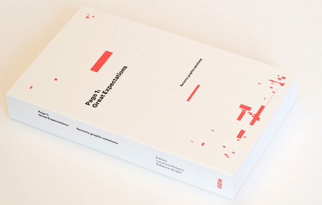
We've been dipping in and out of GraphicDesign&'s new publication Page 1: Great Expectations over the last couple of days, and it's a mighty interesting read.
GraphicDesign& is a collaborative project from Lucienne Roberts and Rebecca Wright, which is aiming create publications which make connections between graphic designers and other subject areas. (We'd perhaps suggest that that's an inherent part of graphic design - it's what we do every day - connect with other disciplines to help communicate their messages.)
Page 1 is their first book, and it's really interesting. The brief they sent out to 70 designers (mainly established names, but a few students too) was to take the first page of Charles Dickens' Great Expectations, and lay it out however they saw fit, within the paramaters of a standard A format paperback, 110mm x 178mm.
In the final book, each designer is given a couple of spreads - one with their name and their design, and then another with the rationale for their design, and the specifics of typefaces and sizes.
This layout works really well - rather than just being a gallery space for a bunch of designs, we get the chance to listen to the designers explaining the thoughts and ideas behind those designs. Some of the designers might perhaps be accused of taking themselves just a tad too seriously, but in general there's a pleasing breadth of responses, from the very dry to the very experimental.
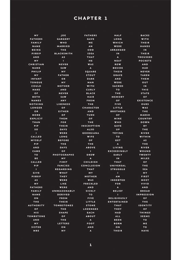
Our studio partner Paul Finn was one of the designers included - here's his page:
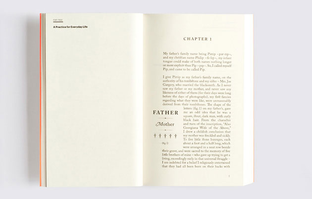
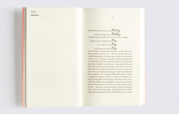
And here are a few others:
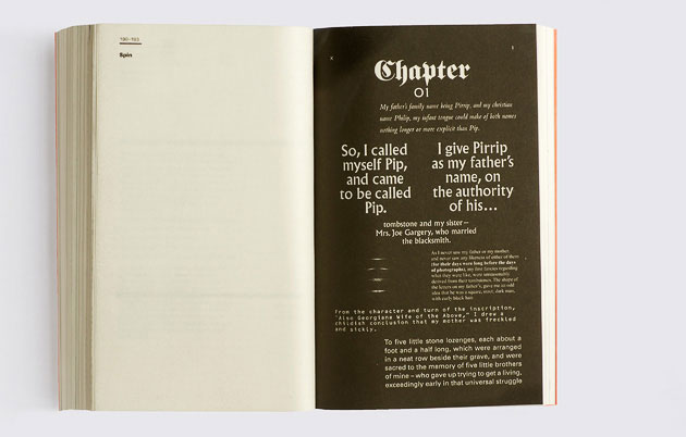
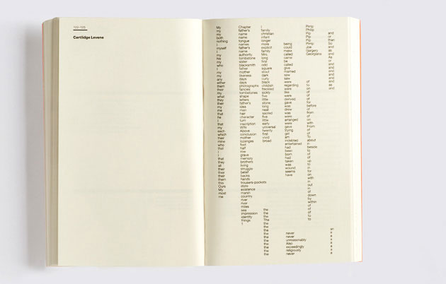
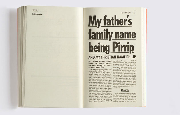
Great stuff. You can buy the book here.