Designs of the Year 2013
We nipped along to the Design Museum's Designs of the Year show last weekend.
Self-styled as "the Oscars of the design world", it's a curious beast of a show, pulling together "the most innovative and imaginative designs from around the world, over the past year, spanning seven categories: Architecture, Digital, Fashion, Furniture, Graphics, Transport and Product", with a view to crowning a single design as the best of the best.
Which means that you get a skyscraper (Renzo Piano's Shard) being pitted against a social-media printing gizmo (Berg's Little Printer).
There's a lot of great stuff on show, but it was the projects that are demonstrably making people's lives better that really caught our eye - and the rest of the designs rather suffered when compared against them.
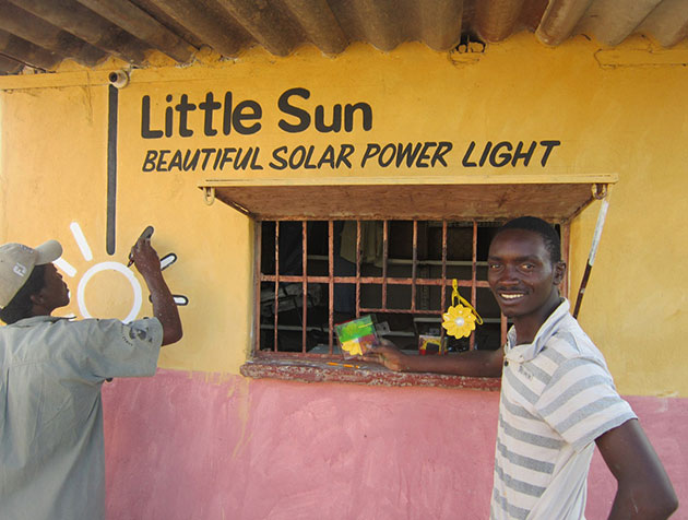
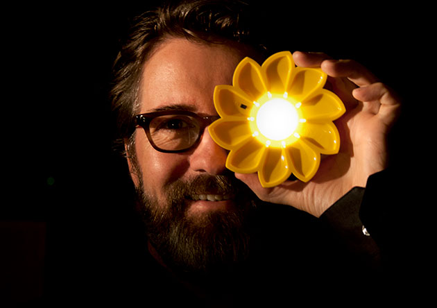
We really loved the Little Sun designed by the artist Olafur Eliasson (the chap who installed the sun in the Tate's Turbine Hall with The Weather Project) and and engineer Frederik Ottesen. It's a low-cost solar powered LED lamp that gives up to five hours of light when fully charged. It's designed to provide a practical, safe and efficient source of light for people living in rural communities off the electricity grid, helping them to work, study or cook at night.
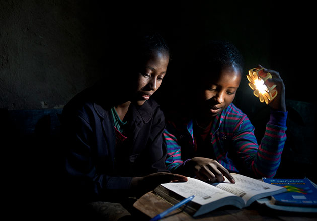
It can be worn, hung or attached to walls, and is much safer and healthier than the kerosene lamp alternative.
And, even more brilliantly, folk in areas of the world with ready supplies of electricity (that's you, dear reader) can buy them at full price, helping to make it available in off-grid communities at much lower prices.
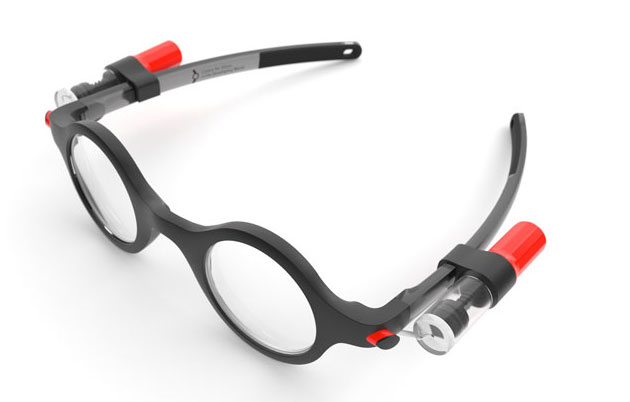
Also helping kids in the developing world to read are the Child ViSion Glasses from the Centre for Vision in the Developing World, designed by the gents at Goodwin Hartshorn.
Designed to improve the eyesight of kids aged 12-18 (or possibly to create a Wally Olins clone army) these groovy self-adjustable specs use fluid-filled lens technology: a silicone oil is injected into the space between two membranes to adjust the prescription until it's right for the user (the design is based on something similar for adults, the Adspecs, also developed by the CVDW).

The package includes a simple eye test, and the lenses can be adjusted by any adult. At this stage they're still undergoing clinical trials, but heck, what a great idea.
Another stunning idea came from the folks at independent non-profit ColaLife, who have developed a novel way of getting life-saving medicines to people in rural areas of Africa - by hitching a ride with Coke.
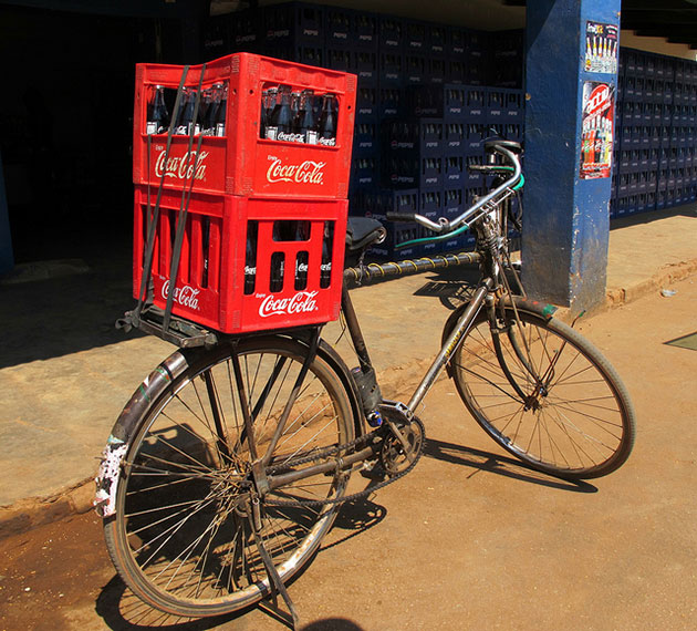
They realised that soft-drinks giant Coca-Cola has an incredible distribution network: you can buy a Coca-Cola virtually anywhere in the developing world - but that in those same places 1 in 9 children die before their 5th birthday from simple, preventable causes like dehydration from diarrhoea.
ColaLife decided to piggyback on top of Coca-Cola's distribution network, and developed the Aidpod, a package which can slot into the empty spaces left between soft drinks bottles when they're stacked in a crate. The pods are designed to carry ‘social products’ – oral rehydration salts, high-dose vitamin A, water purification tablets – to save children’s lives. By using an already established network, medicines can reach communities for little or no cost.
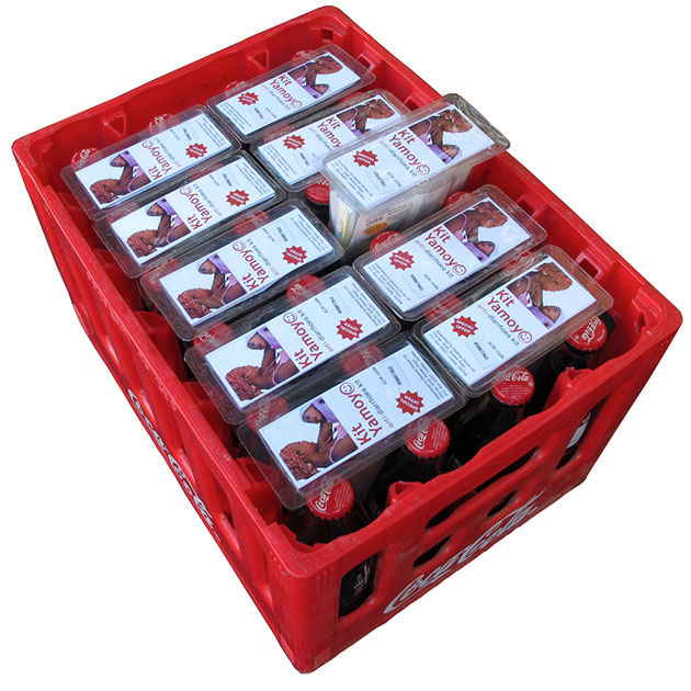
The Kit Yamoyo, nominated for an award, is an Anti-diarrhoea pack which they're trialling in Zambia at the moment. The original concept was by Simon & Jane Berry (founders of Colalife), with design by Tim Llewellyn for PI Global.
Read more about it all here.
Meanwhile, over in the Architecture category, we loved the renovation of Tour Bois le Prêtre: a 17 storey tower block, on the edge of the 17th Arrondisement in Paris, that was being threatened with demolition.
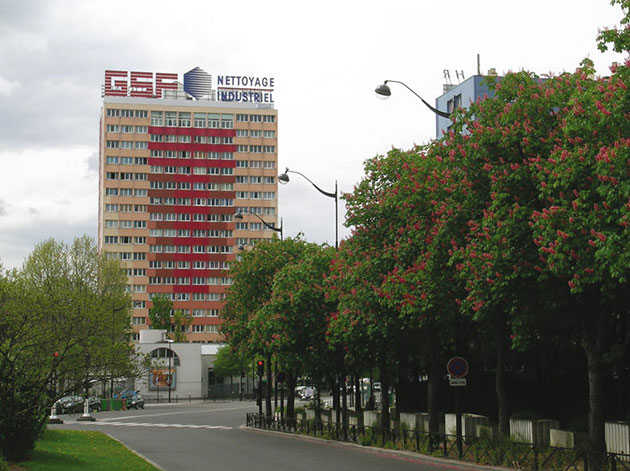
In 2005 a competition was organised by Paris Habitat, the Paris Office for Public Housing, to renovate the building. Lacaton & Vassal studio put together a retrofitting scheme for the block, using prefabricated balconies, which cost £15 million, around half of the projected demolition and rebuilding cost; and which also meant minimal disruption for the inhabitants of the block.
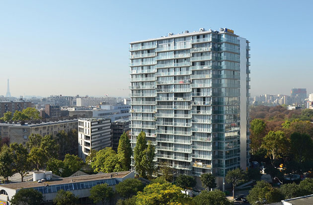
A pioneering example of how renovated buildings can create great housing. Be good to see some more of that sort of thing going on in the UK. (Read more about the project in this New York Times article.)
Over in the Graphics category, it was the new Australian cigarette packs that caught our eye.
Thanks to the Australian Tobacco Plain Packaging Act, as of 1 December 2012, all cigarettes sold there have to be sold in plain packaging. So there's no branding to speak of, just warnings, graphic images of the dangers of smoking, and product names.
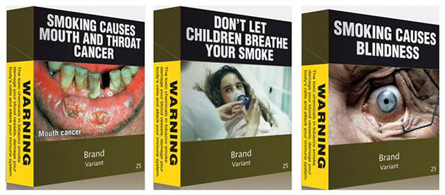
As the act states, this was done to: "(a) reduce the appeal of tobacco products to consumers, (b) increase the effectiveness of health warnings on the retail packaging of tobacco products, (c) reduce the ability of the retail packaging of tobacco products to mislead consumers about the harmful effects of smoking or using tobacco products."
It's design doing the exact opposite of what it normally does. It's ugly, unpleasant, and uncomfortable, and it's intentionally trying to dissuade you from making a purchase. The packaging colour has been specified as Pantone 488C, after research by the Australian Department for Health and Ageing discovered it to be the least attractive colour for packaging.
Poor old 488C.
It's not beautiful, but it may well be very effective.
Although.
It did remind us of the Death Cigarettes brand from the 90s, which was equally up front about the dangers of smoking.
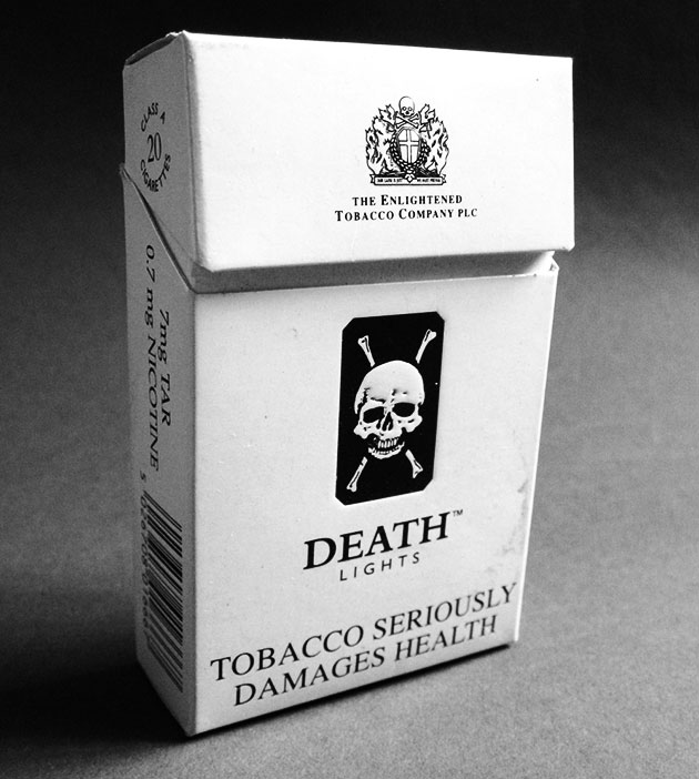
It'll be interesting to see if the Australian packs pick up a similar cachet amongst rebellious youth...
Other than those projects, the Zumbtobel Annual Report, by Brixton design studio Brighten the Corners and Anish Kapoor, is a real stunner, set in two parts, with one part consisting solely of a series of full-bleed chromatic spreads (you really need to have a copy in your hands to experience it properly).


And the Ralph Ellison series of book covers by Cardon Webb are also all kinds of lovely.
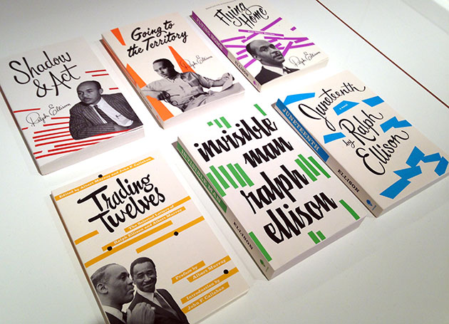
And of course, Thomas Heatherwick Studio's lyrical Olympic Cauldron for the London 2012 is nominated too, and deservedly so. It was the design highpoint of the Olympics, and there was a real sense of awe watching it open and close during the ceremonies.

All in all it's a fascinating show - but we definitely came away with the feeling that design is at its best when it's directly helping make the world a better place.
And we were also struck by this bit of text from the permanent collection on the floor above the Designs of the Year show:
"The most successful designs are those that endure and continue to be relevant many years after they are first introduced. These are the icons that define the landscape of design. The bicycle, the ball-point pen and Anglepoise lamp are all examples, where the basic form has remained the same for decades."
It'll be really interesting to see if which, if any, of this year's crop of designs endure for many years to come.