Penguin Random House Learning Journal
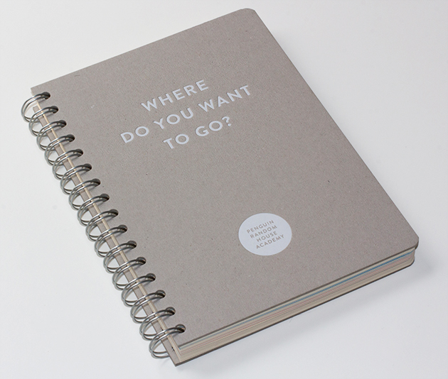
Often, when you get a job back from the printer (having laboured over it for hours, days, weeks, and often months), there can be a certain sense of disappointment, with the final result not living up to your by now unjustifiably elevated expectations. That's not to say that the finished object isn't worthy of love and pride, just that you can easily have an idealised view of what you hope to have created, a view which reality can never match.
But every now and then, the reverse happens. Despite having those same supposedly unrealistic expectations, the finished object manages to exceed them.
This happened to us with this learning journal we created recently for the Penguin Random House Academy - the in-house training programme for the company's UK staff.
We were hoping it was going to look great, but once we got it in our hands, we couldn't help but grin. It just felt right - the cover stock, the text stock, the print process, the finishing – it all came together in one lovely package. (And yup, we know we're blasting away on our own little trumpet here, but heck, sometimes it's okay to do that.)
We started out by designing the identity for the Academy, a simple circle. We then carried that circle through as a motif throughout the book.
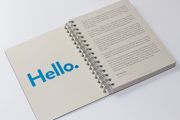
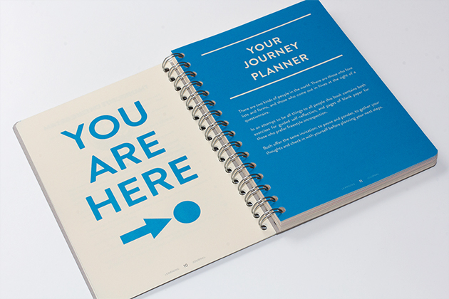
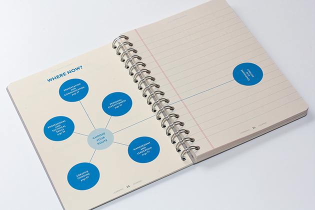
The book is designed in two separate sections, each of which has its own front cover. Start at one end and it's an informative guide to all the training and career development possibilities at the company; flip it over and it's a travel journal, where you can make notes and doodle.
The text pages are printed onto a cream stock using the CMYK process, but with the black swapped for a Pantone grey.
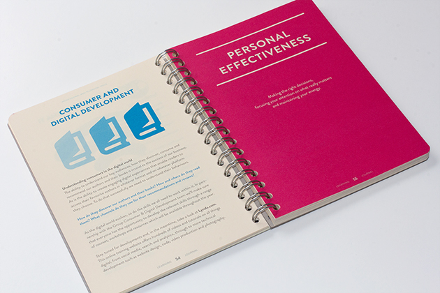
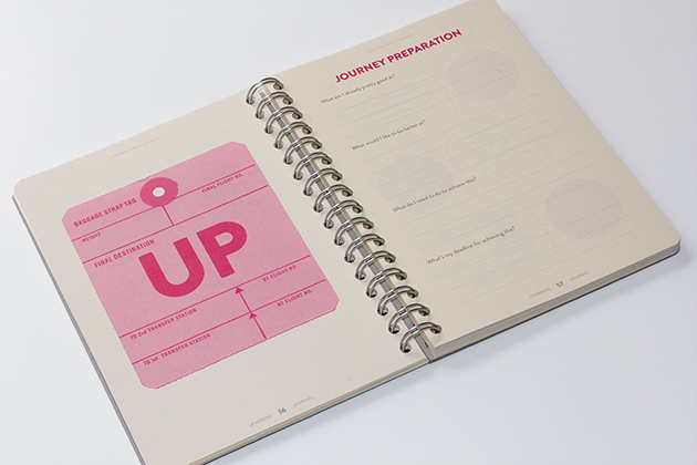
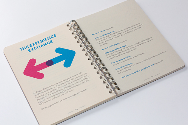
The two halves of the book meet at a spread which reads in both directions, letting you know that it's time to flip the book:
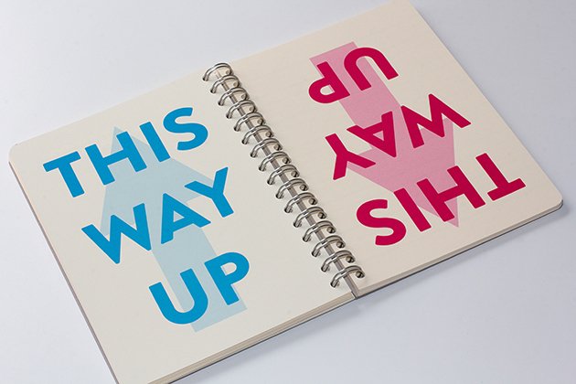
The covers are 2000 micron greyboard, foil-blocked in white.
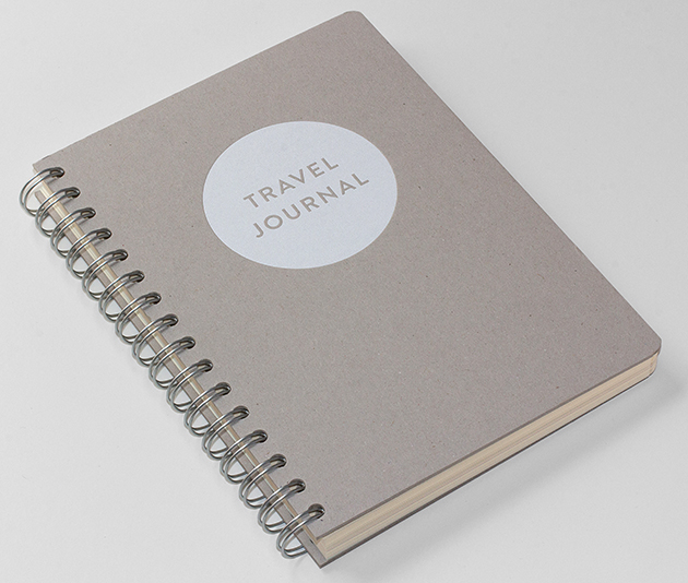
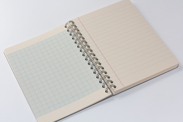
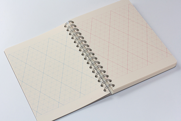
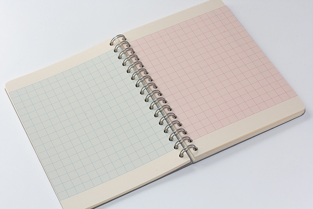
The travel journal pages are a mix of blank pages, inspirational quotes, and many different types of lined paper pages:
Our thanks to Jo, Bethany and Erica at Penguin Random House, and printers Colophon and Lavengro for their help in creating something we're dead proud of.