Hoxton Street Monster Supplies’ new website

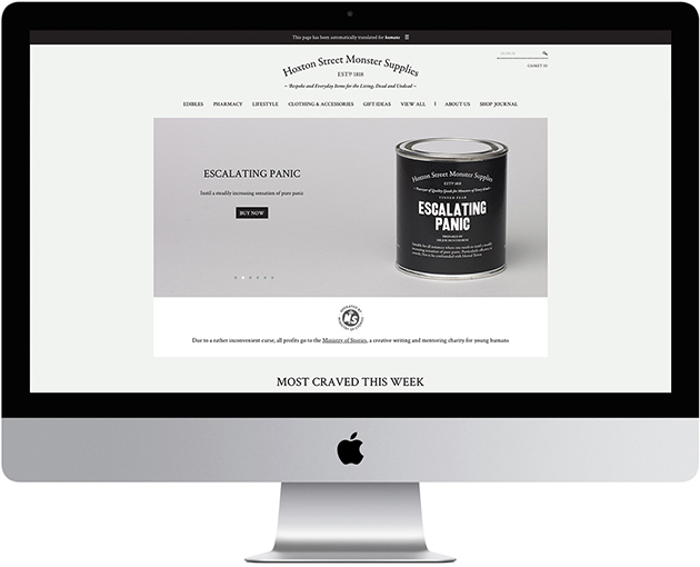
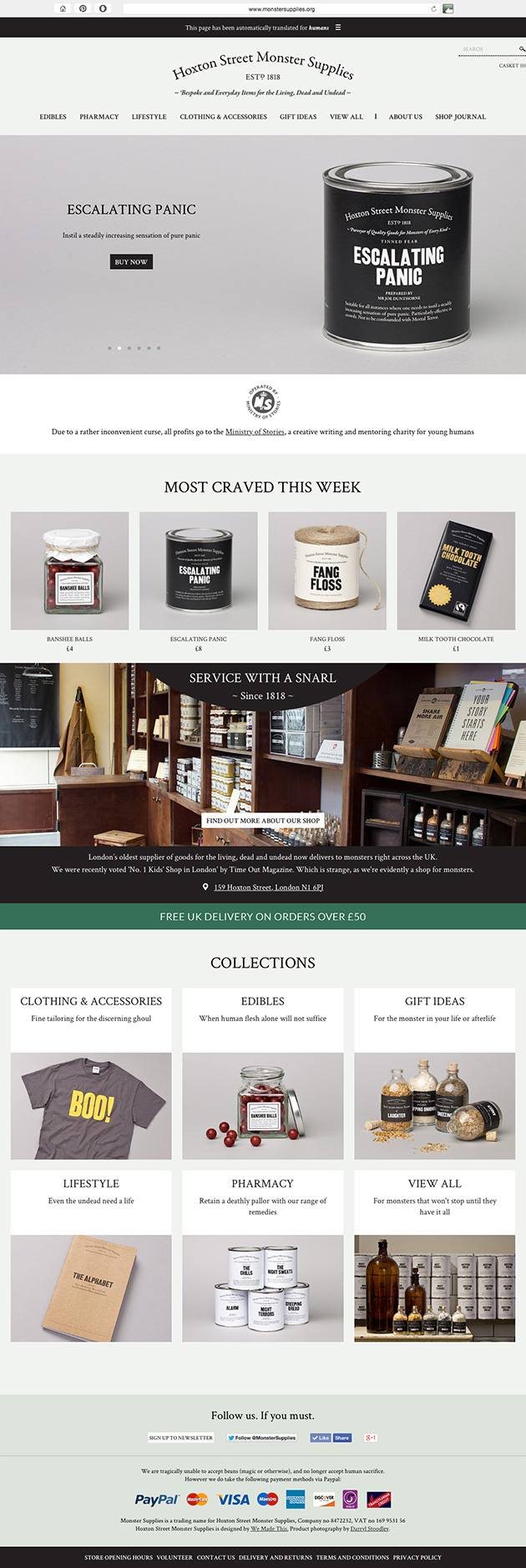
So, I’m feeling more than a little excited. The new website for Hoxton Street Monster Supplies has just launched. I’m hugely proud of it.
The shop, established in 1818, provides bespoke and everyday items for the living, dead and undead. (And also happens to give all its proceeds to the Ministry of Stories, the young people’s writing and mentoring centre which dwells somewhere behind its shelves.)

The shop’s old website, developed a few years back, didn’t work too well on mobile devices, so we took the chance to give it a complete overhaul.
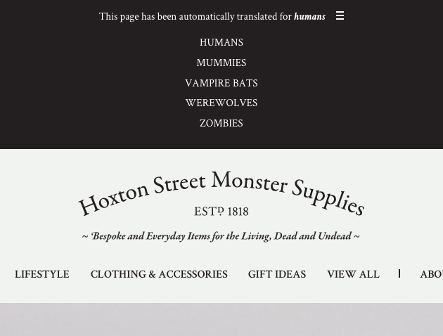
I’m particularly pleased with a (much requested) translation feature:

(You’ll have to visit the site to see how it works.)
The site is the result of a huge amount of work from a whole heap of talented folk giving their time, energy and skills for free. It was designed by the brilliant Fox twins, Gavin & Jason. They’re creative directors (at Framestore) who ‘specialise in storytelling in many mediums including theatre, video, VR, social media and of course websites’. They also do some amazing things for Secret Cinema, and a whole host of other incredible stuff. Jen Williams, Head of UX at Poke, made sure the user experience was just right. It was built (with remarkable patience) by the wonderful Jamie Ingram, Technical Director at Poke. Copywriter James North crafted the text on the site expertly, perfectly catching the flavour of the shop.
I provided art direction, mainly by getting in the way and being overly pernickety about typographic stylings.

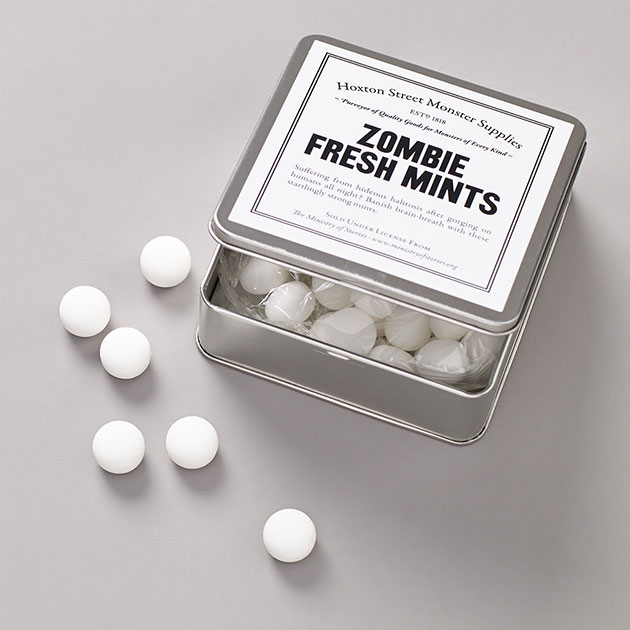
The products themselves look fantastic too, thanks to some brilliant photography by Darryl Stoodley.