(Graphic) Designer Watches
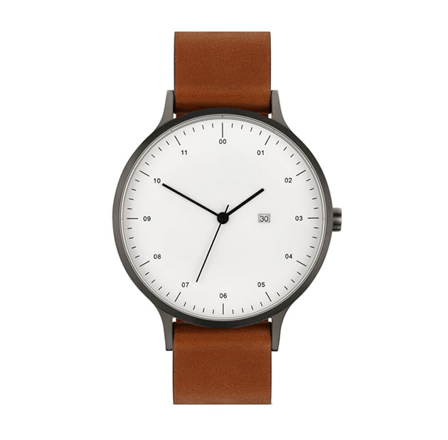
So, I was at one of the events at the London Design Festival last month, and bumped into a couple of design colleagues. We noticed that all three of us were sporting the same type of watch - the INSTRMNT 01 (above). This made us realise that, although we like to think we’re all special unique unicorns with our own free will, we’re actually just brainless automatons who can’t help but be sucked in by the same things.
But, it did get me wondering: which watches are most popular amongst the design community?
The INSTRMNT watches are made by a small team in Glasgow, and they have a stripped back simplicity that (evidently) appeals to graphic designers. They're the polar opposite of bling, and adhere closely to Dieter Rams’ Ten Principles for Good Design, particularly ‘Good design is as little design as possible’.
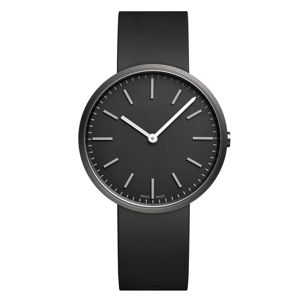
For a very similar feel, you don’t have to go much further than Uniform Wares, who started up in London in 2009, and seem to be a particular favourite of architects:
Of course, you could just go direct to source, with a Braun watch:
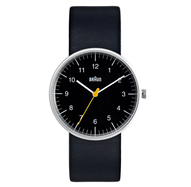
Clean, simple, functional.
Another favourite we’ve spotted adorning the wrists of more than a couple of designers is the Max Bill by Junghans:
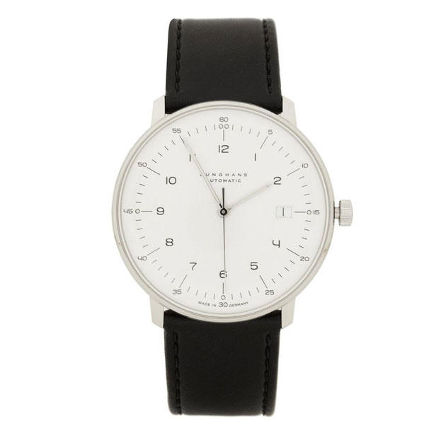
Max Bill was a Swiss designer, type designer, architect, painter and sculptor (polymath much?) who studied at the Bauhaus under Wassily Kandinsky and Paul Klee. Originally made at the beginning of the 1960s, the watches and clocks he designed for Junghans have a really refined elegance.
For something a little chunkier, but still iconically Swiss, perhaps the Mondaine Official Swiss Railways Watch?
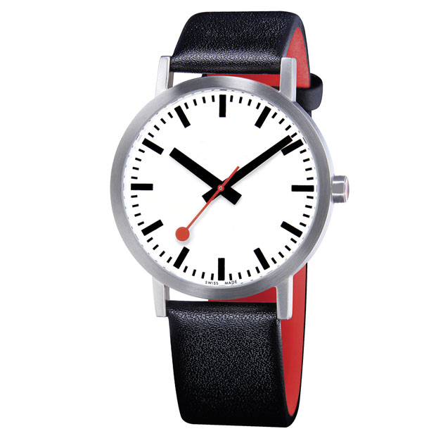
These are based on the patented design of the Swiss railway clock, designed in 1944 by Hans Hilfiker, an employee of the Federal Swiss Railways. The watches were first produced in 1986, and quickly became a classic. They’re sort of the equivalent of big round black framed glasses.
And if you're discussing Swiss classics, it’s pretty much impossible to avoid mentioning Helvetica. Last year Mondaine produced their Helvetica No. 1 watch:
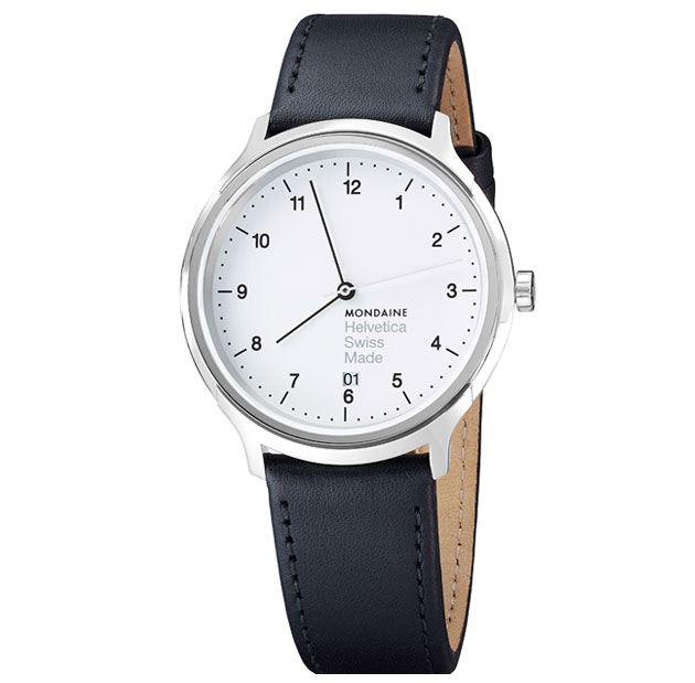
Naturally they come in light, regular and bold. And as a little additional quirk, the lugs are based on the Helvetica numeral ‘1’. See what they did there? Now, we’re more than happy to see some elegant typography on a watch face… but perhaps calling the watch Helvetica, and sticking the word Helvetica on the face is slightly overcooking it?
Of course, designers are also historically more than a little partial to Apple products, so perhaps the Apple Watch should be included in this list?
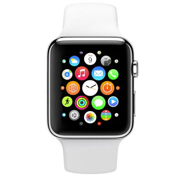
I’ve seen a few of them in the wild though, and still don’t really understand what they’re actually for. Where the iPhone felt like a complete game changer when it launched, turning an existing industry on its head, the Apple Watch feels like a bit of a gimmick.
So, which watch ticks the right box for you (if you’ll pardon the pun)? Any of the above? Or something else entirely?
UPDATE (21 October 2015)
I couldn't let this post stand without including the newly launched Sekford Type 1A watches, which feature bespoke lettering and numbers drawn by Commercial Type. They’re not cheap, by my they’re beautiful.
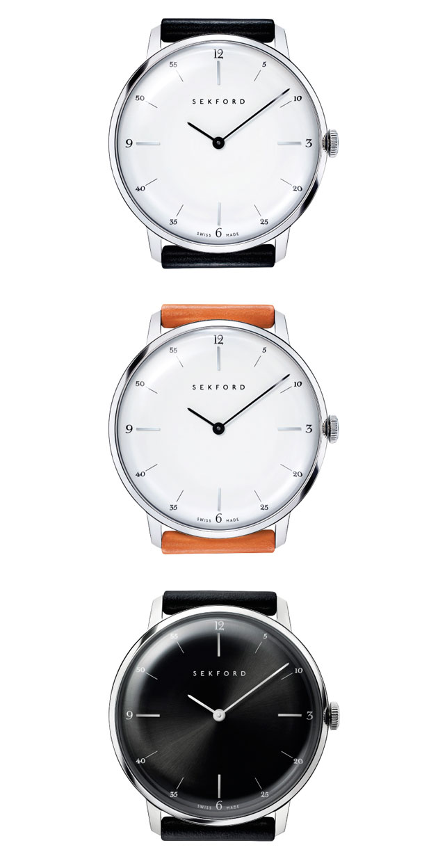
Browse through the comments below for watch links from other readers.
Also, it’s interesting note how popular the time around ten past ten is for setting the watches to when photographing them. Evidently a watch and clock photographic tradition.