A Smile in the Mind
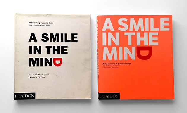
I nipped over to The Partners on Wednesday evening for the launch of the revamped A Smile in the Mind - Witty thinking in graphic design.
The book was originally published in 1996 (that’s my grubby copy on the left up above, which I picked up around 1999), and presented a wealth of the sort of graphic design that deals with ideas, play and wit. When I was at college, it was considered a key text for ideas-based design.
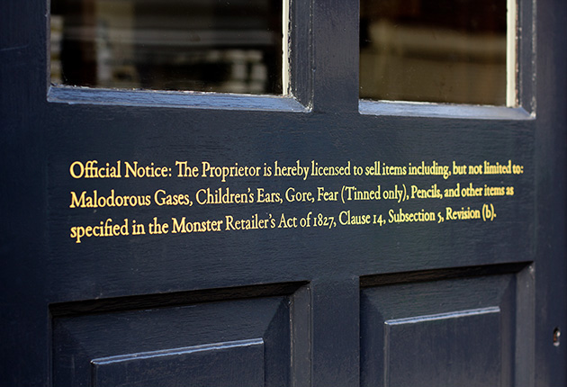
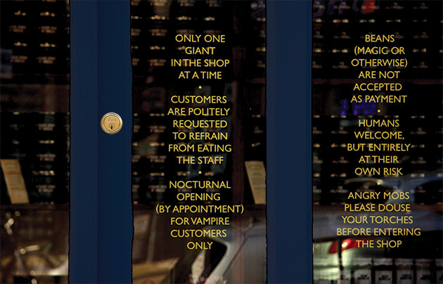
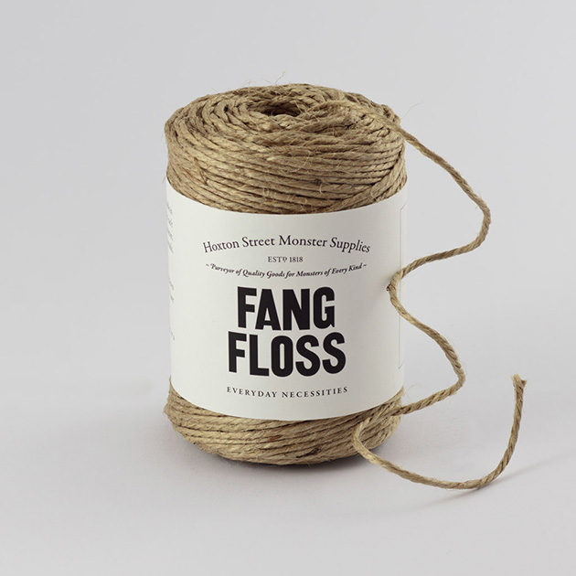
With a fresh neon coat, the new version has been extensively revised and updated, with over 1,000 examples of witty logos, book covers, posters, illustrations, packaging and photography - about 50% of it new material. And I’m ridiculously chuffed to have my work for Hoxton Street Monster Supplies included in amongst that.



I thought I’d show a few more pieces from the book here. Up first, a cover for Nabakov’s Lolita, by the offensively talented Jamie Keenan. Quite possibly my favourite bit of graphic design from the last twenty years.

Sticking with book covers, my studio partner David Pearson’s wonderful cover for Walter Benjamin’s The Work of Art in the Age of Mechanical Reproduction, from the Penguin Great Ideas series, is rather brilliant too – with the spine of the book duplicated repeatedly across the front cover.

This logo for The Guild of Food Writers by 300 Million is a perfect example of graphic wit and economy:

Sticking with food, this pack by Design Bridge for Tiger Nuts is, well, the nuts.

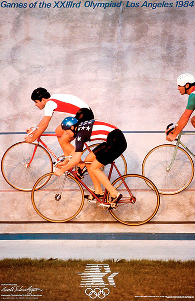
There’s a good section at the back of the book where various design folk talk through how they came up with an idea, including this corker of a poster by Arnold Schwartzman for the Los Angeles Olympics:
A Smile in the Mind is a fantastic compendium of witty thinking, and a real credit to both Beryl McAlhone & David Stuart who put together the original edition, and Greg Quinton and Nick Asbury who put together the new edition.
You can see a further selection of work from the book (including my stuff) over at Creative Review.