Designology at the London Transport Museum
I nipped along to the London Transport Museum recently to catch their brand new show, Designology.
The exhibition is part of their London by Design Season, celebrating 150 years of design heritage. As part of this, they’ve already installed a new permanent gallery, London by Design, within the museum. This temporary show adds to that, displaying a selection of bits and bobs that illustrate how the design process works within various strands of London’s transport network.
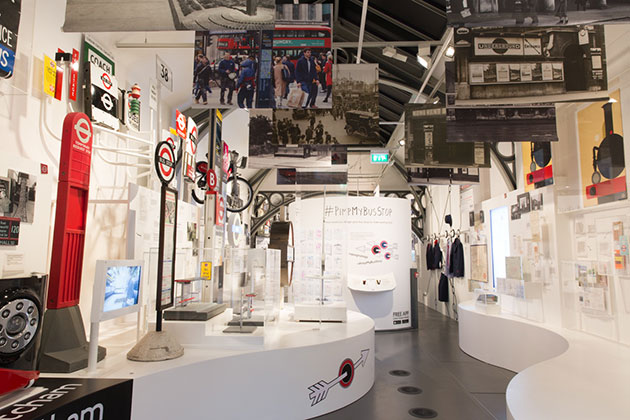
It’s a slightly cramped show, and the display can feel a little home-made at times, but there are some real gems on display.
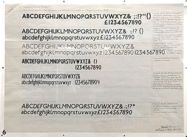
My favourite was the set of archival material from when the London Underground’s iconic Johnston typeface was updated and turned into New Johnston by Eiichi Kono at Banks & Miles. (This provides the perfect complement to the Johnston exhibition currently on at Ditchling Museum of Art + Craft.)
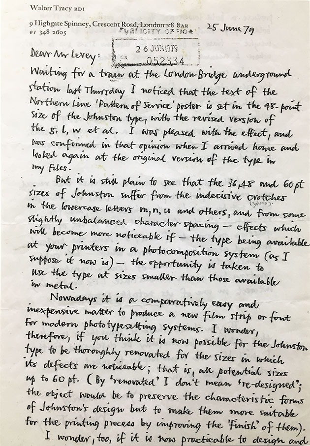
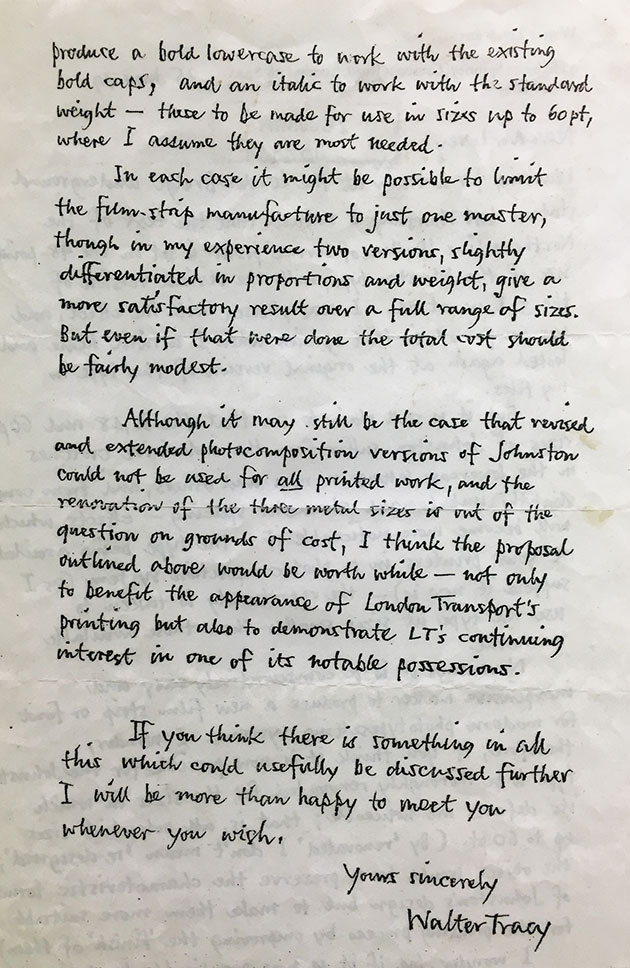
It was partly some indecisive crotches that prompted the renovation. Here’s typographer Watler Tracy RDI (at the time, recently retired, but who had worked on some Johnston revisions in the mid ’70s) to explain:
At the top of this post you can see a page of Eiichi’s preparation for a presentation to London Transport in 1980. It shows the original range of Johnston typefaces. The note at the very top reads: ‘There are six variations but only medium and bold romans are available for LT’s general printed publicity.’ The faces are: Johnston Bold, Medium, Light, Bold Condensed, Medium Condensed and Medium Italic. Here are some of Eiichi’s illuminating notes:
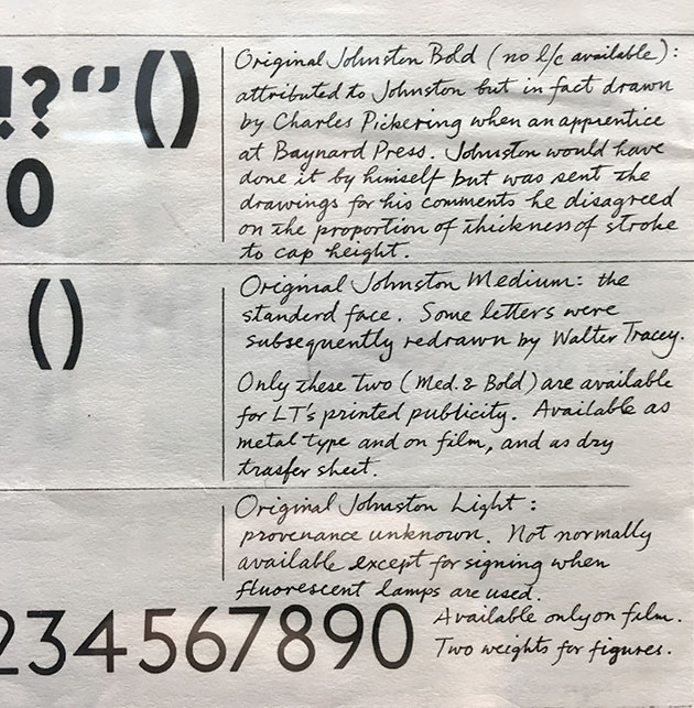
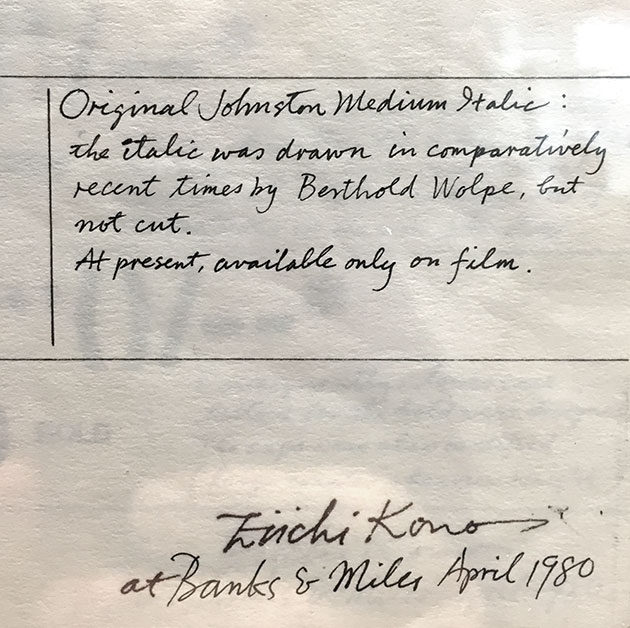
Brilliant stuff.
Here’s how New Johnston is specified in the current Tfl Design Standards:
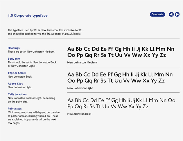
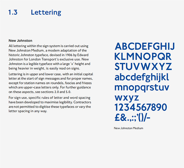
You can read more about the design of New Johnston in this fascinating piece by Eiichi for the Edward Johnston Foundation. And Eiichi will be giving a talk about New Johnston at the museum on Tuesday 7 June.
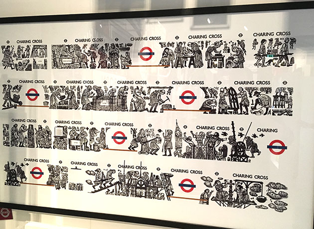
Also on show at the exhibition, you can see David Gentleman’s original wood blocks for his stunning murals on the Northern Line platforms at Charing Cross.
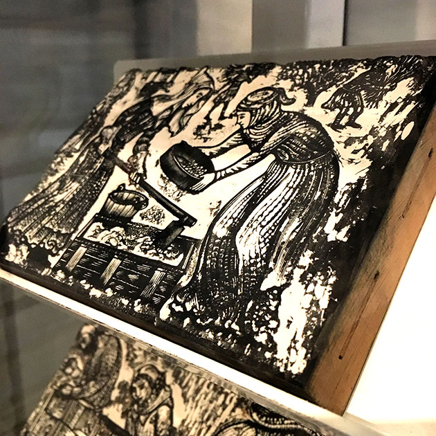
Here’s how the print from that block looks:

And a poster showing how the artwork appears on the platforms (the brown lines on the artwork represent benches):
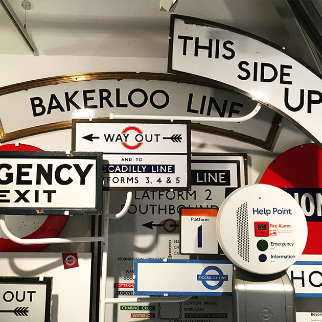
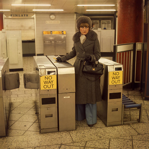
And of course, there is a vast array of lovely signs, photographs and ephemera:
There’s also a fantastic short film showing how bus destination blinds are manufactured… but you’ll have to visit the show to see that!
--------------------------
Related posts: