Central Saint Martins Graphics Summer School
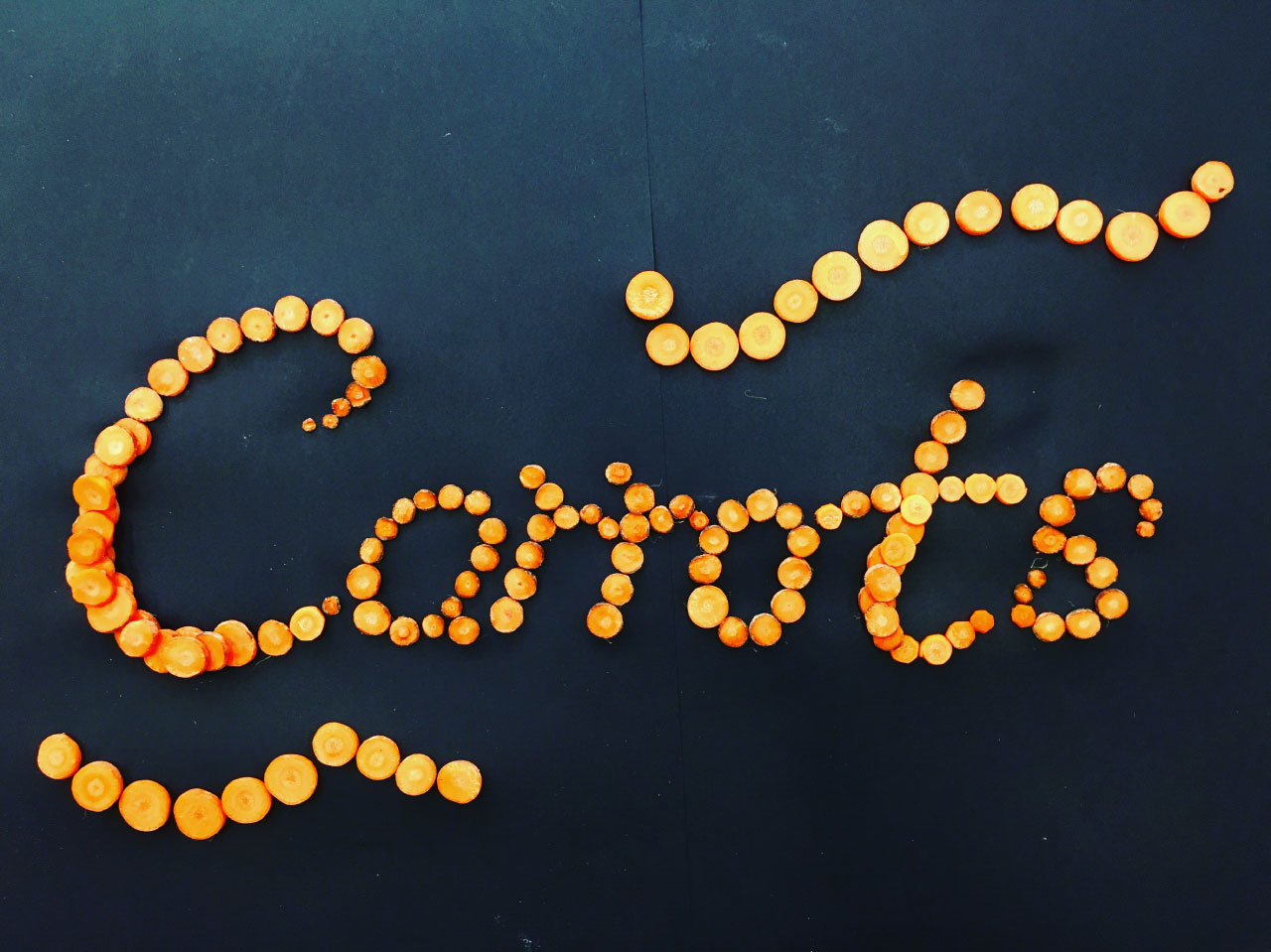
How wonderful is the lettering above? It’s by Hongxu Lu, a student on this year’s Graphic Design Summer School at Central Saint Martins.
The summer school is a two week course that offers students the chance to do four briefs in quick rotation: Typography, Illustration, Photography and Advertising. Students come from all over the world, from a wide variety of backgrounds, and vastly different levels of experience. There’s normally a smattering of design students already on BA courses, a fair few school leavers weighing up their options, some people just looking for something different to do during their holidays, and often a few people considering a full career change.
This is the tenth year that I’ve taught the Typography section of the course, and for this year’s brief, I challenged the students to create a hand-lettered poster using only materials that they could buy at a supermarket. The focus was heavily on experimentation – on the joy of not knowing quite where you might end up. The results were really inspiring, and I thought I’d share a few here.
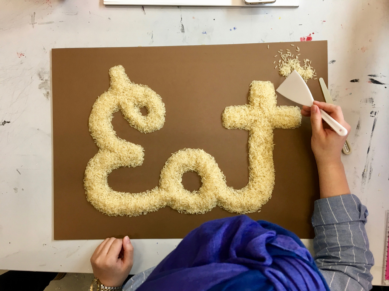
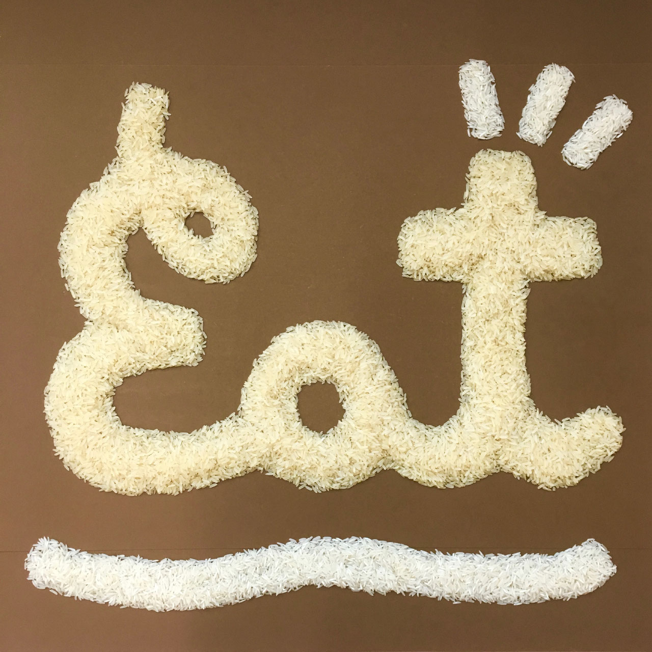
Ghaida from Saudi Arabia created a wonderfully balanced set of letters using rice, meticulously crafting the shapes directly on the paper without a guide.
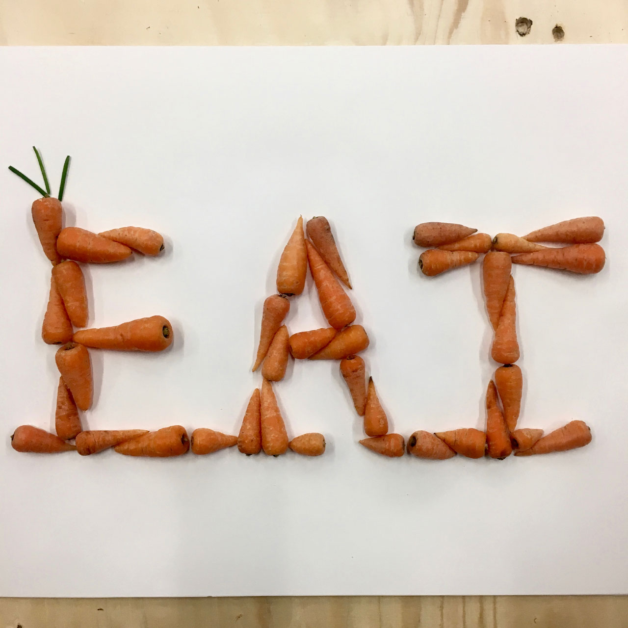
Marina, a graduate in World History from Japan, used baby carrots to create the same word:
Theatre student Julia, from Barcelona, invented the character of a disgruntled cleaner, and designed a fantastic set of lettering for her using cleaning cloths, which she photographed all around the college.
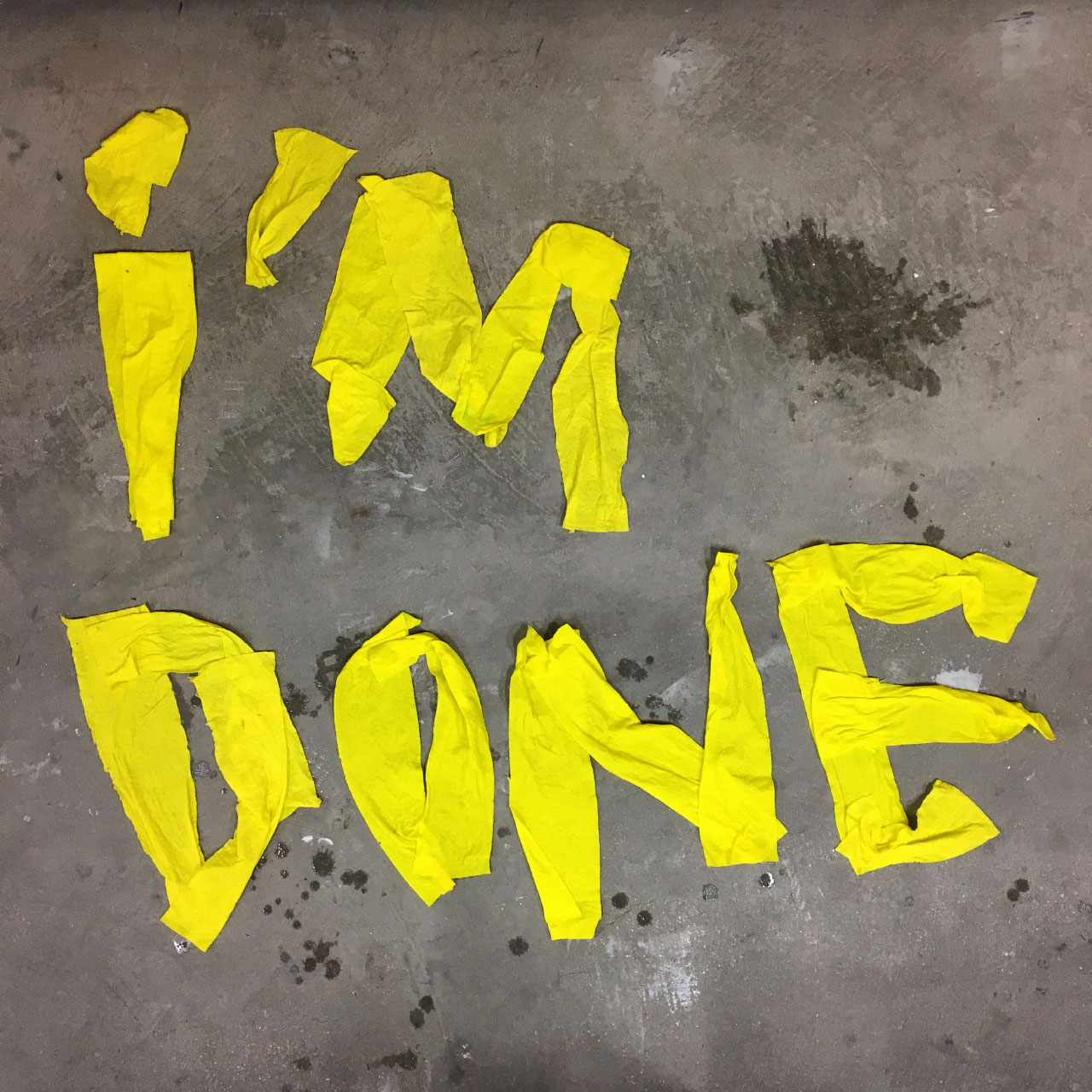
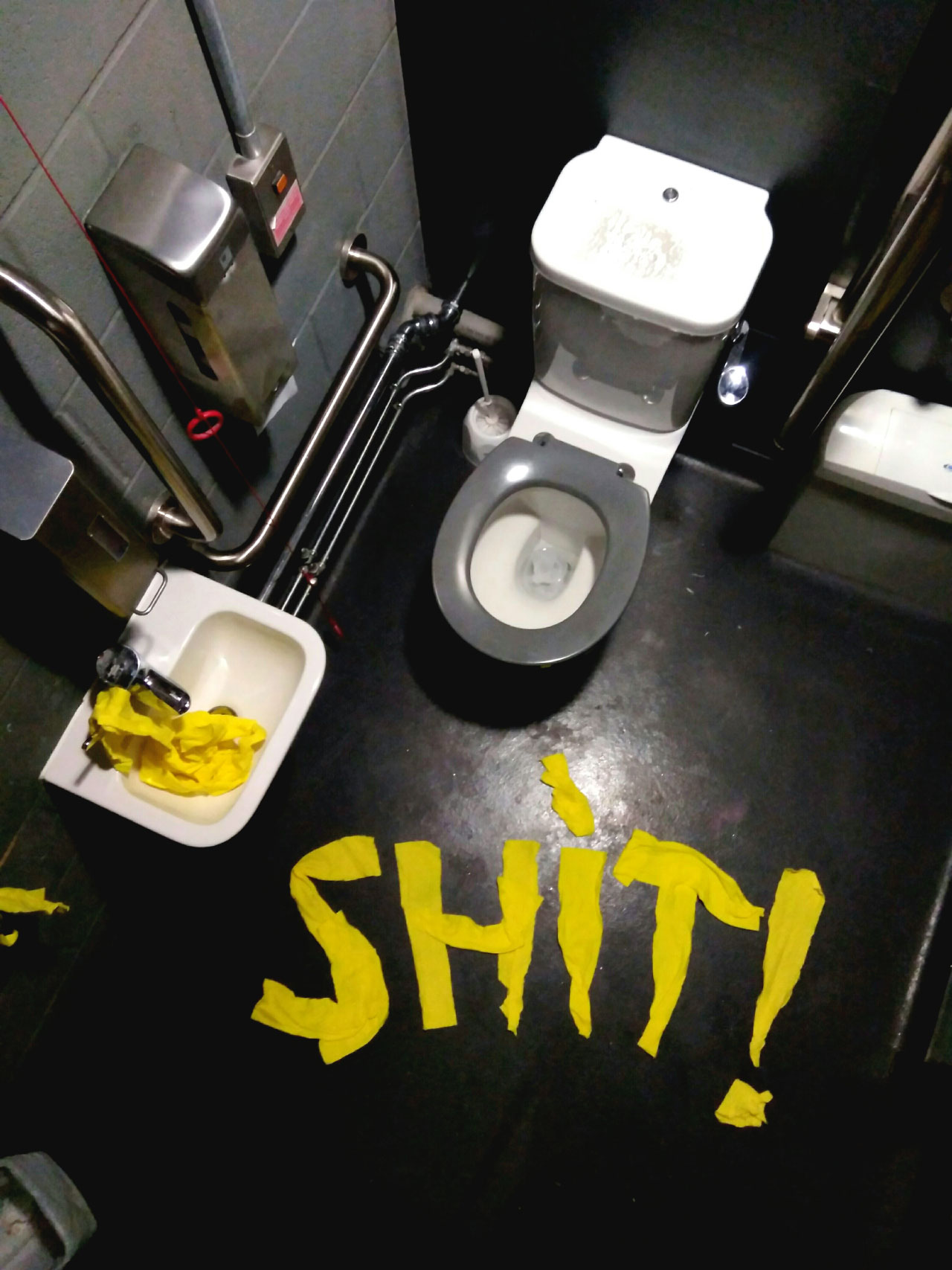
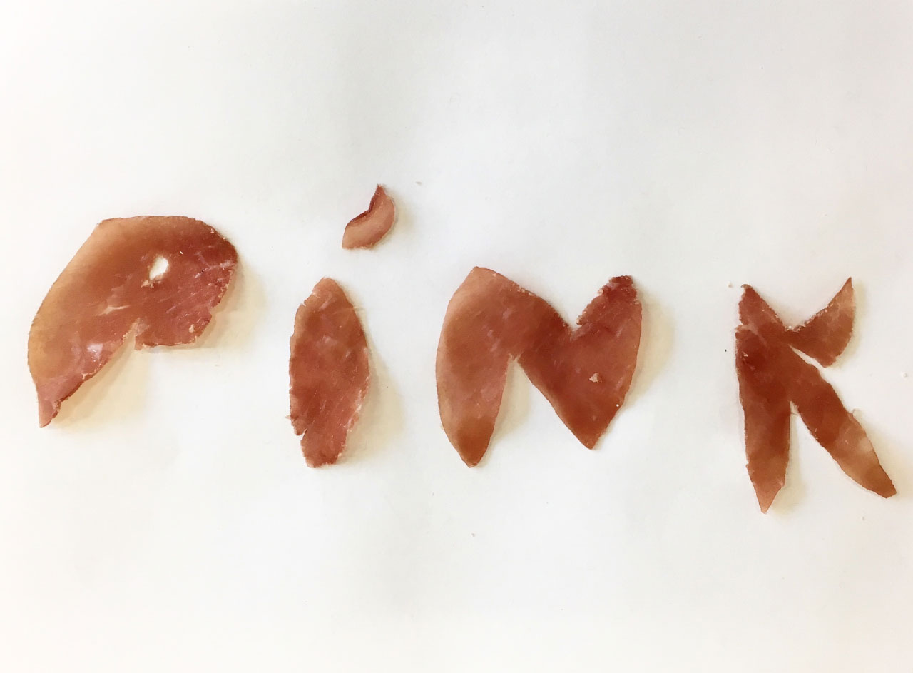
Julia also tested out cooked ham for lettering, photographing it as it gradually dried and curled over the course of the project:
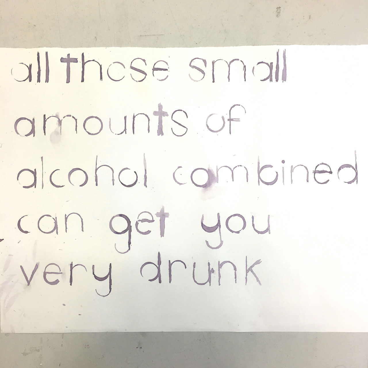
Anne, a literature and philosophy student from Amsterdam, printed letters using wine and some bits of cardboard:
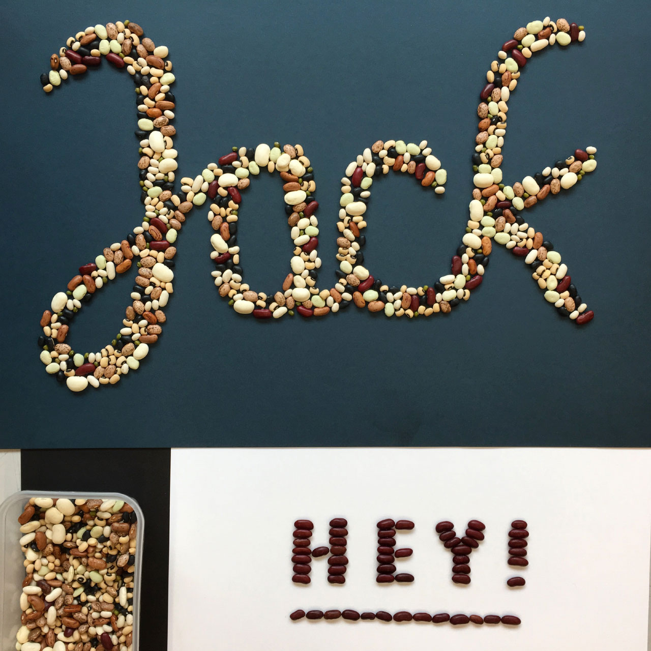
Yee Fung created a stunning set of letters using mixed beans:
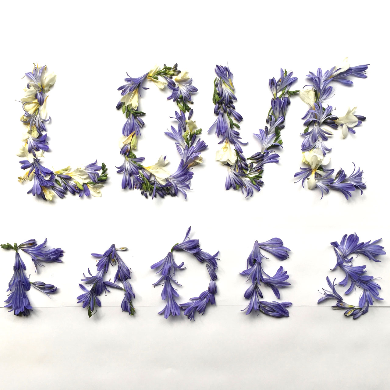
Shikha, a business computing student from Saudia Arabia, created this wonderful piece from some cut flowers:
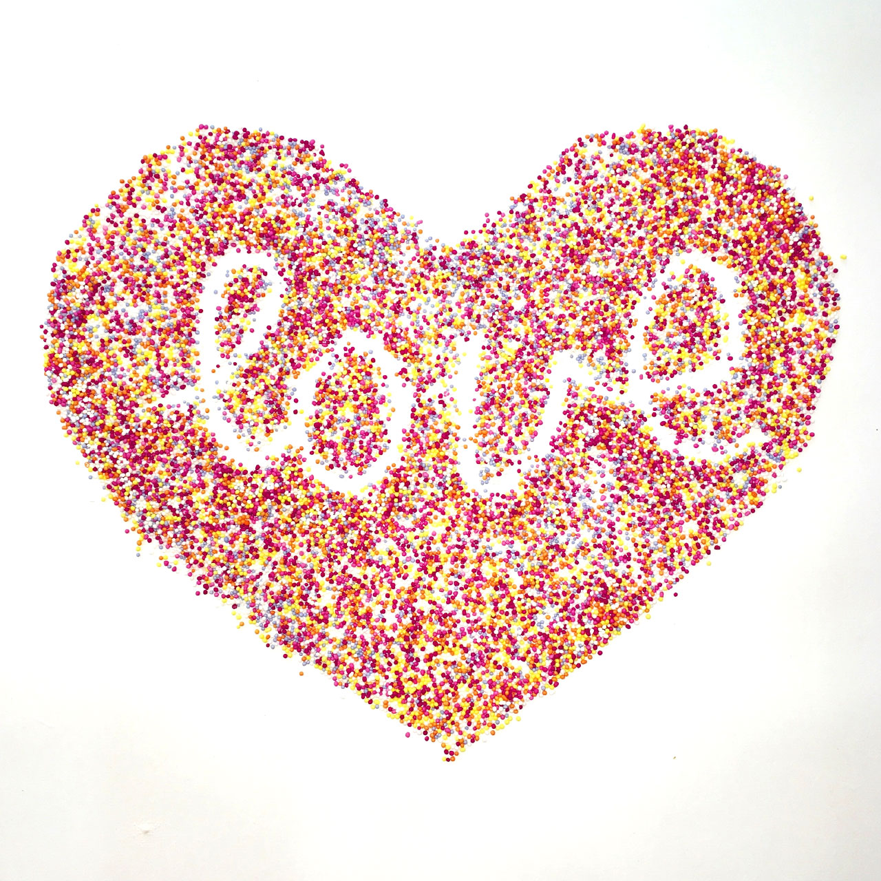
Hongxu, not content with creating a single piece, also made this fantastic image using 100’s & 1000’s – all completely freehand, with no glue to keep them from rolling around.
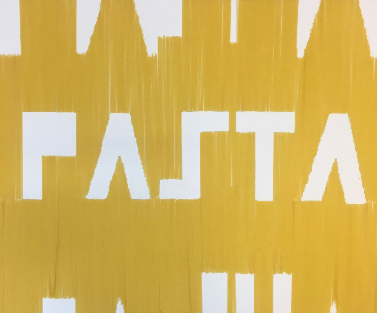
Brazilian graduate Rebecca used dry spaghetti to create these wonderfully angular letterforms:
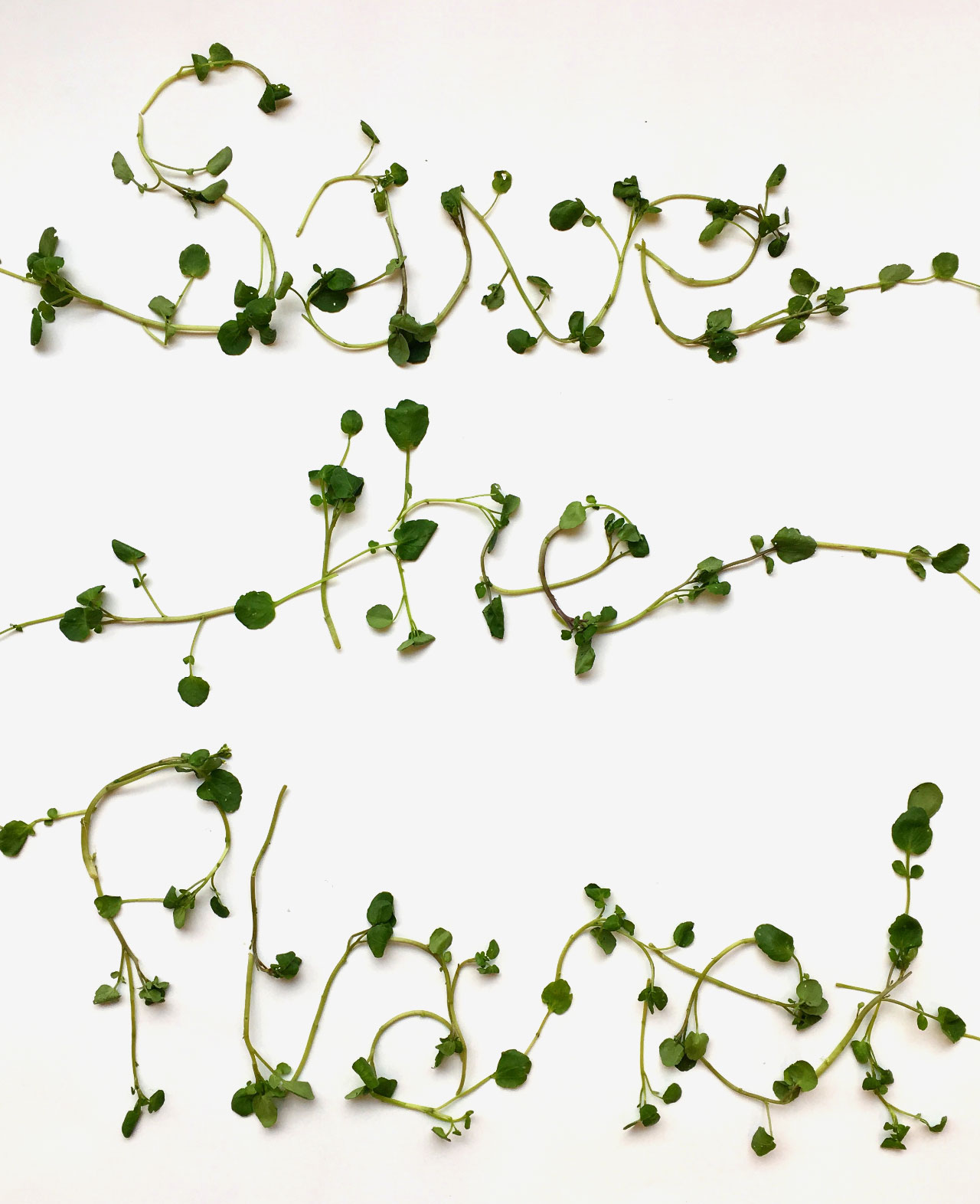
Another student who looked at the way lettering changed over time was Simay from Turkey, who used pre-washed watercress for the stunning poster below. It was fascinating to see how quickly the watercress wilted and flattened against the paper.
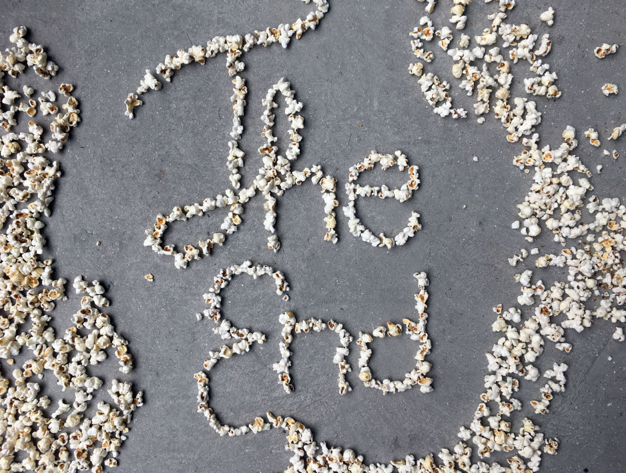
Finally, Simone from Denmark created this brilliant piece using popcorn, based on the end title cards from old movies.
It was really fantastic to see such imaginative and playful work from all the students on the course.