Can Graphic Design Save Your Life?

Roughly 9 years ago, in September of 2008, I wrote a post, De-branding cigarettes, about the fact that the Department of Health was considering making it compulsory to use plain packaging to sell cigarettes in the UK. I was intrigued at the idea of a major product having its branding completely removed. To illustrate the article I mocked up a blank cigarette pack, and then added some graphics to it in Photoshop.
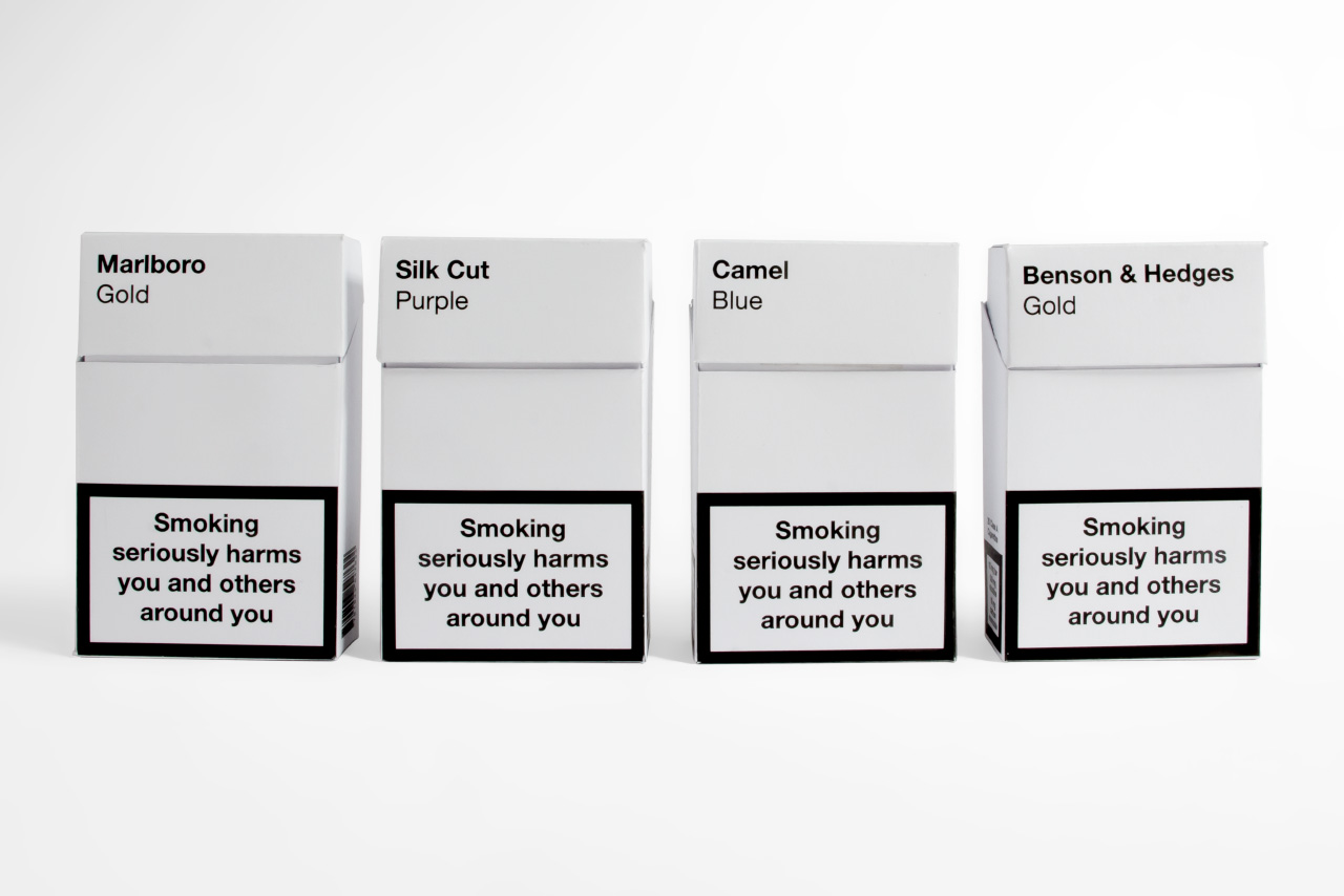
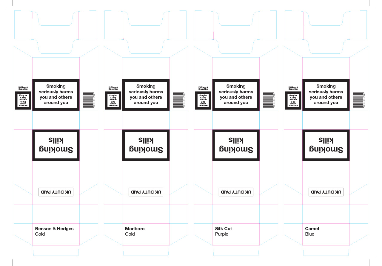
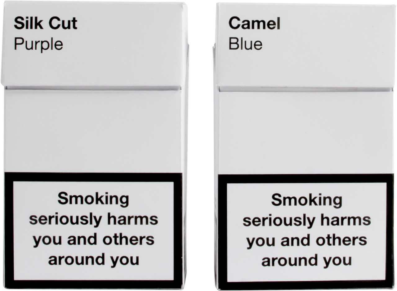
In May of 2015, Lucienne Roberts from publishing house GraphicDesign& got in touch about a new exhibition they were curating called ‘Can Graphic Design Save Your Life?’, commissioned by the Wellcome Collection. The exhibition would be about graphic design related to health, and she asked if I’d be happy to have the packs we designed included. I explained that the actual packs didn’t exist, but that I’d gladly put some new ones together for the show. I put some new artwork together, and got busy with the scalpel and double sided sticky tape.

Jump cut to today, and the show has just opened at the Wellcome Collection in London, and features my packs.

The show, divided into six sections – Persuasion, Education, Hospitalisation, Medication, Contagion and Provocation – examines the role of graphic design in helping to make the world a better place, and features many examples of it doing just that.
(It does also touch on the fact that it can do the exact reverse too of course – showing that Raymond Loewy’s revised packaging designs for Lucky Strike helped to dramatically increase the number of smokers in the USA.)
Encouragingly, Rebecca Wright, one of the partners at GraphicDesign&, and Programme Director of Graphic Communication Design at Central Saint Martins, said at the show’s launch that design responsibility is a hot topic amongst students.
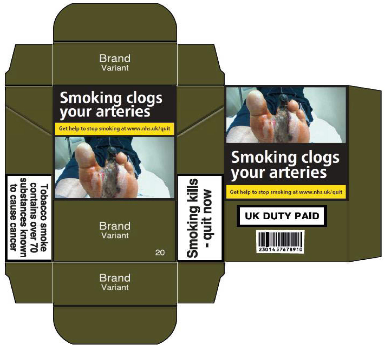
Relatively recently (May of this year) standardised cigarette packs were finally introduced in the UK. This was due to happen in 2014, but the legislation was delayed by challenges to its legality. Thankfully they’re not the clean, minimalist packs we had hypothesised for our piece, but instead are deeply unattractive, largely based on the designs that already existed in Australia (introduced at the end of 2012) which can also be seen at the Wellcome show.
The packs are a dark brown green – Pantone 448C which researchers for the Australian packaging found to be unattractive and associated with death and tar. They feature large and generally off-putting images showing the harmful effects of smoking. The brand name and product variant is set in Helvetica, with other information and health warnings in Helvetica and Neue Frutiger. You can read the full guidance here.

Intriguingly, this is a case of packaging being designed to be as unattractive as possible. Almost a form of anti-design.
One can only hope that this, together with the bans on tobacco advertising and display in shops, and the ban on smoking in public buildings, as well as the rise of e-cigarettes, continues to drive down the numbers of tobacco smokers in the UK.
The show is definitely worth a visit (entry is free), and runs from now until 14 January; and an accompanying book by GraphicDesign& is also available.