work blog about search


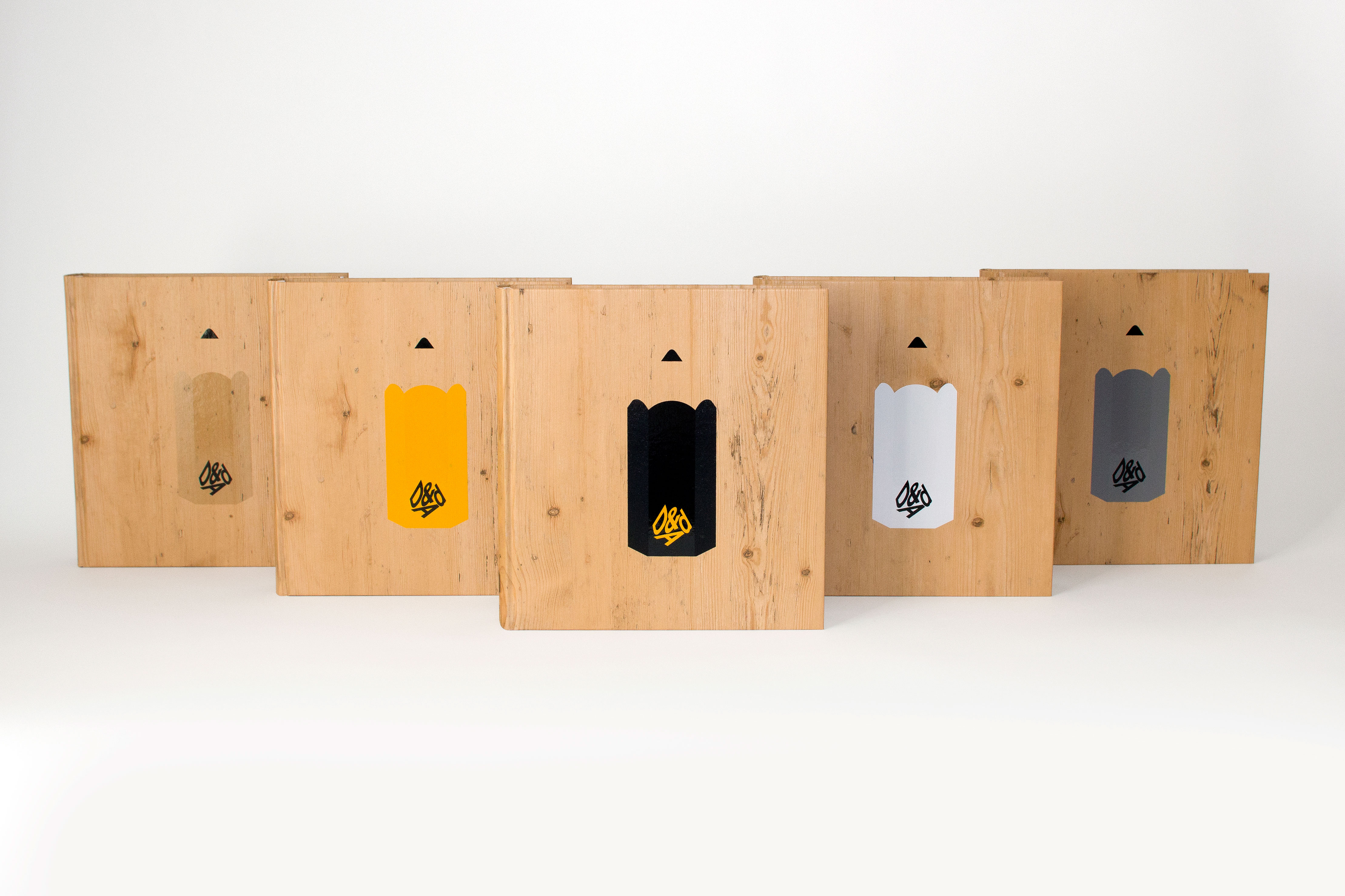
2015 D&AD Annual cover

Project Type:
Books

Client:
D&AD

D&AD celebrates the best in advertising and design each year with the D&AD Awards. All the winning entries are then published in the D&AD Annual. Each year a different designer or design team is asked to create a cover for the Annual. My friend and colleague David Pearson was commissioned to create the 2015 cover, and he asked me, along with our friend Paul Finn, to collaborate with him on the designs.

The D&AD Awards come in the form of oversized pencils (below), and two new ones were introduced in 2015: the Wood and Graphite Pencils. With their introduction, it felt like the right time to put them all front and centre on the cover.
D&AD-pencils
 

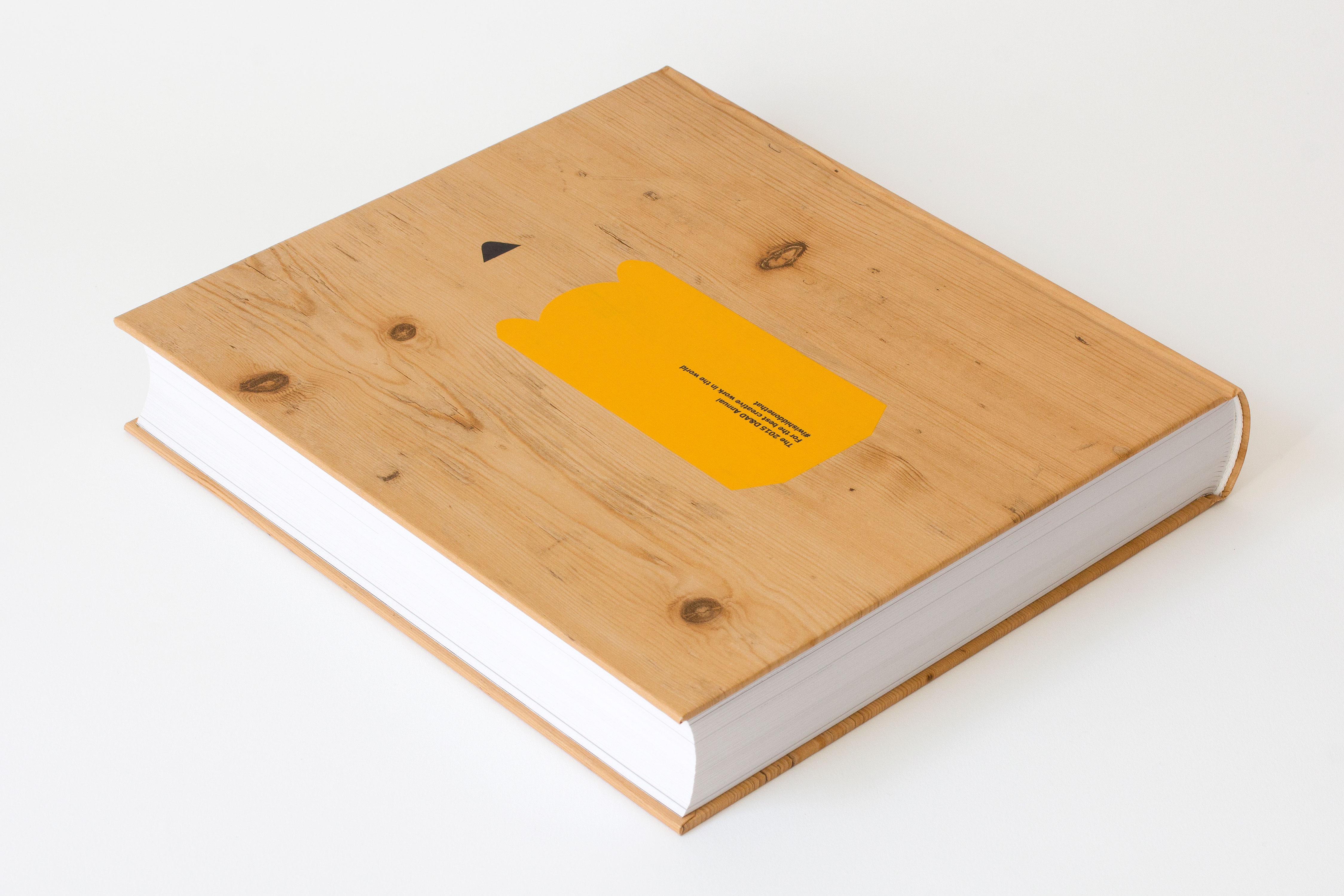
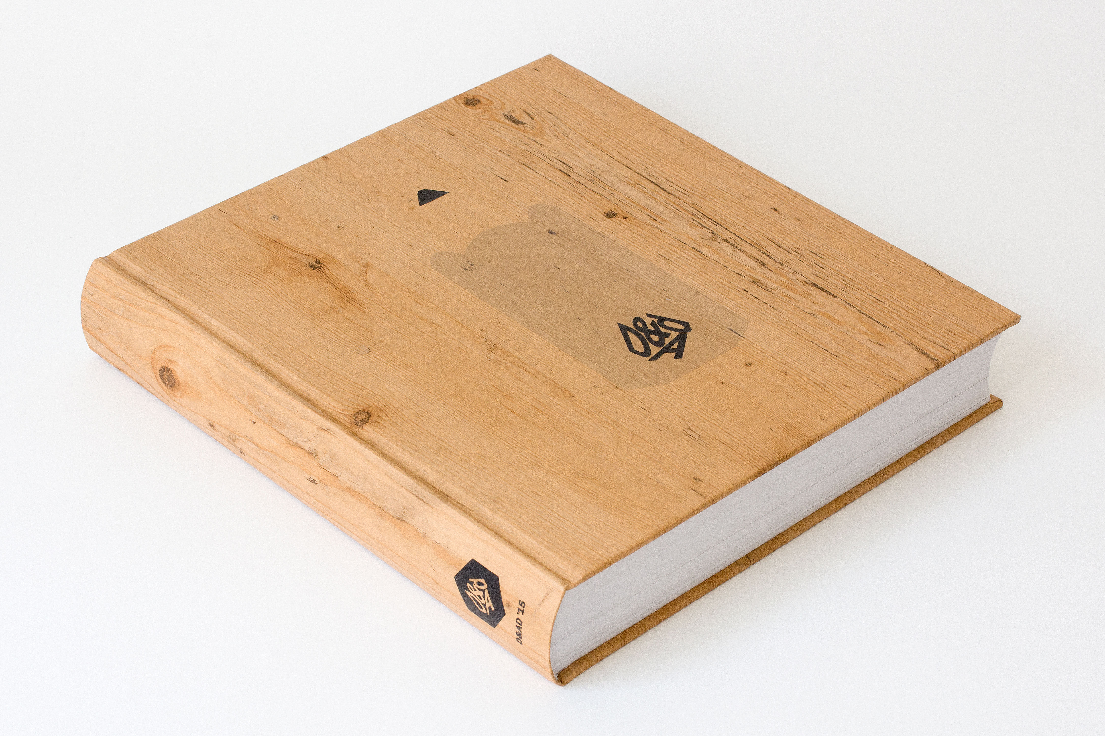
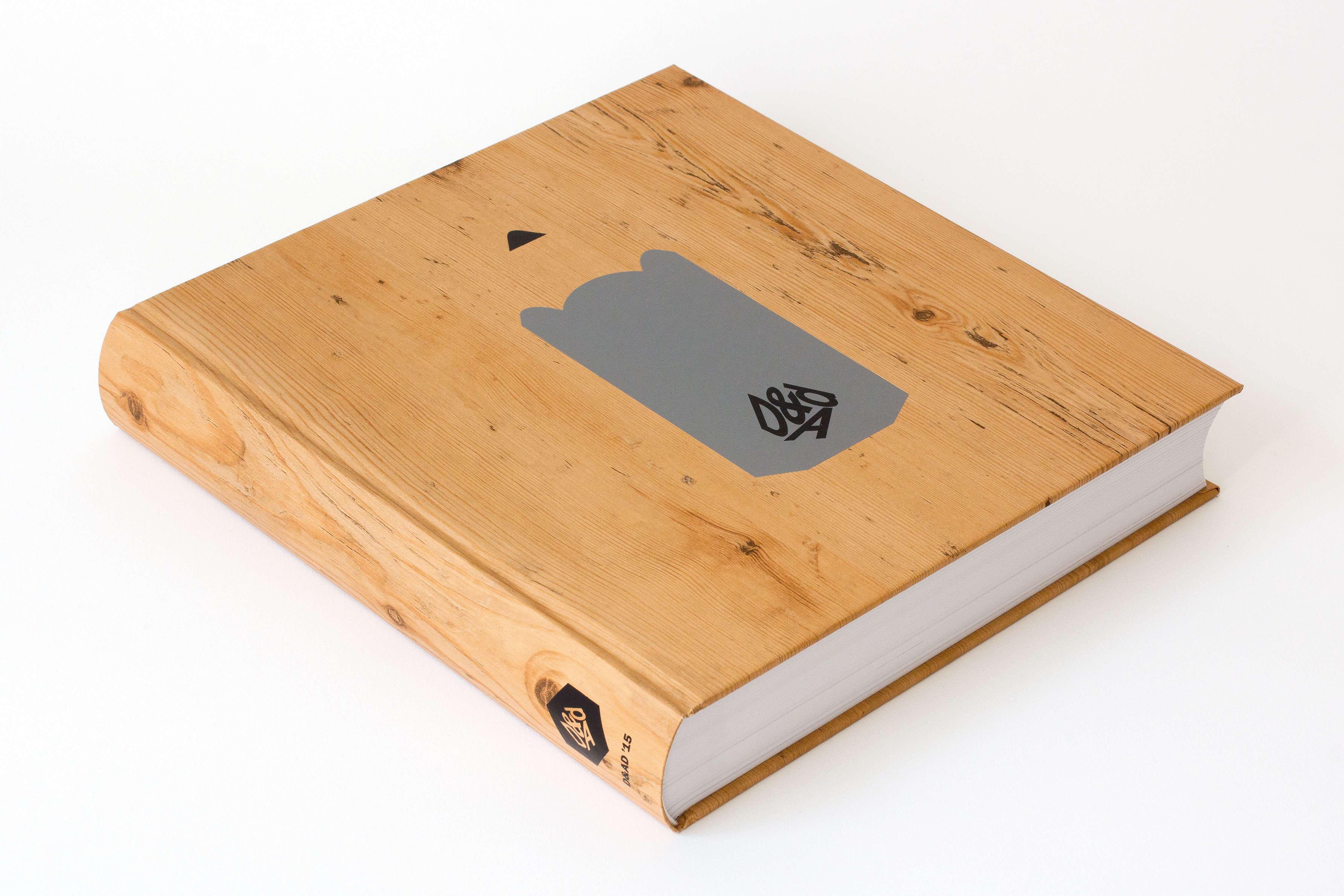
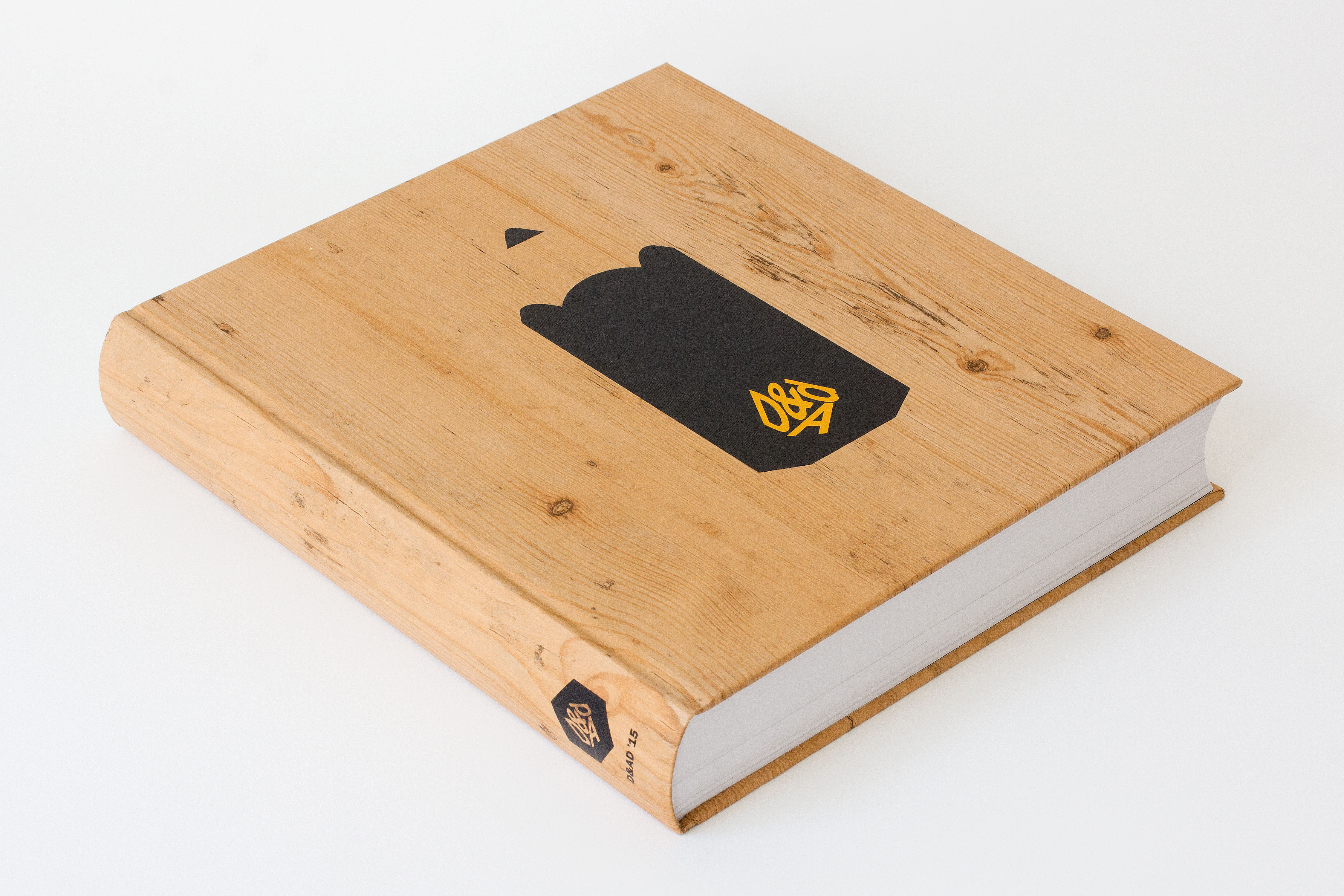
We designed a series of five covers, each one featuring one of the awards at actual size, shown front and back. Clean and simple. The Pencils were screenprinted onto a delicious GF Smith wood-effect stock, Woodside Garden Pine, (which I’d just used for one of my postcards for Benwells). The wood portion of the pencils was left unprinted, allowing the texture of the paper to become part of the image in the mind of the viewer.

D&AD_covers_from_the_side_0003_Yellow-f
D&AD_covers_from_the_side_0002_Yellow-b
D&AD_covers_from_the_side_0005_Wood
D&AD_covers_from_the_side_0004_Graphite
D&AD_covers_from_the_side_0001_White
D&AD_covers_from_the_side_0000_Black
 

‘A brave, clean design that deserves to be put in front of that big, scary design community’
It’s Nice That