The Gardener Architect – Eric Guibert
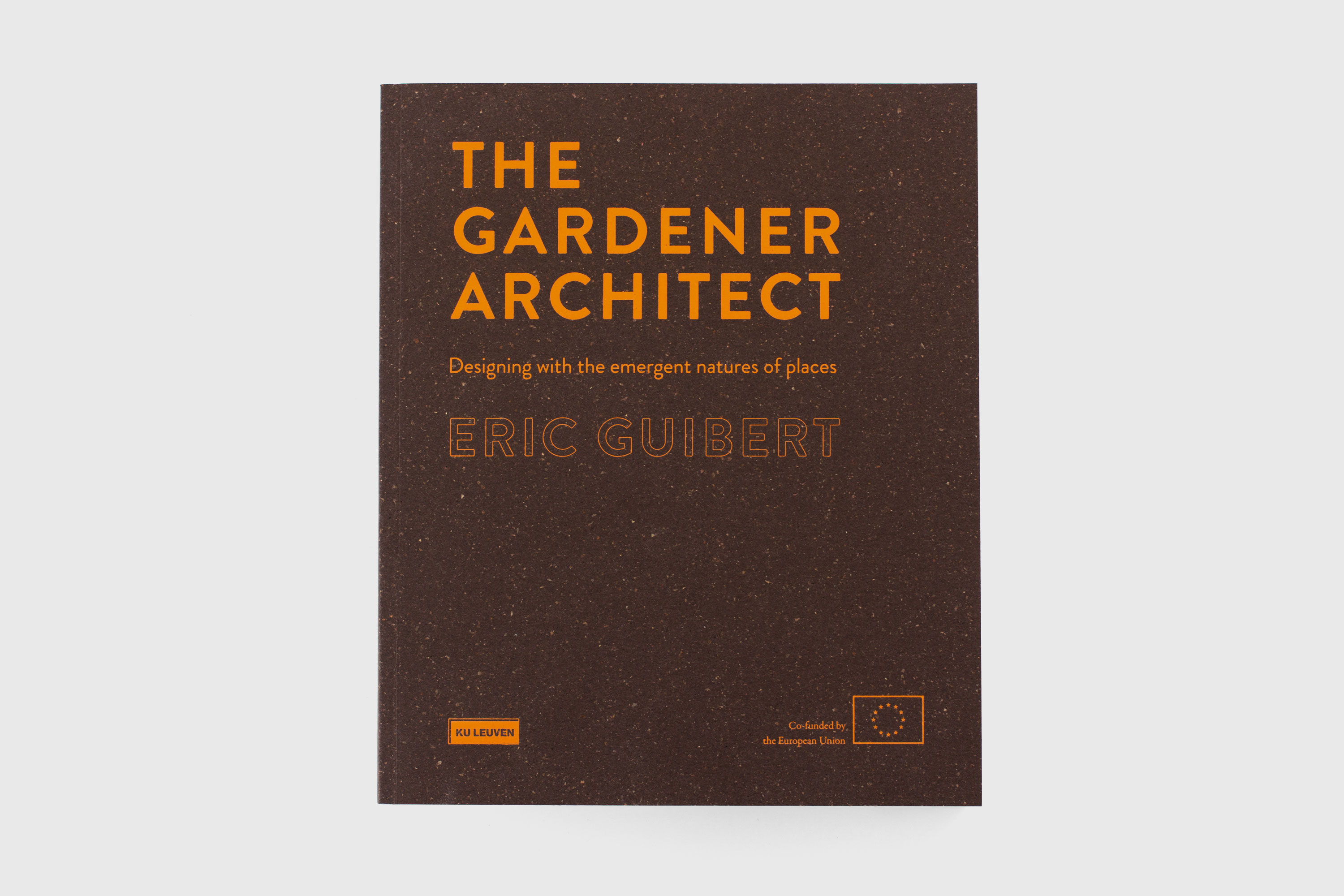
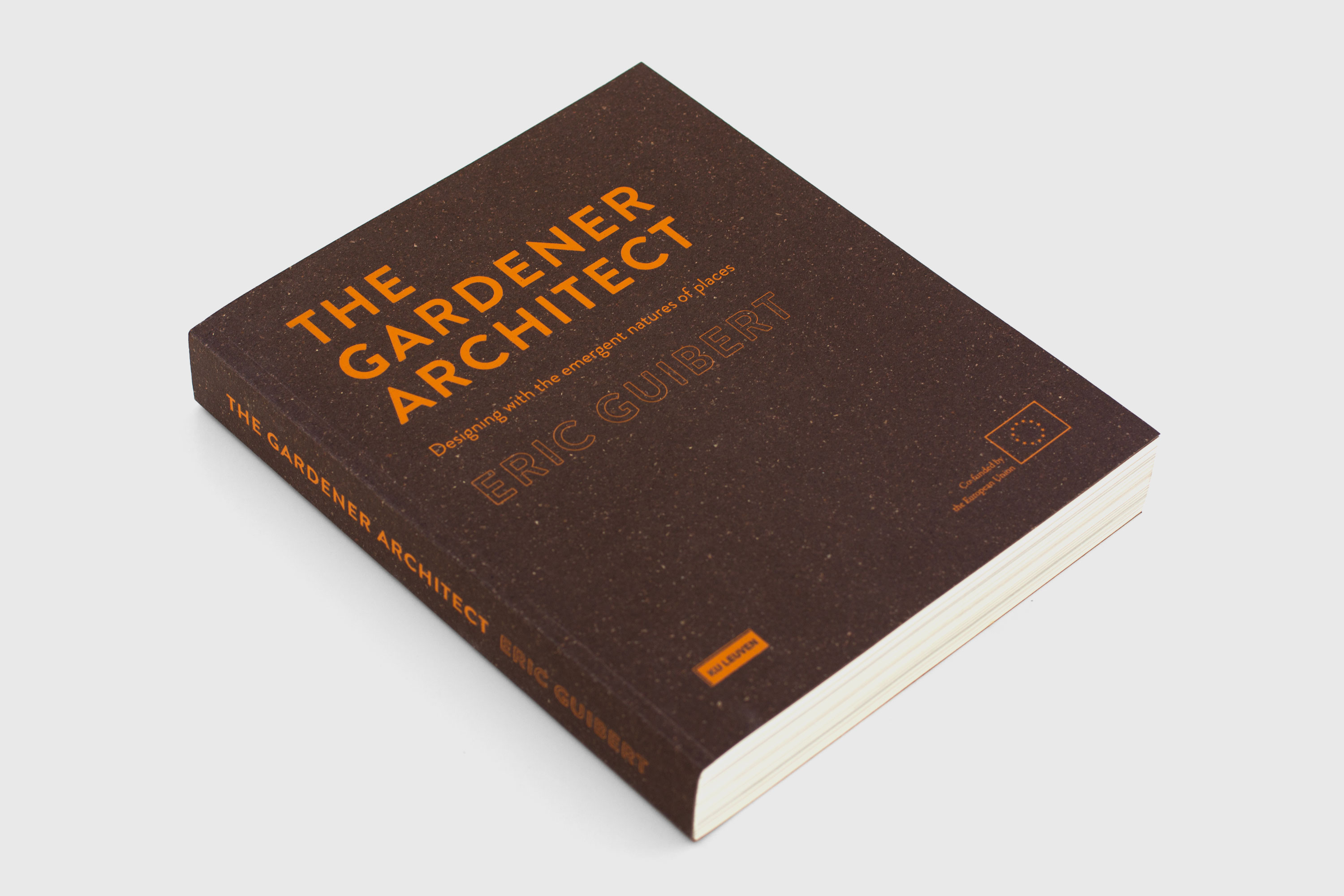
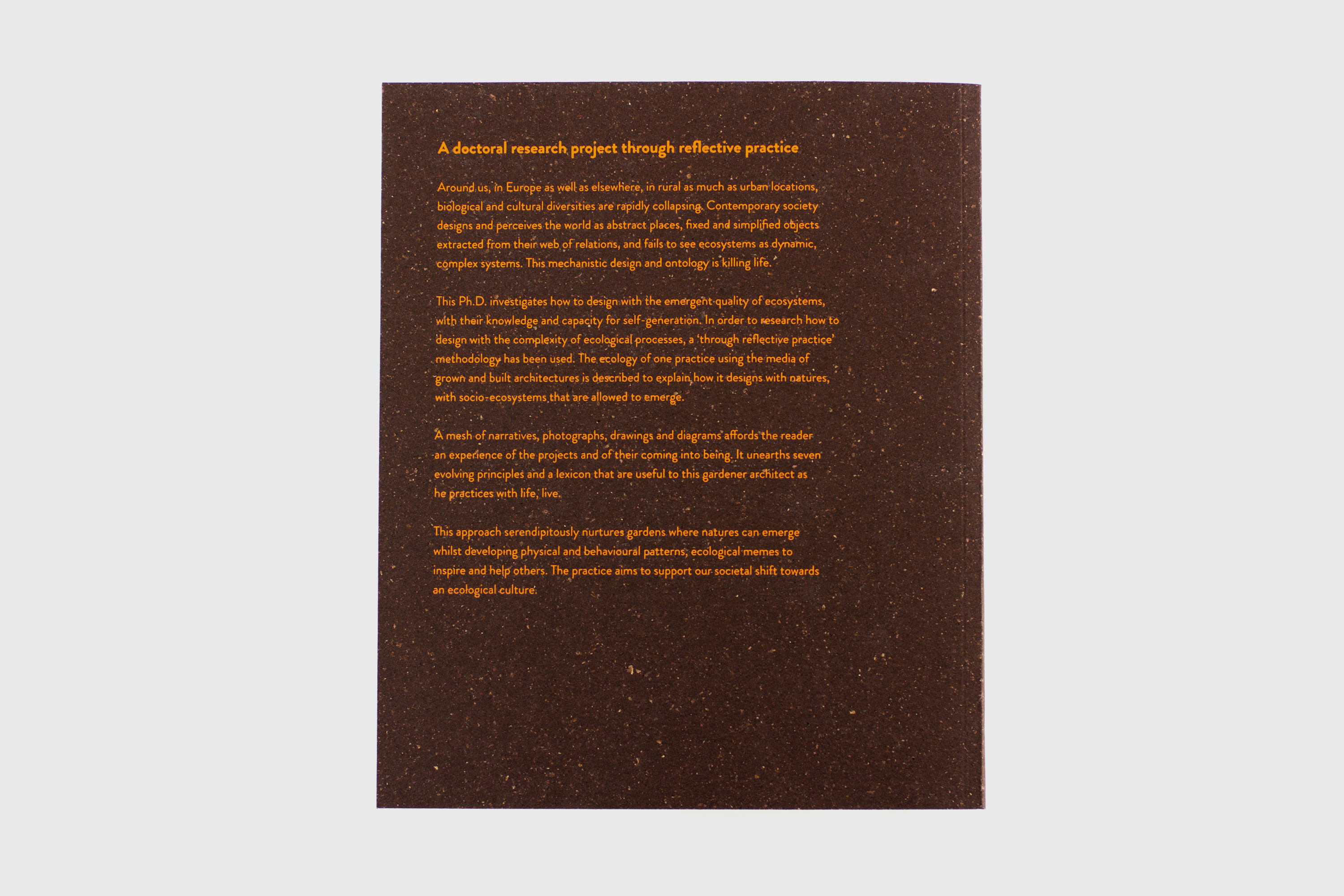
I first met Eric Guibert around a decade ago. A gentleman in the truest sense, he’s also a distinctly talented architect, and he recently completed a practice-based Ph.D. at KU Leuven. When it came to publishing his finished thesis, The Gardener Architect, he asked me for a little help with the design of the cover and dividers of the book.
We had many conversations about the nature of the book, and how the cover should represent it. Eric naturally wanted something that felt similar to the work inside the book, but more specifically something real, tactile, and physical. It needed to have a balance between past and future, and to feel natural, earthy and dark.
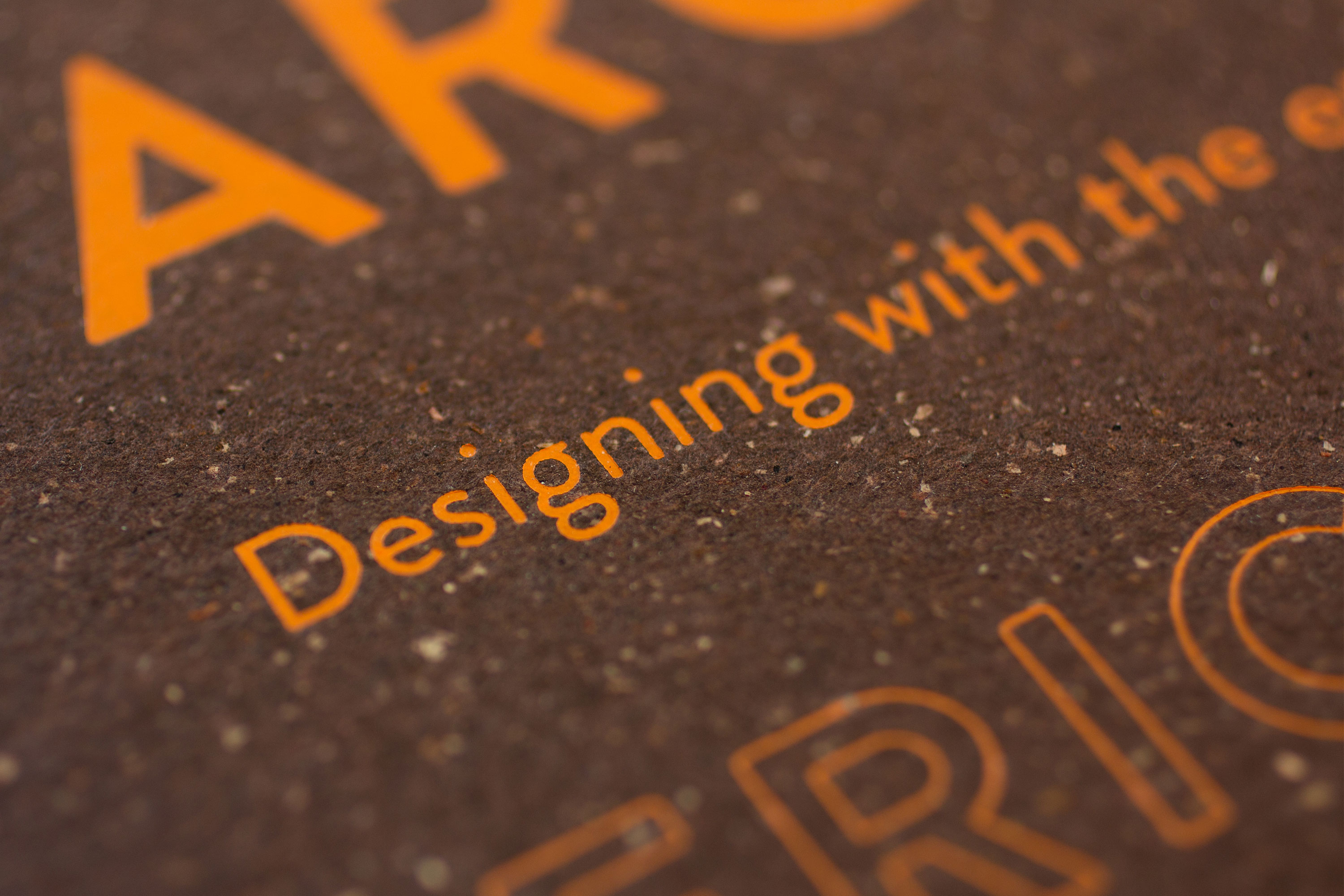
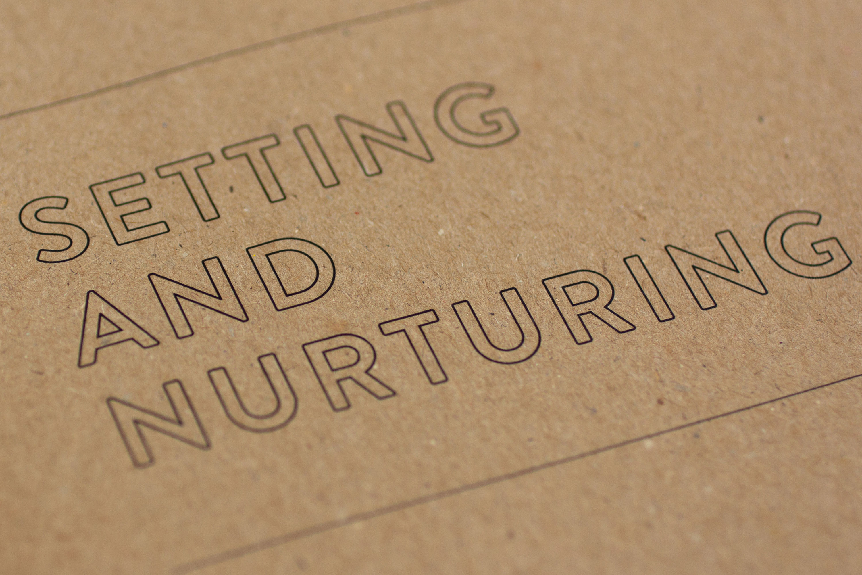
The perfect cover material came in the form of GMund Bier paper, a GF Smith stock made with elemental chlorine-free pulp and spent brewer’s grain. This gives it a pleasingly dark, earthy texture which feels organic but still professional.
We offset the earthiness with a bright orange foil, printed by the good folks at Benwells.
